Rivers’ Remedies
A gentle identity system that makes natural products feel clear, useful, and distinctly British.
A natural, contemporary identity for a British remedies brand.
Rivers’ Remedies is a small independent shop founded in London in 2008. The refreshed identity gives its honest, safe, effective, 100% British products a clear visual language across clicks and bricks.
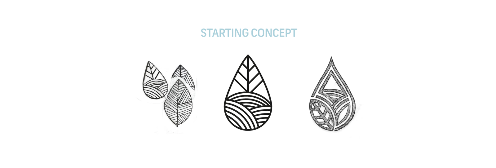
Starting from natural forms
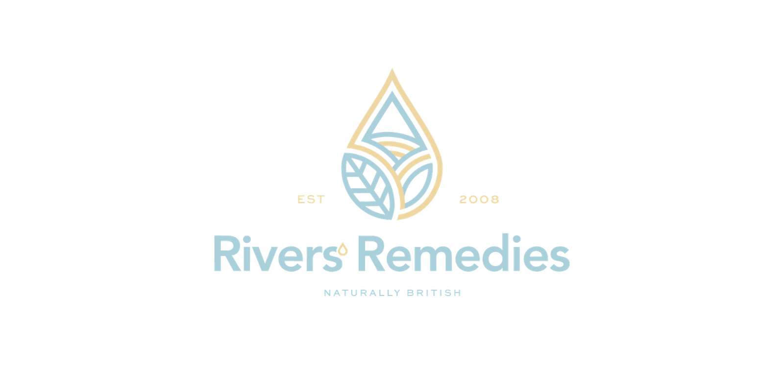
The identity begins with a simple visual vocabulary: leaves, drops, and the quiet irregularity of hand-drawn forms. The mark keeps that natural provenance while becoming clear enough to work as a compact signature.
A mark with room to breathe
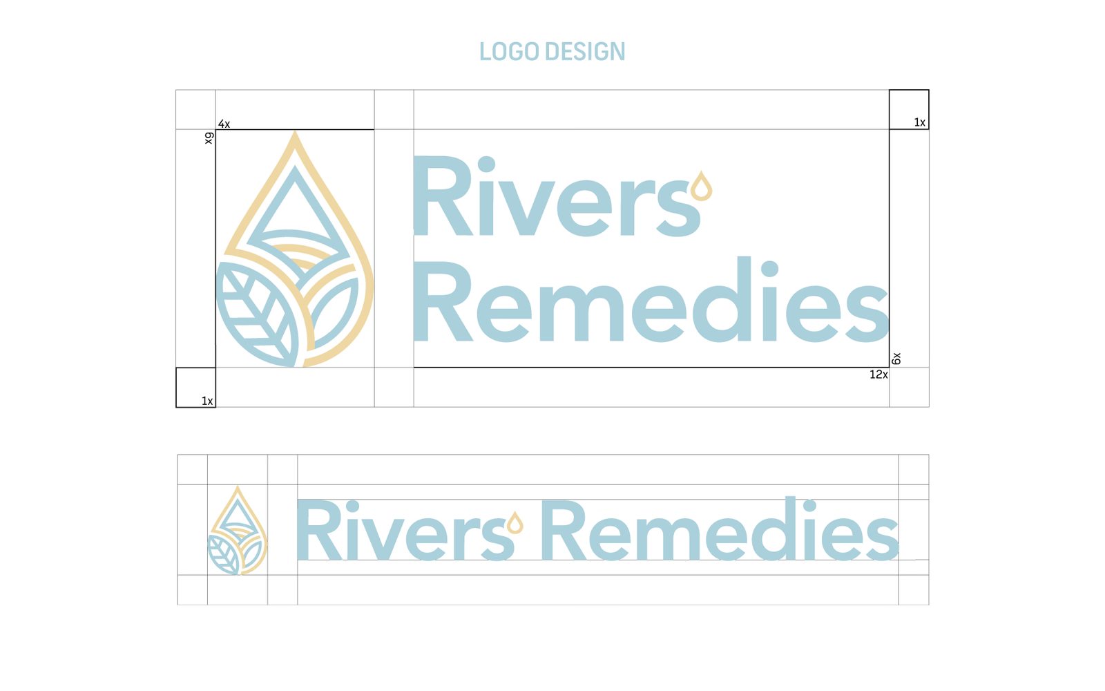
The chosen symbol is refined through construction studies and paired with a generous wordmark. The result feels considered without losing the approachable quality of the original forms.
Pale blue, soft yellow
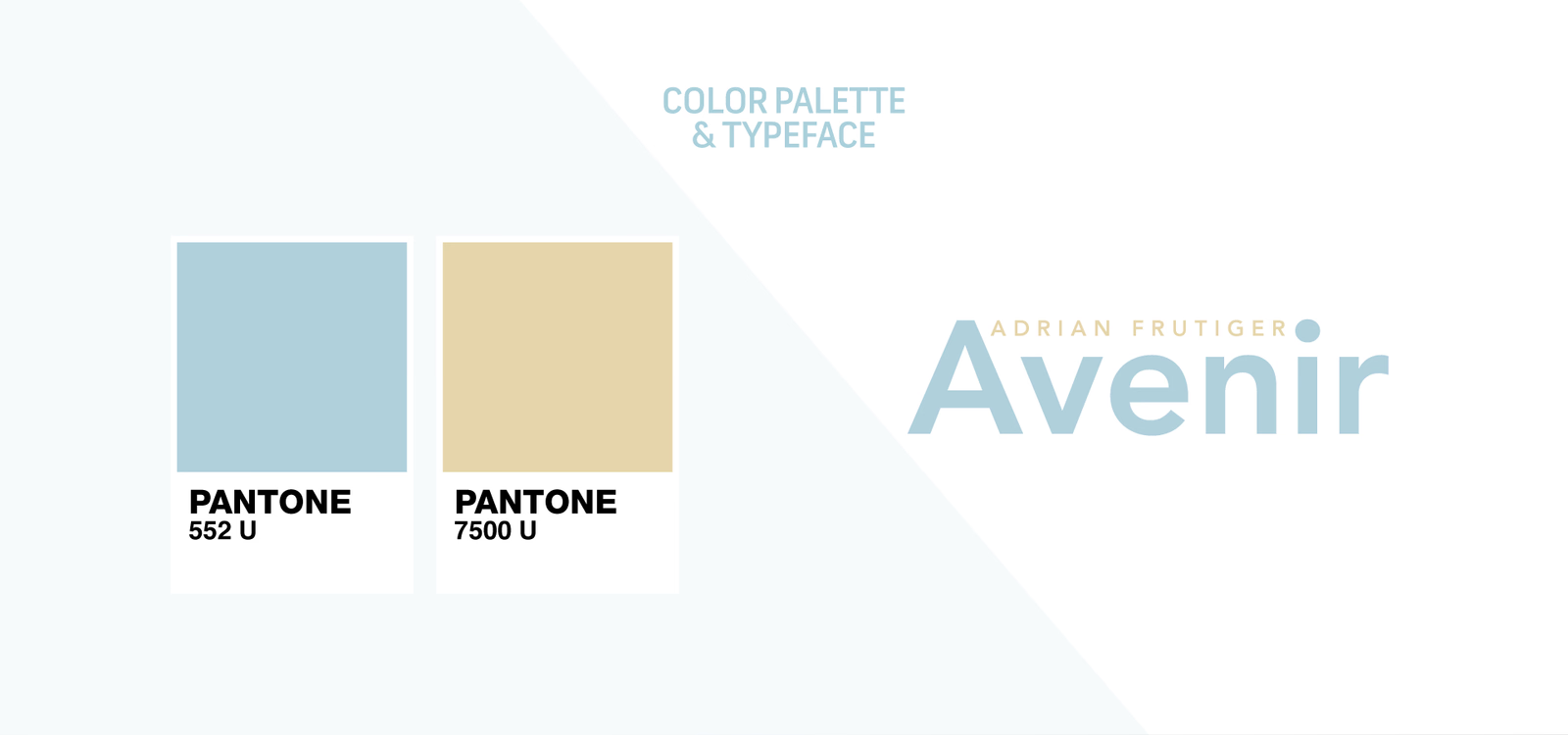
Colour and type keep the system calm and recognisable. Pale blue brings a sense of freshness, soft yellow adds warmth, and Avenir gives the wordmark a clean, legible voice.
From identity to product
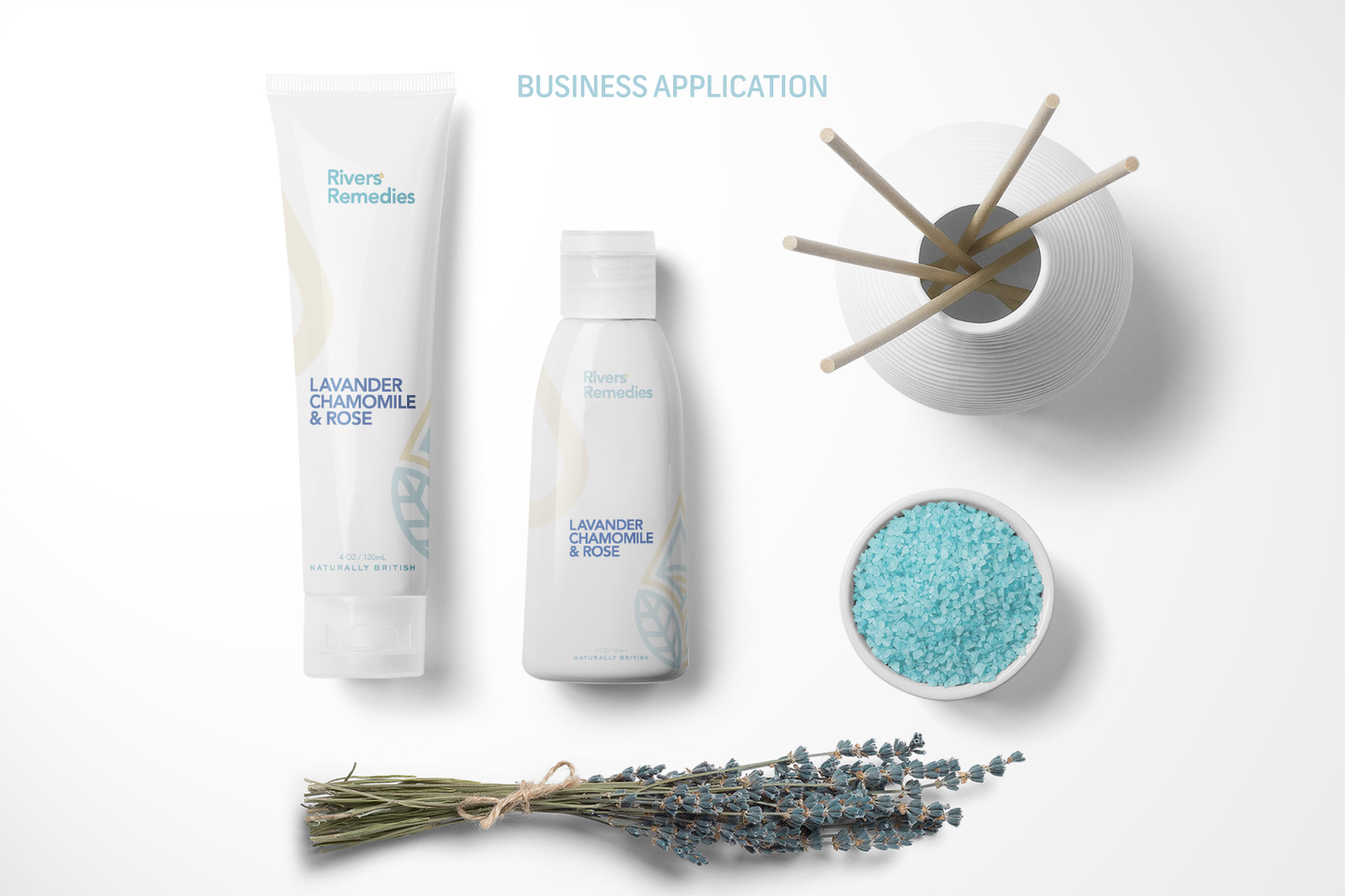
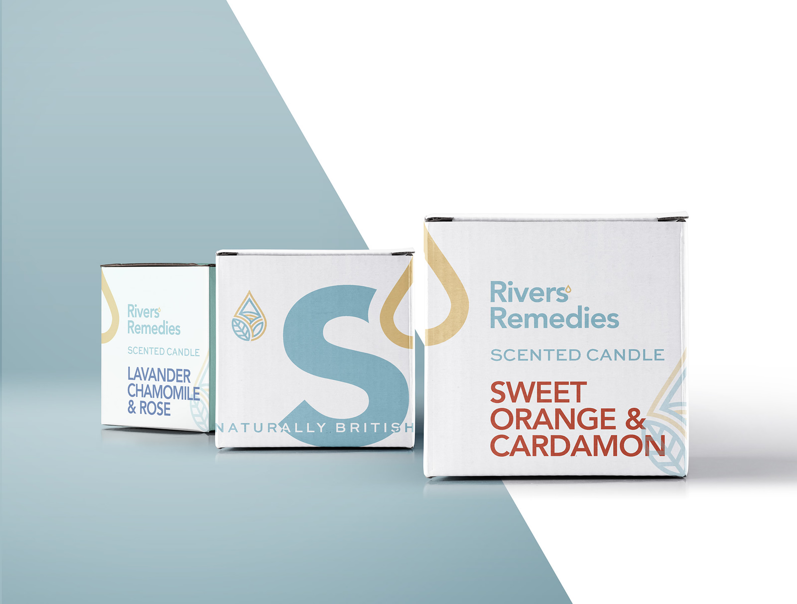
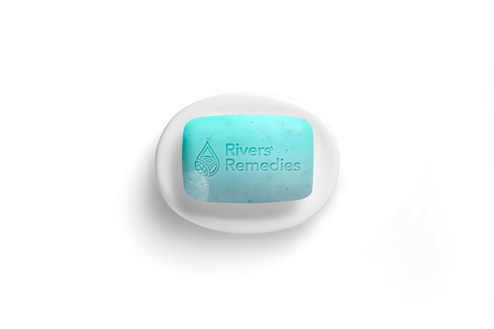
The system is designed to travel. Bottles, tubes, candles, salts, and other product touchpoints carry the same mark, colour, and spacing logic, making the range feel like one family.