Lycaremit
A focused evolution of the Lyca identity for the clarity and confidence of international money transfer.
A sharper identity and digital language for a financial services brand.
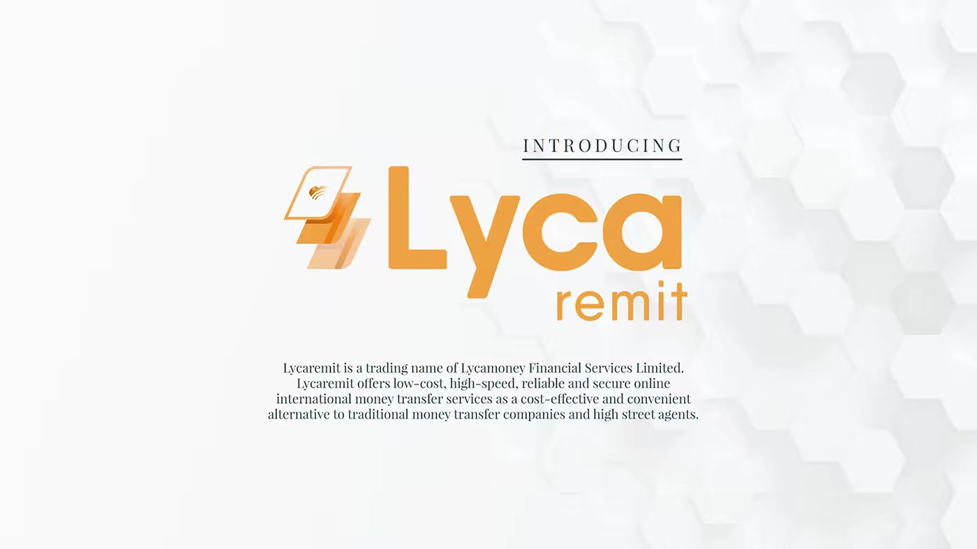
Lycaremit is a trading name of Lycamoney Financial Services Limited. The rebrand moved from the corporate identity into the new UX/UI elements for an online international money-transfer service.
From group identity to specialist service
After the wider Lyca Group identity was established, Lycaremit needed a related but more focused expression. The system keeps the parent brand’s sense of connection while translating it into a service where trust, clarity, and ease are part of the experience itself.
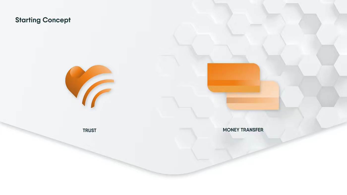
A symbol for trust and transfer
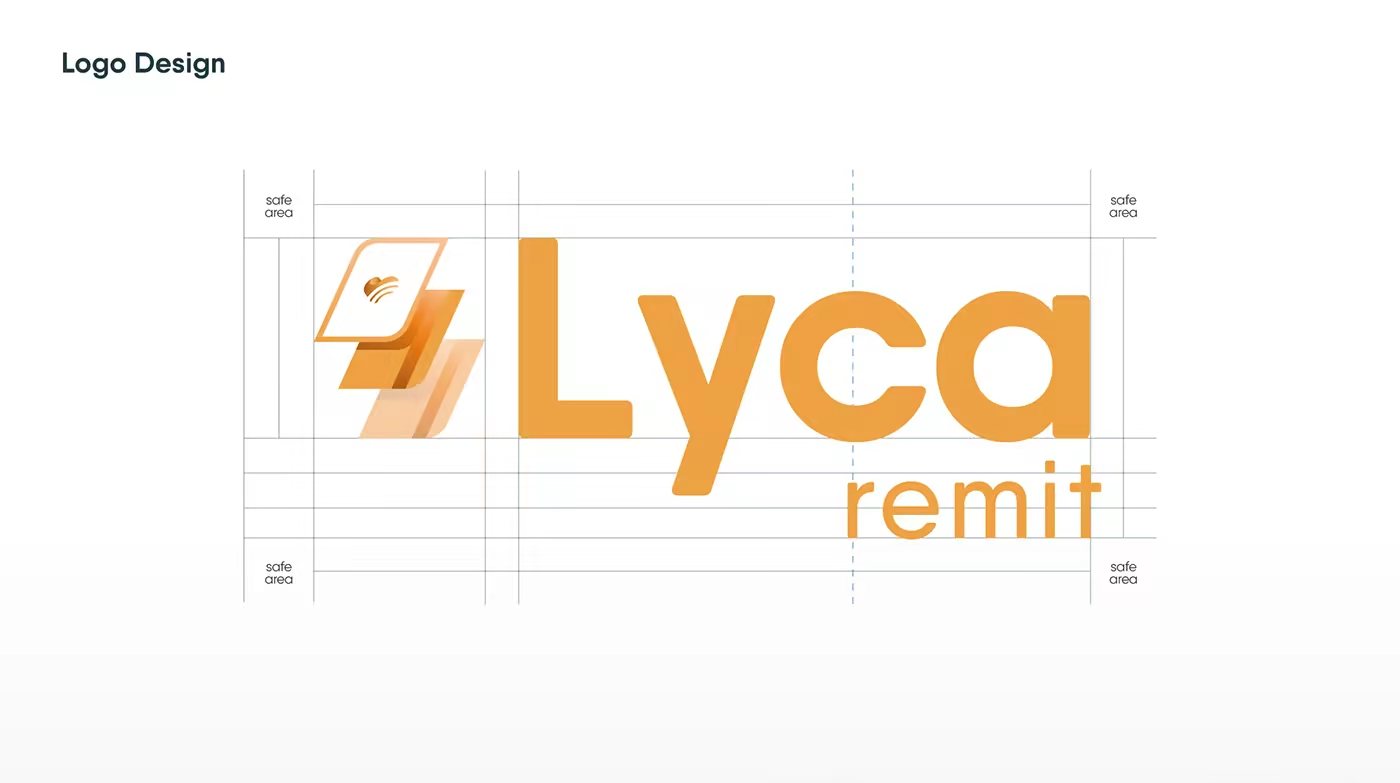
The identity combines the Lyca name with a new service-specific mark: a folded form carrying a small connection signal. It gives Lycaremit an ownable centre without severing its relationship to the group.
A warmer financial language
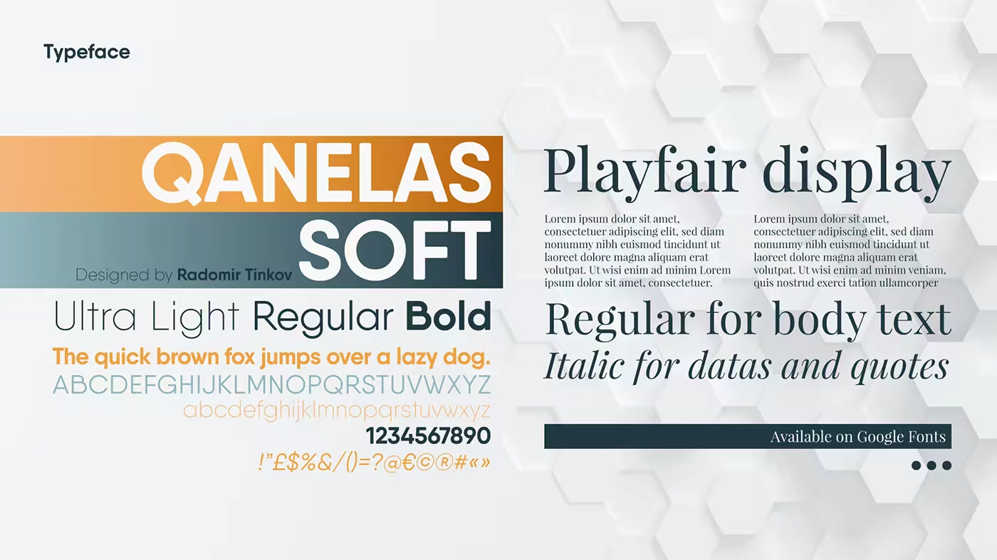
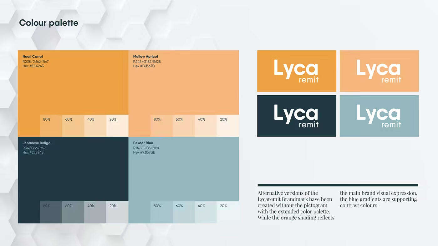
The visual system softens the distance often associated with financial services. Qanelas Soft gives the identity a direct, approachable voice, while the coral, apricot, indigo, and powder-blue palette creates a flexible range from energy to reassurance.
Designing the transfer experience
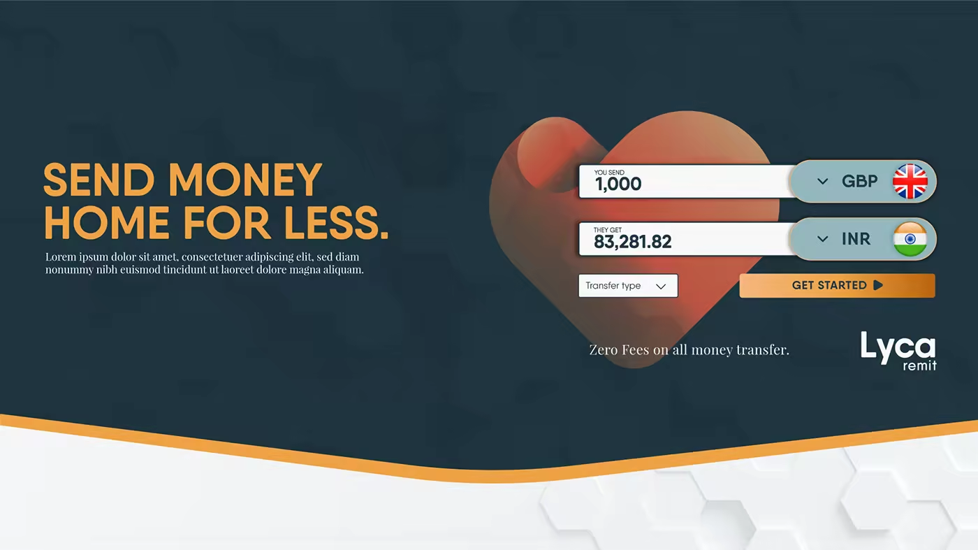
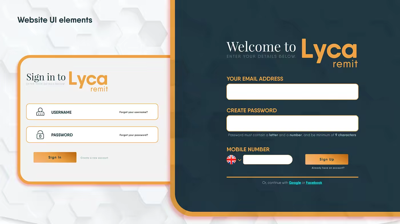
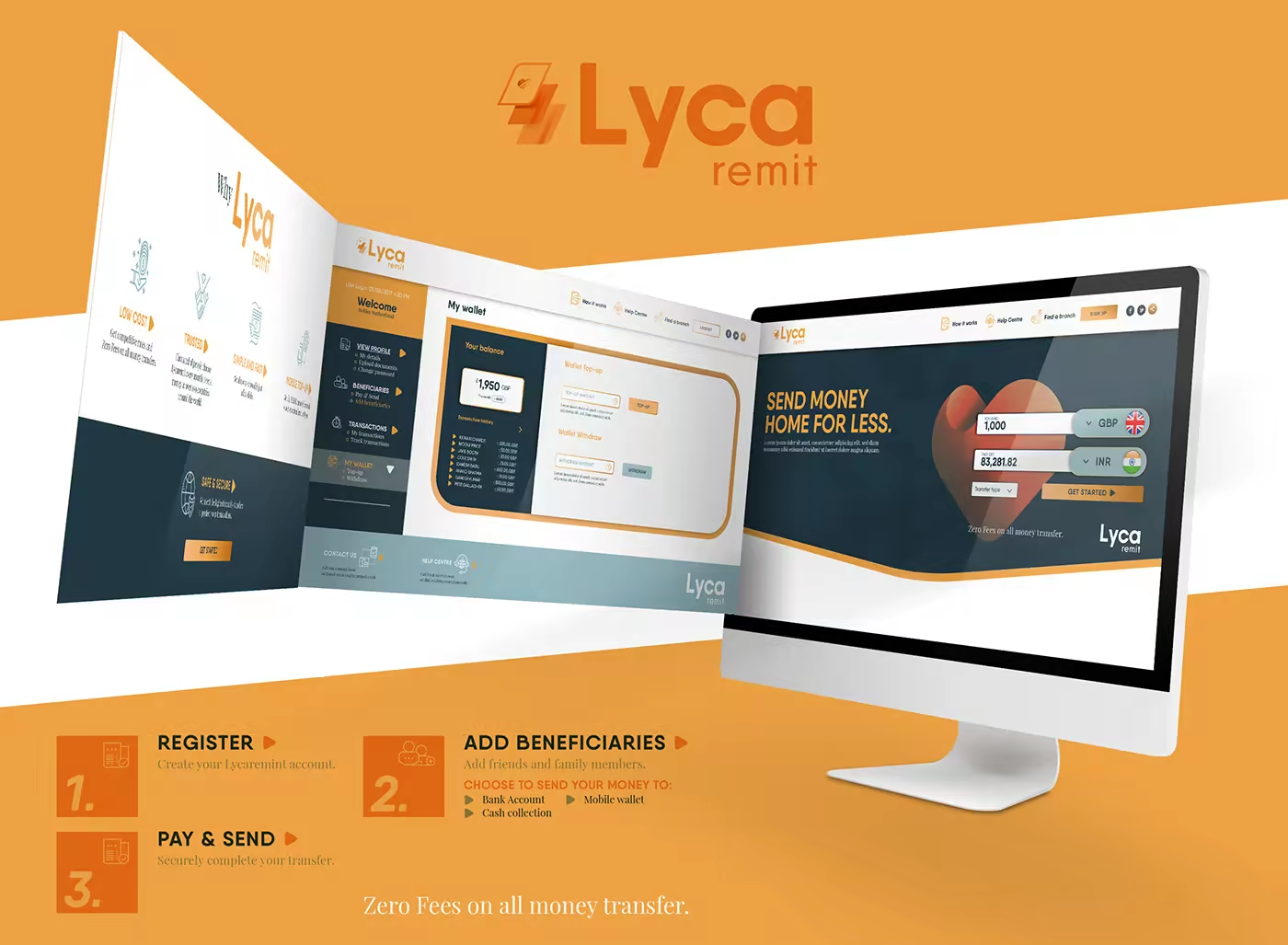
The identity was designed to work where confidence is tested: choosing a destination, entering details, checking a rate, and completing a transfer. The same rounded frames, directional markers, and colour hierarchy move into the interface without turning the product into a decorative brand exercise.
From first click to completed transfer
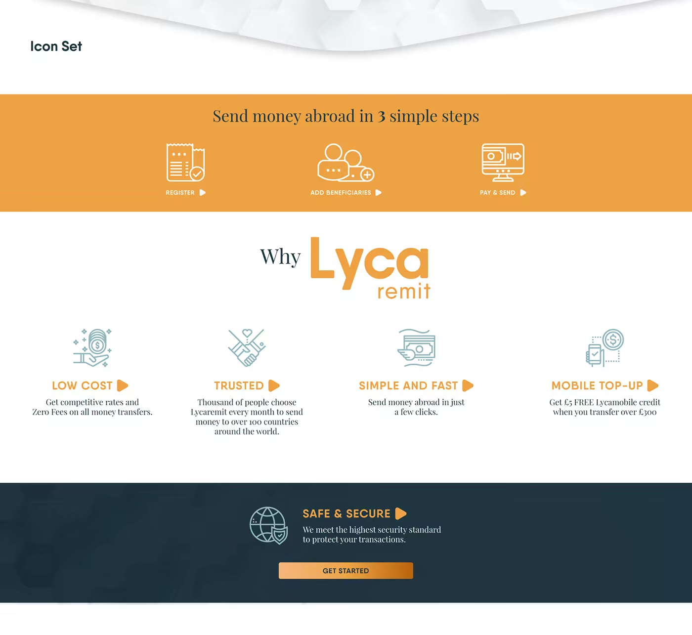
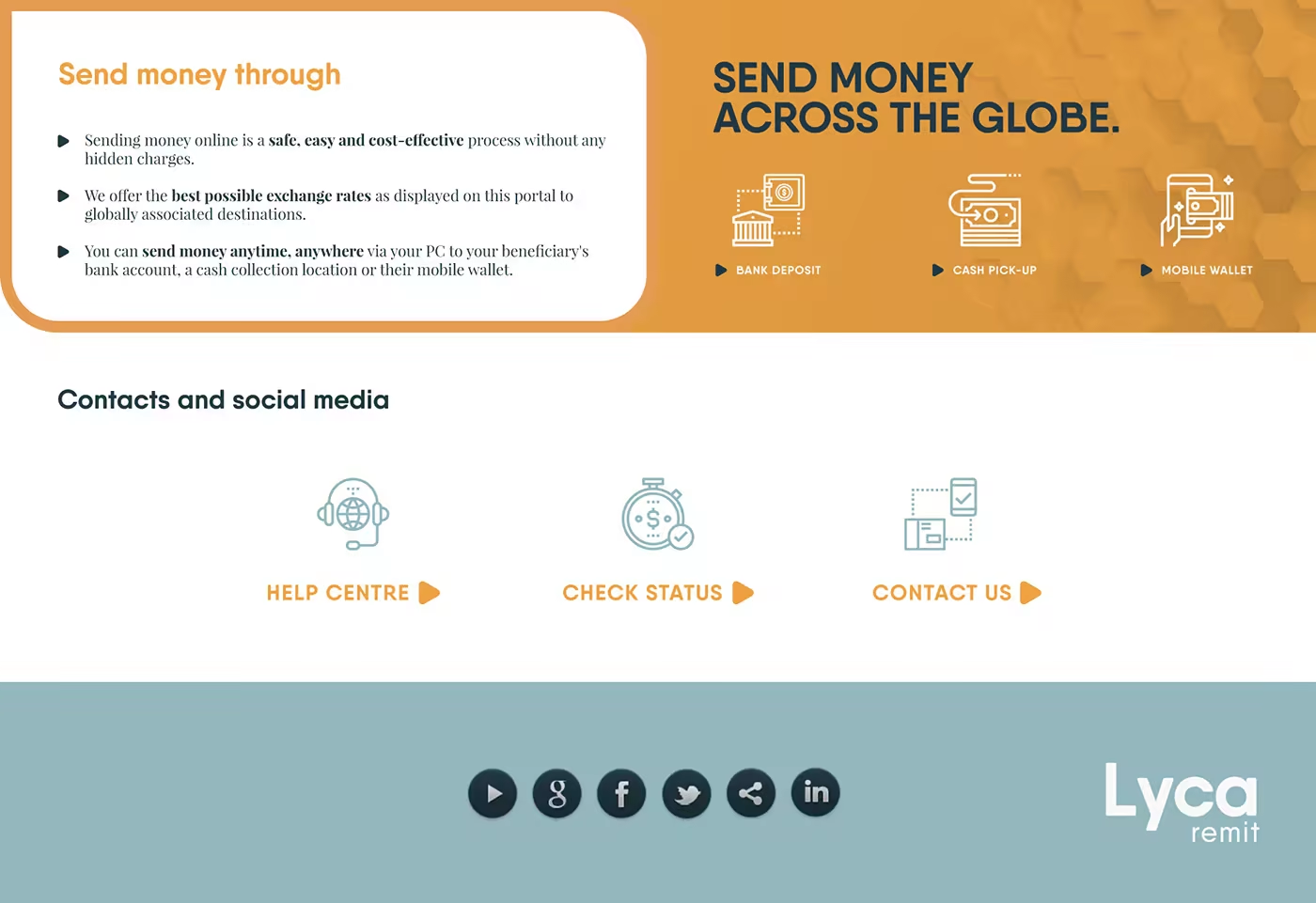
The broader application system explains the service as a sequence rather than a single promise: register, add beneficiaries, choose how money is received, and send. Icons and supporting modules make those steps legible across the website, help content, and social touchpoints.
The result is not a smaller copy of the group identity. It is a natural branch: recognisable as Lyca, but shaped around the particular confidence required when people move money across borders.