Lycachat

Client
Lyca Group
Year
2017
Role
Brand designer
Scope
Rebranding / Product
View on Behance
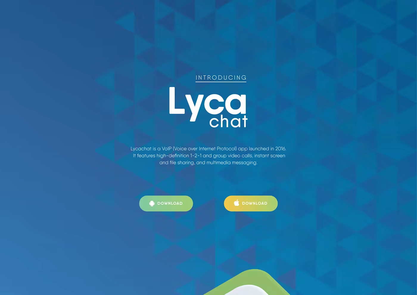
Lycachat introduction screen showing the blue geometric identity, app logo, and download actions.

A focused branch of the Lyca identity for more immediate, human communication.

A warmer, more direct expression for a communications product.

Lycachat was a VoIP app launched in 2016, with one-to-one and group video calls, screen sharing, file sharing, and multimedia messaging. The rebrand followed the guidelines established for the Lyca Group master brand while giving the product a more immediate voice.

From group identity to conversation

Like Lycaremit, Lycachat is a natural extension of the Lyca Group identity after the main system was established. The parent language supplies recognition and structure; the product focus shifts that language toward presence, exchange, and the small moments that make communication feel human.
Lycachat introduction screen describing the app’s video calls, screen sharing, file sharing, and multimedia messaging.
A communication product with the Lyca name, shaped for direct and everyday exchange.
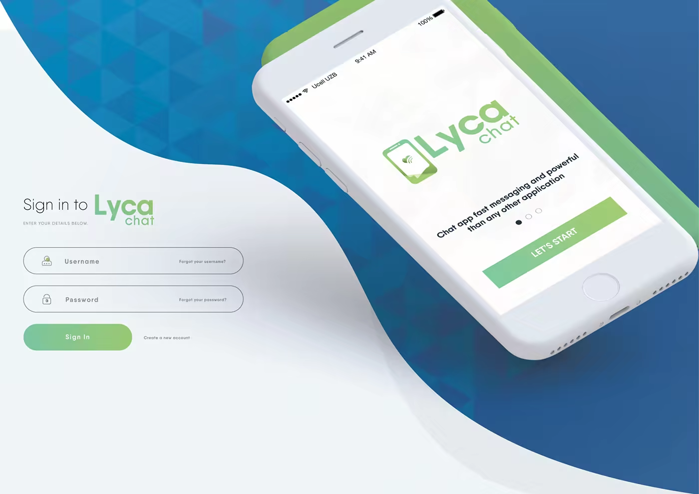
Lycachat sign-in and app-entry screen with a phone interface and green call to action.
The first interaction brings the product promise into a simple, recognisable entry point.

A mark for connection

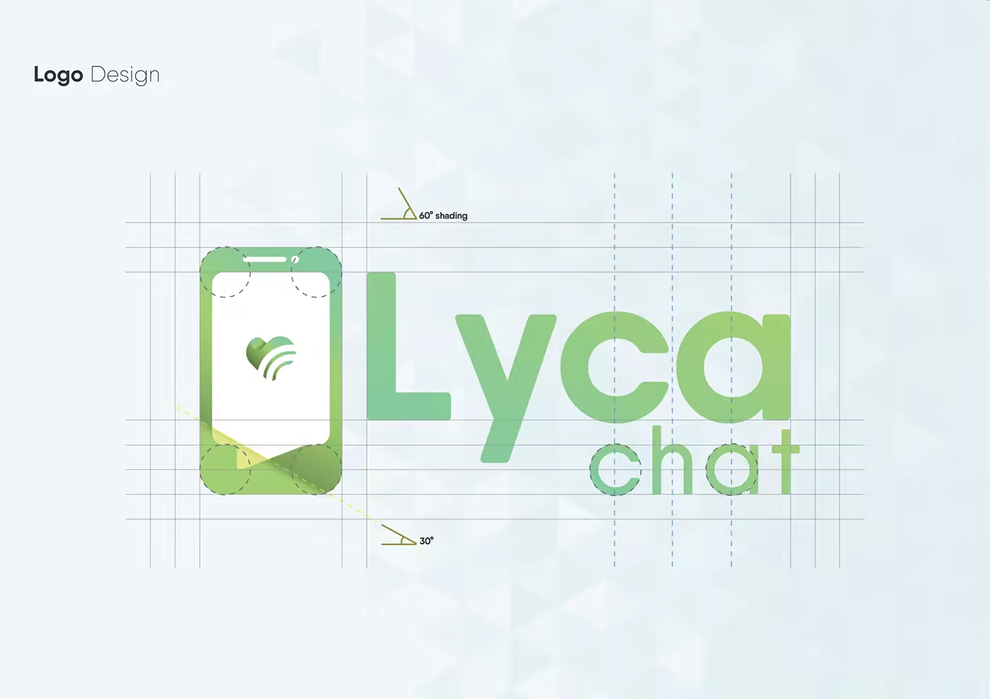
The identity gives Lycachat its own product signal: a phone-shaped mark carrying the Lyca connection motif. It keeps the relationship to the group visible while making the app legible as a distinct service.
Lycachat logo construction showing the phone-shaped mark, wordmark, and geometric guides.
The mark combines a device cue with the connective gesture already present in the Lyca family.

A lighter product language

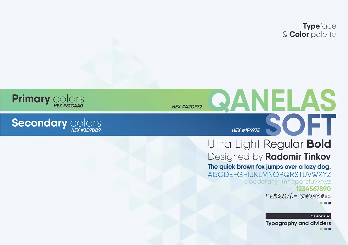
The visual system moves between blue depth, pale surfaces, and lime-green action states. Qanelas Soft gives the interface a friendly, open voice, while the triangular field creates a consistent background rhythm across product and communication materials.
Lycachat typeface and colour palette showing Qanelas Soft, blue, green, and supporting tones.
Typography and colour turn the master-brand structure into a lighter product language.
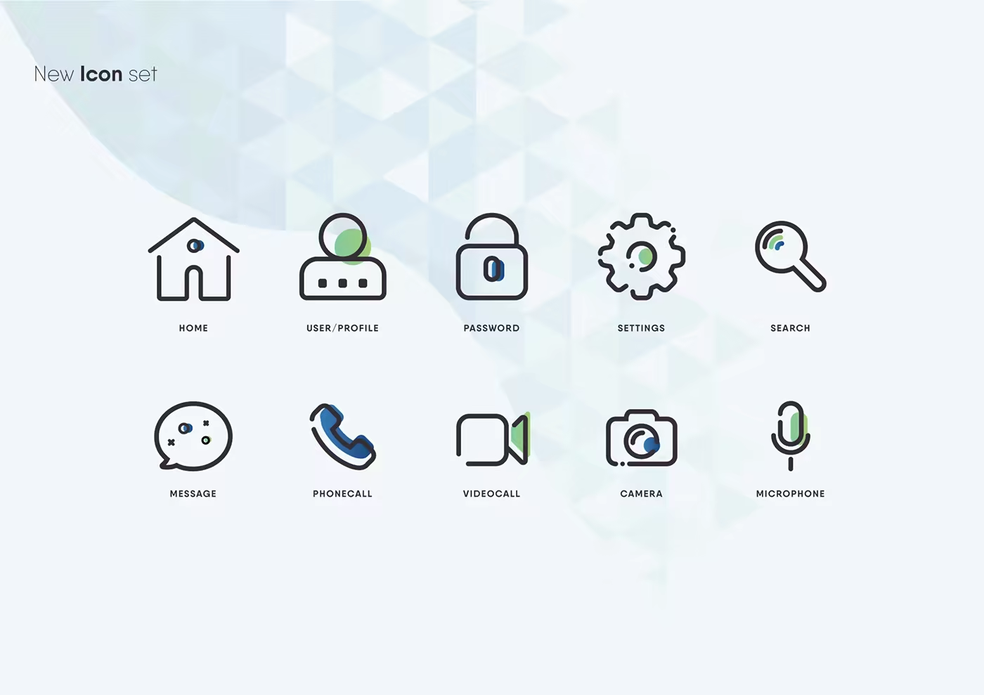
Lycachat icon set showing home, profile, password, settings, search, message, phone, video, camera, and microphone icons.
A compact icon vocabulary makes the communication tools easier to scan and recognise.

Designing the moments between people

The product language had to work across more than a logo: sign-in, calls, messages, media, profiles, and the controls around them. The same rounded shapes, directional cues, and colour states carry through those moments without making every screen feel identical.
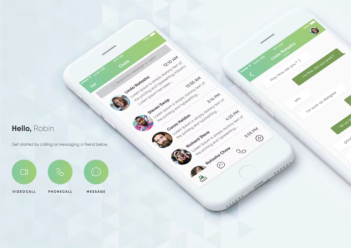
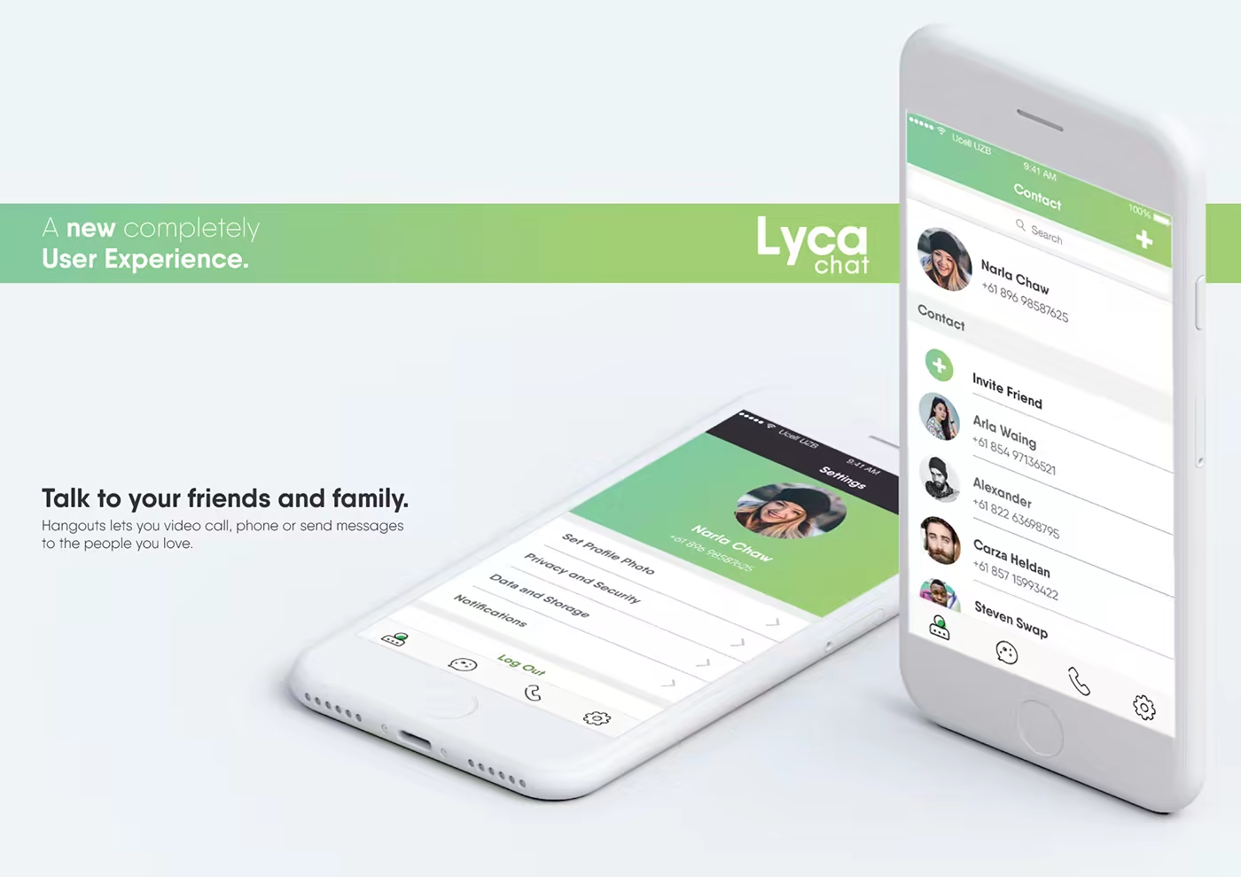
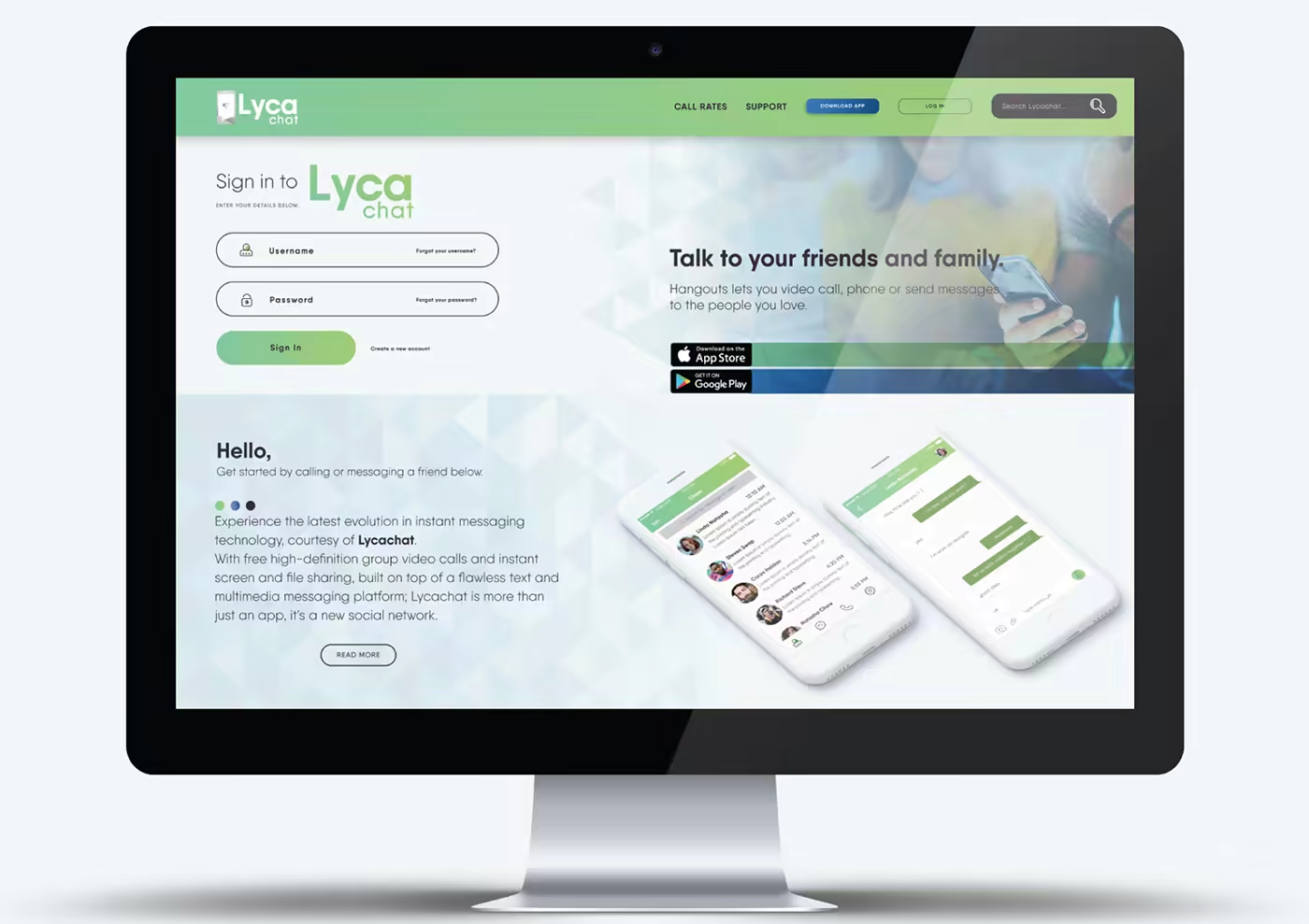
Lycachat product messaging and communication interface applications.
The system extends from identity into the repeated actions of communication.
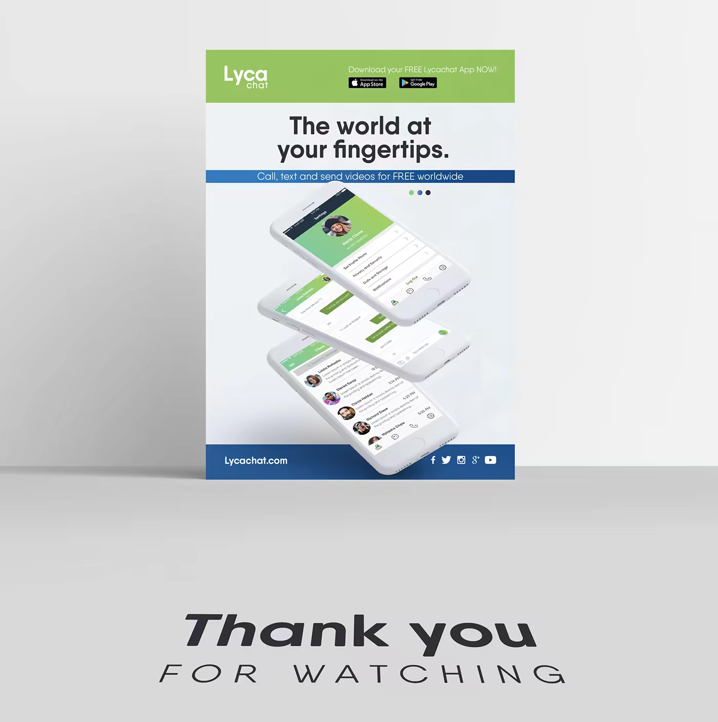
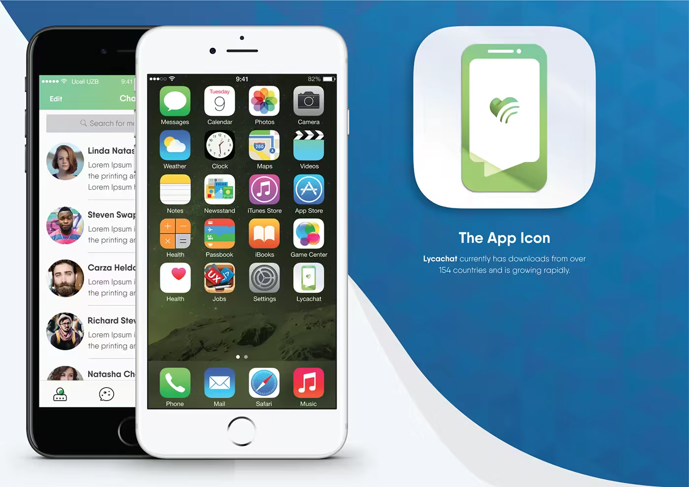
Lycachat application layouts showing product screens and communication touchpoints.
Product applications keep the service language consistent across different contexts.
Lycachat interface interaction showing the product language in motion.
Motion gives the communication system a small sense of presence, making each exchange feel a little more immediate.

A system that stays close to the product

The final applications bring the identity back to the product journey: entering the service, finding the right communication tool, and staying connected through the interface. Lycachat is not a smaller corporate identity; it is the Lyca system adapted to the immediacy of conversation.
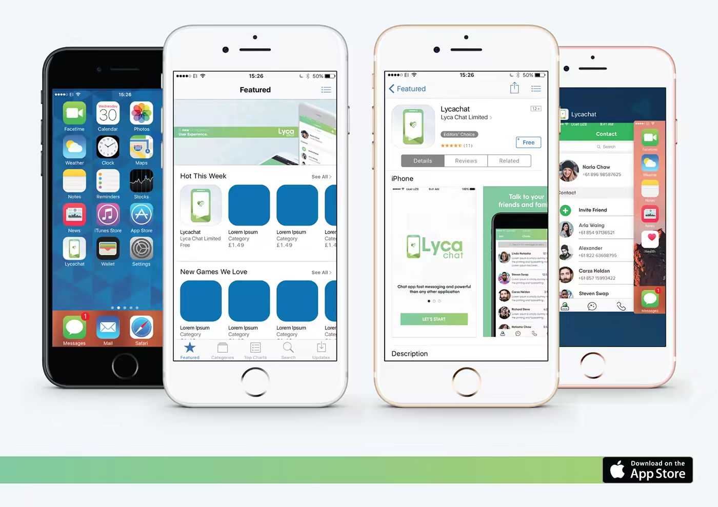
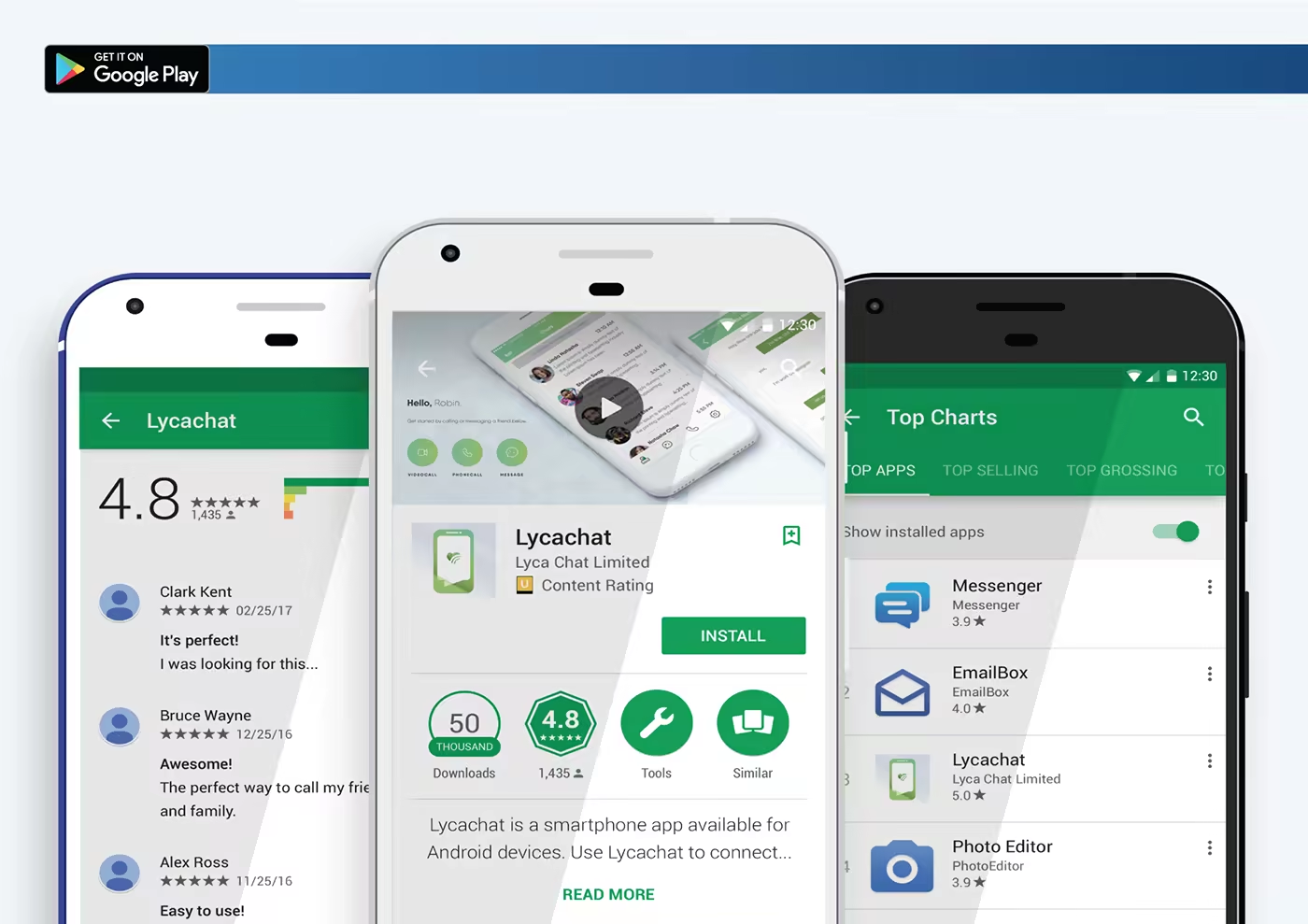
Lycachat digital experience application using the blue geometric field and lime interaction states.
Lycachat product feature system showing communication capabilities and supporting interface elements.
Lycachat horizontal transition graphic from the product application sequence.
Lycachat product journey showing the interface and communication experience across screens.
A product identity is strongest when its visual language survives the whole journey.
Lycachat closing application sequence showing the identity across product and communication touchpoints.
The identity returns to the product, where recognition has to survive the full communication journey.