Lyca Group
A shared identity built from connectivity and human connection.
Bringing a multinational family of businesses into one clearer, more human visual system.
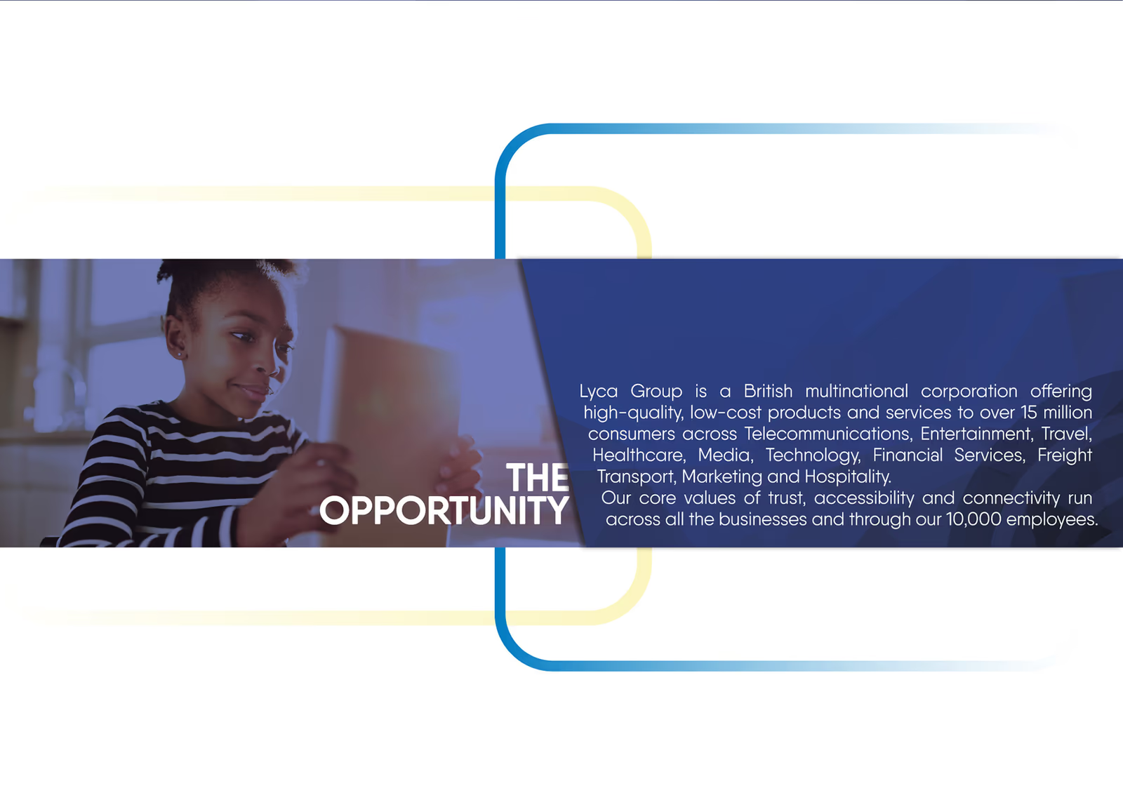
Lyca Group operated across telecommunications, entertainment, travel, healthcare, media, technology, financial services, freight, marketing, and hospitality. The rebrand needed to make that scale feel coherent without losing the accessibility and connection at the centre of the organisation.
The opportunity
The existing identity named the group but did not yet give its many businesses a strong shared visual language. The work reframed the system around three qualities already present in the organisation: trust, accessibility, and connectivity.
Connection made human
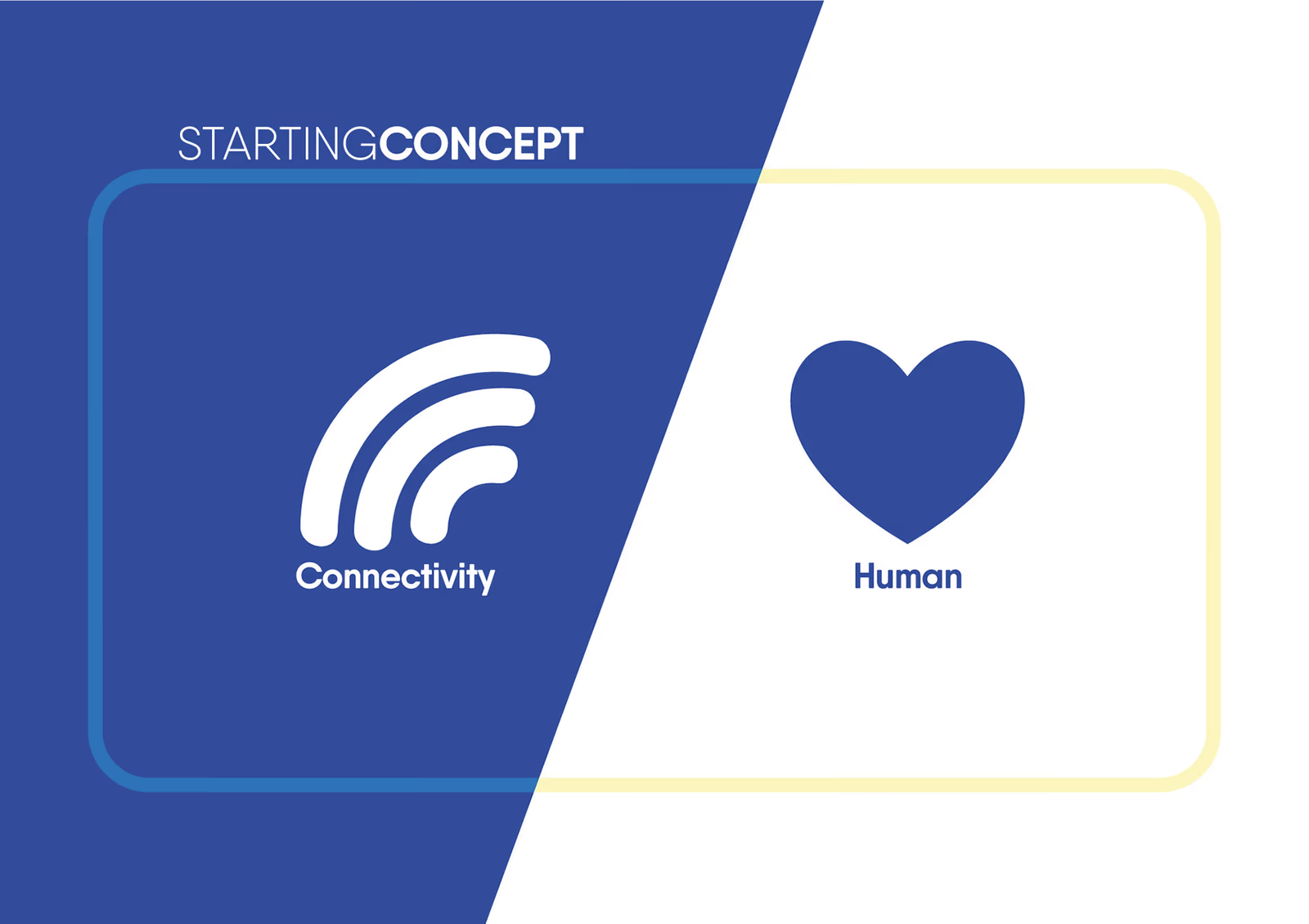
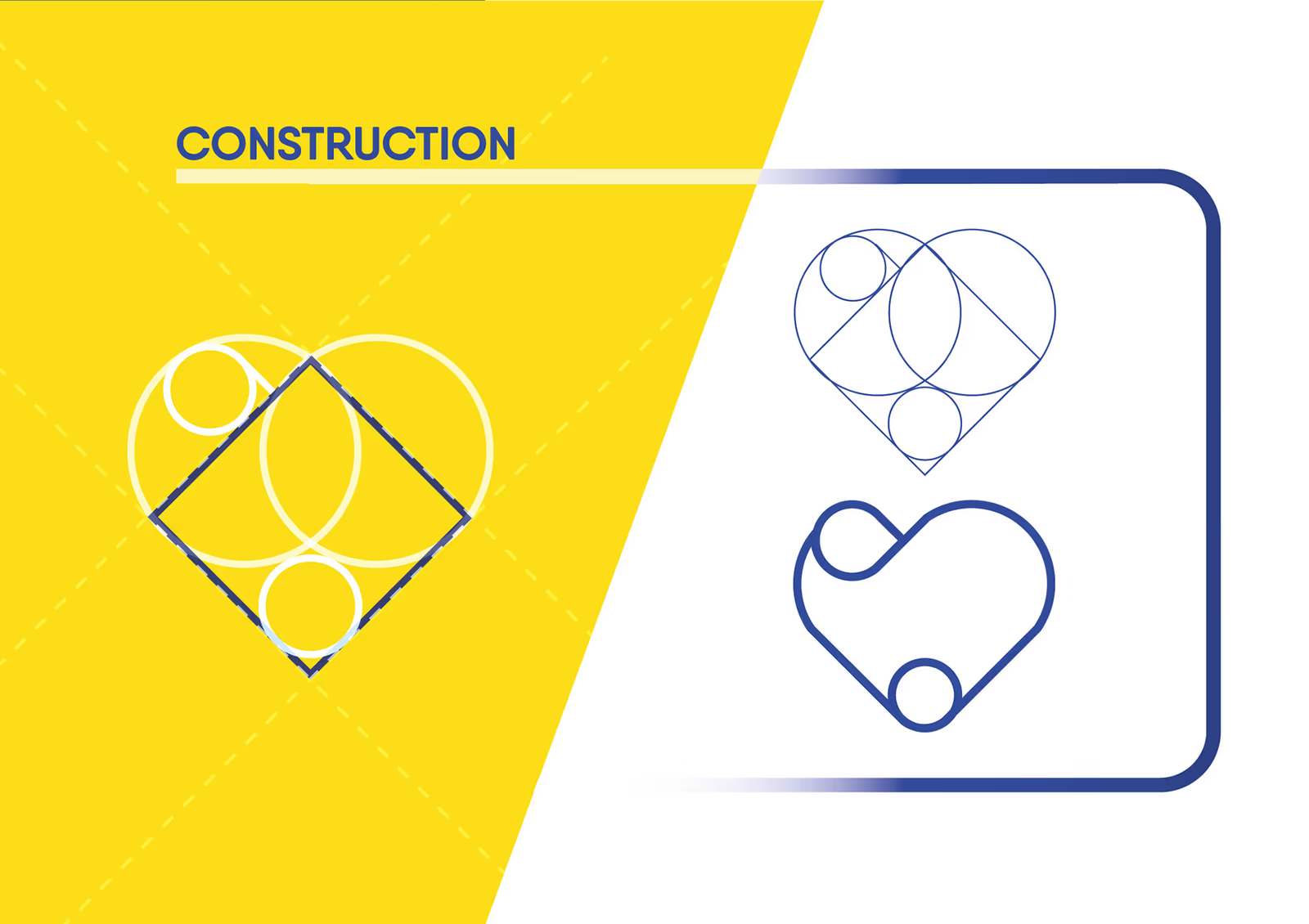
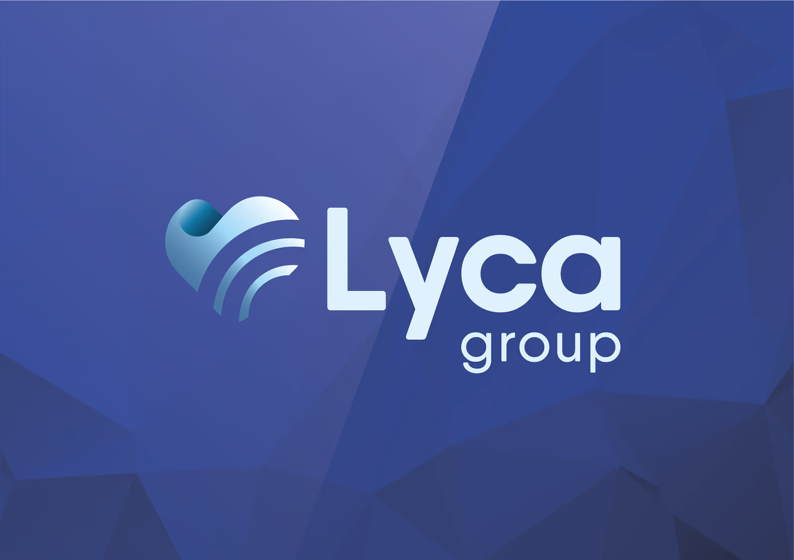
The new symbol brings together two simple ideas: the radiating lines of connectivity and the familiar shape of a heart. Their overlap creates a mark that can represent infrastructure and human exchange in the same gesture.

A practical visual language
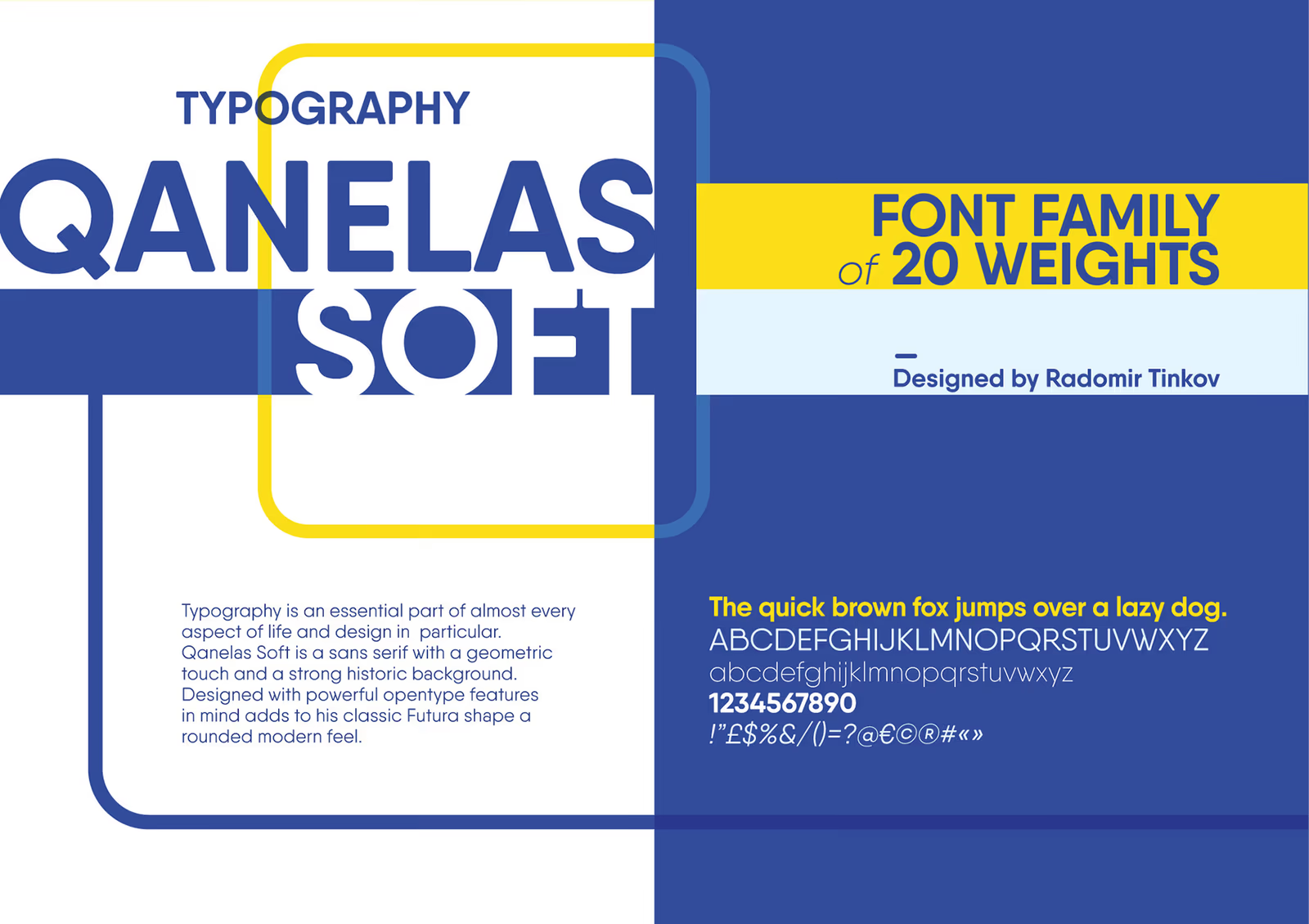
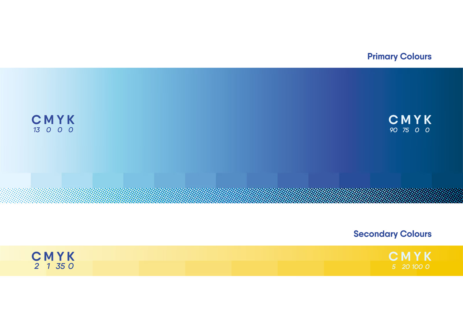
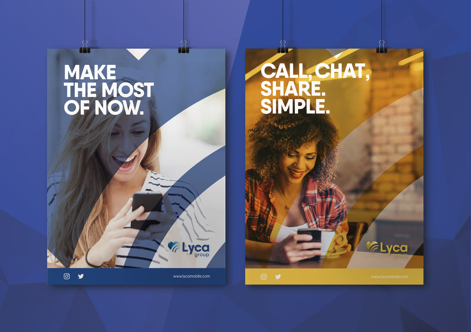
The identity expands through a high-contrast palette, a broad typographic family, rounded line frames, and faceted image fields. Blue provides continuity and authority; yellow adds pace and visibility; pale cyan carries the connective line through quieter applications.
From group to experience
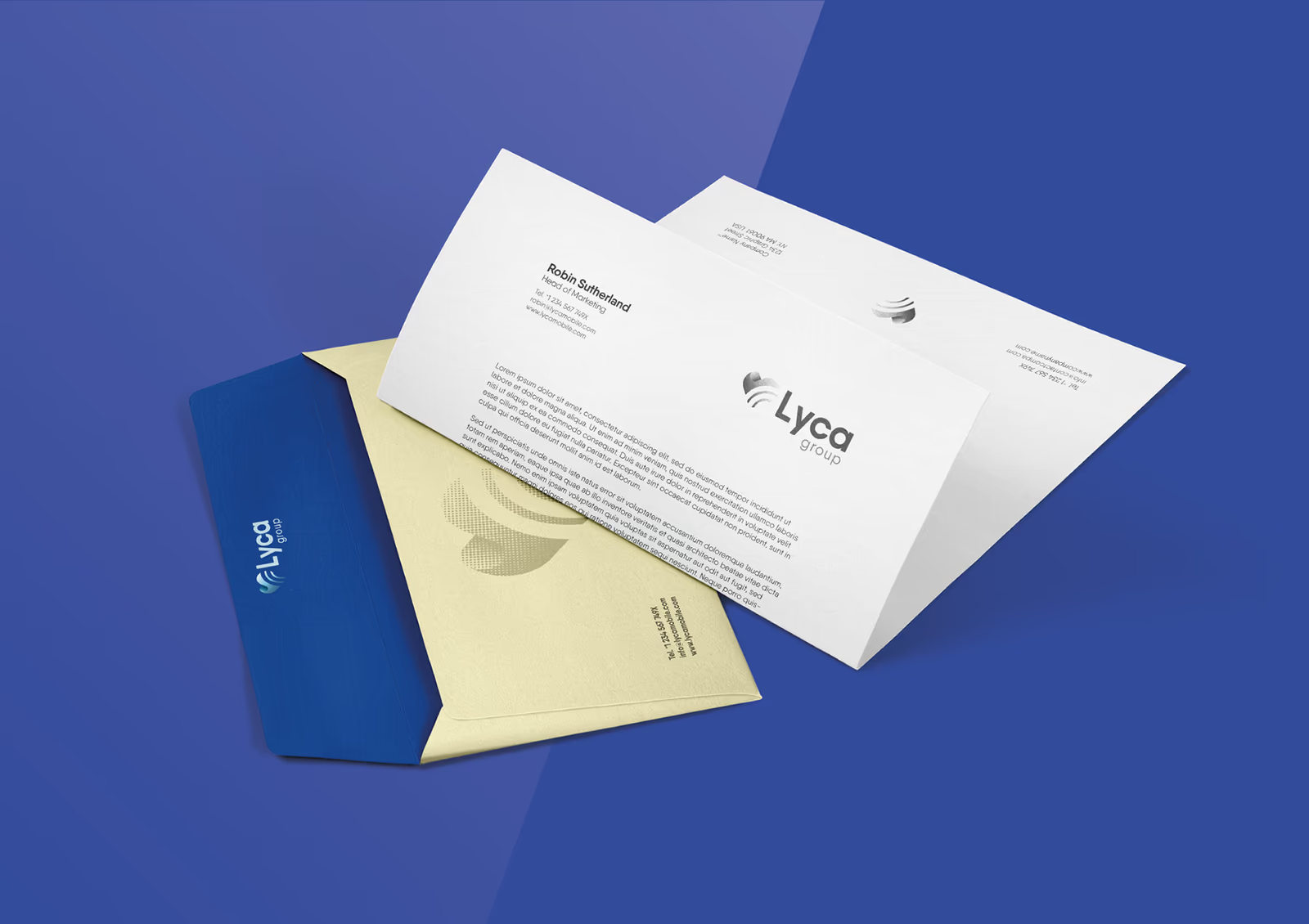
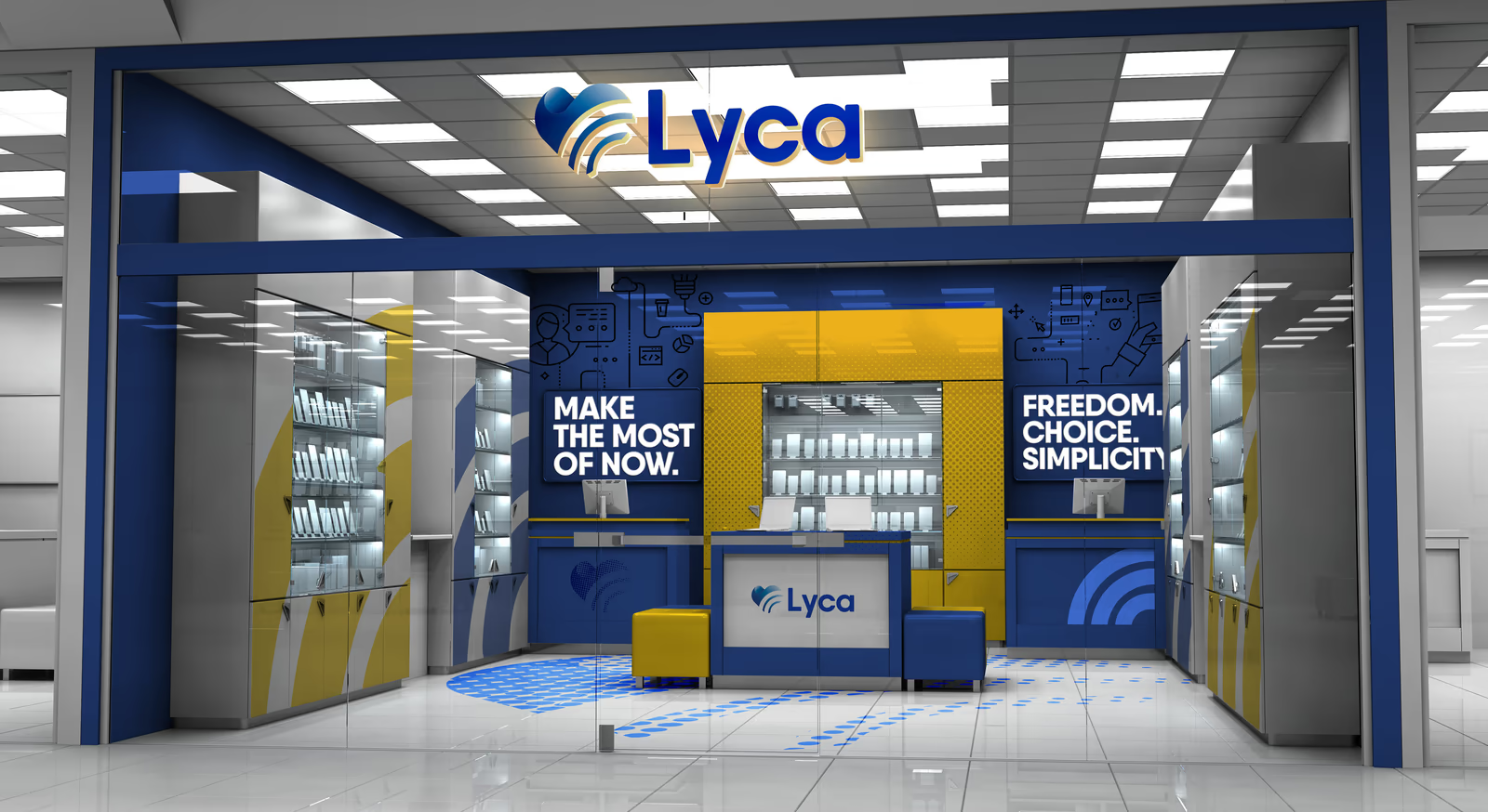
The system was tested where consistency becomes operational: correspondence, campaign material, retail environments, and the digital estate. The same components move between formal group communications and more direct consumer-facing messages.
One system across screens
The digital applications use the same colour blocks, line frames, icon language, typography, and image treatment. That continuity lets the group website, mobile layouts, and social presence feel related even when their content and interaction patterns differ.
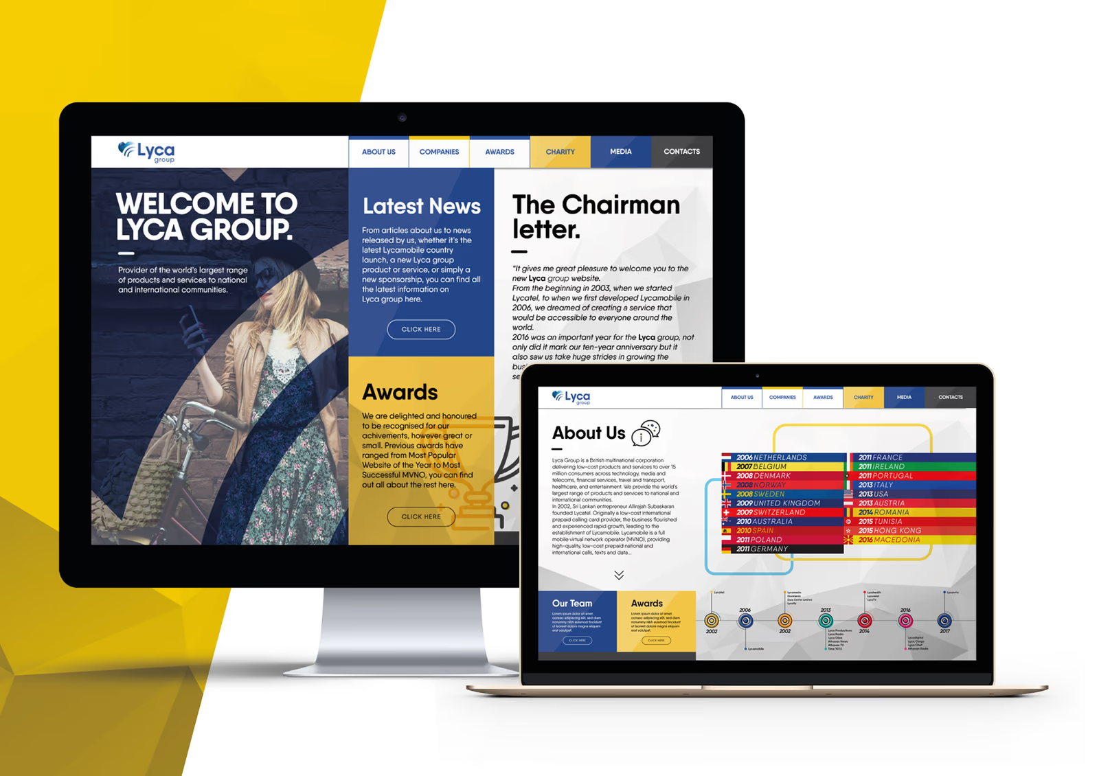
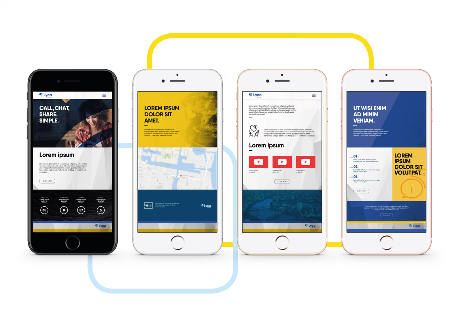
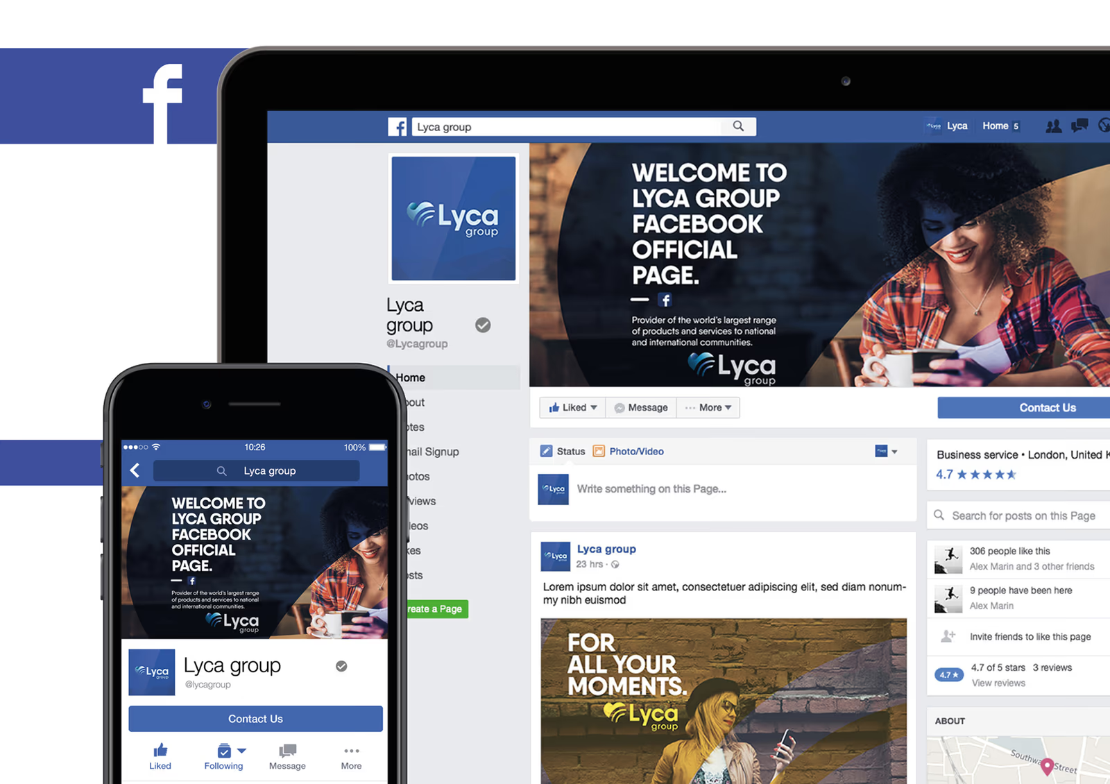
The result is a common visual foundation with enough range to support a large organisation: recognisable at the level of the mark, but most useful in the repeated details that connect one experience to the next.
A longer life than a launch
Designed in 2017, this identity continued to represent Lyca Group across its global businesses for years after the initial rebrand. Its life was not limited to a presentation or a campaign: the mark, colour system, and language of connection became part of the group’s working visual identity.
In 2021, Lyca Mobile announced a new identity and began rolling it out across Lyca Group companies and international touchpoints. The later system is its own design, but the lineage is visible: the heart remains a shorthand for connection, and the blue-led visual language continues to carry the group’s sense of scale and belonging. That continuity is a meaningful measure of the earlier work’s legacy. A good identity does not need to remain unchanged to remain present; its ideas can survive by becoming the foundation for what follows.