Gillespie Pharmacy

A pharmacy identity that makes professional care feel close, clear, and human.
A more human visual identity for a pharmacy rooted in care.
Gillespie is a new high-street pharmacy designed to stand out on the high street while building strong links with local NHS GP facilities. It combines standard pharmacy services with health and beauty products, aiming to make the experience more enjoyable and relaxed.
Care without distance
The brief held two needs together: the authority expected from healthcare and the warmth that makes people comfortable asking for help. The identity needed to make that relationship visible before a customer reached the counter.
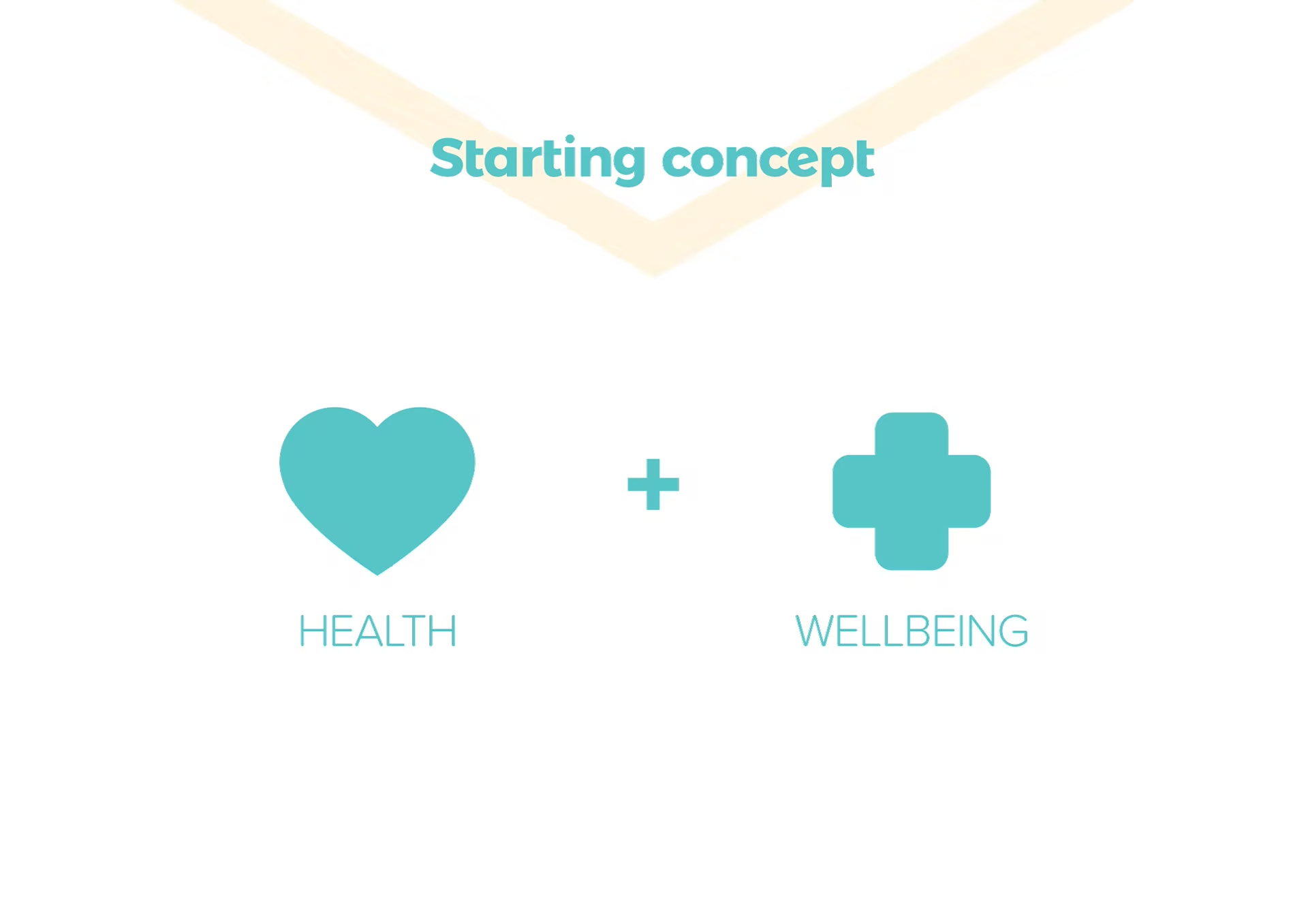
Health plus wellbeing
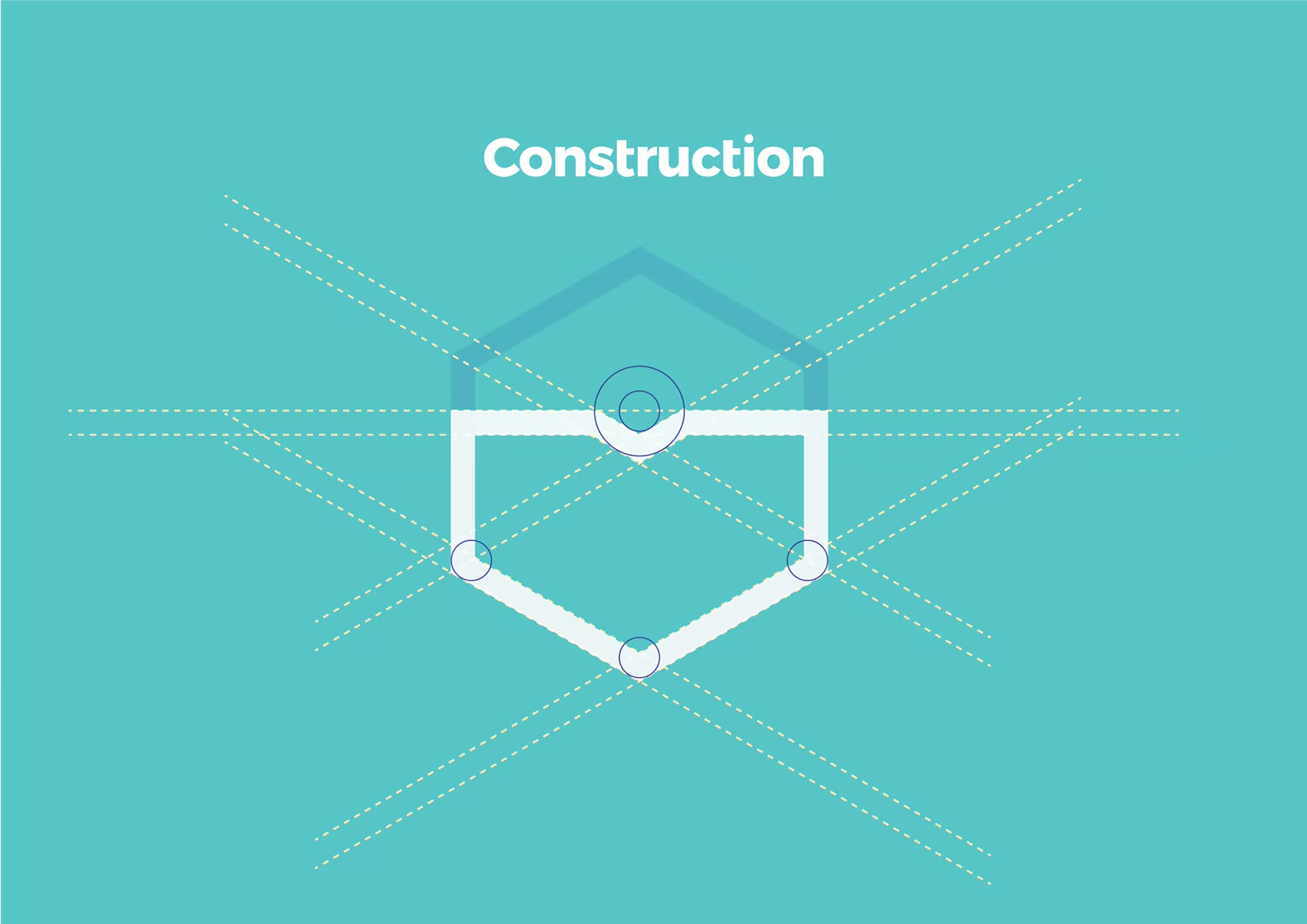
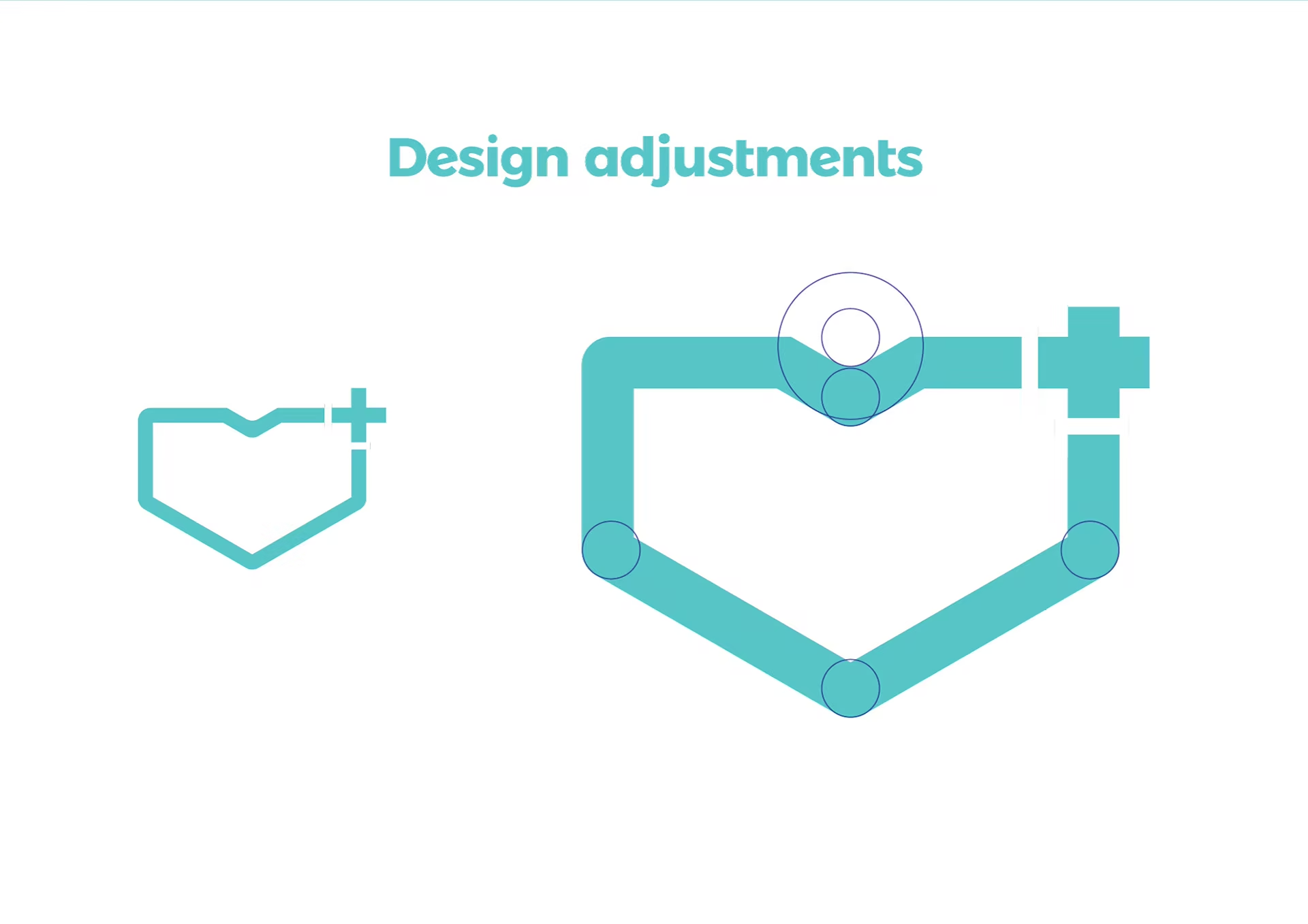
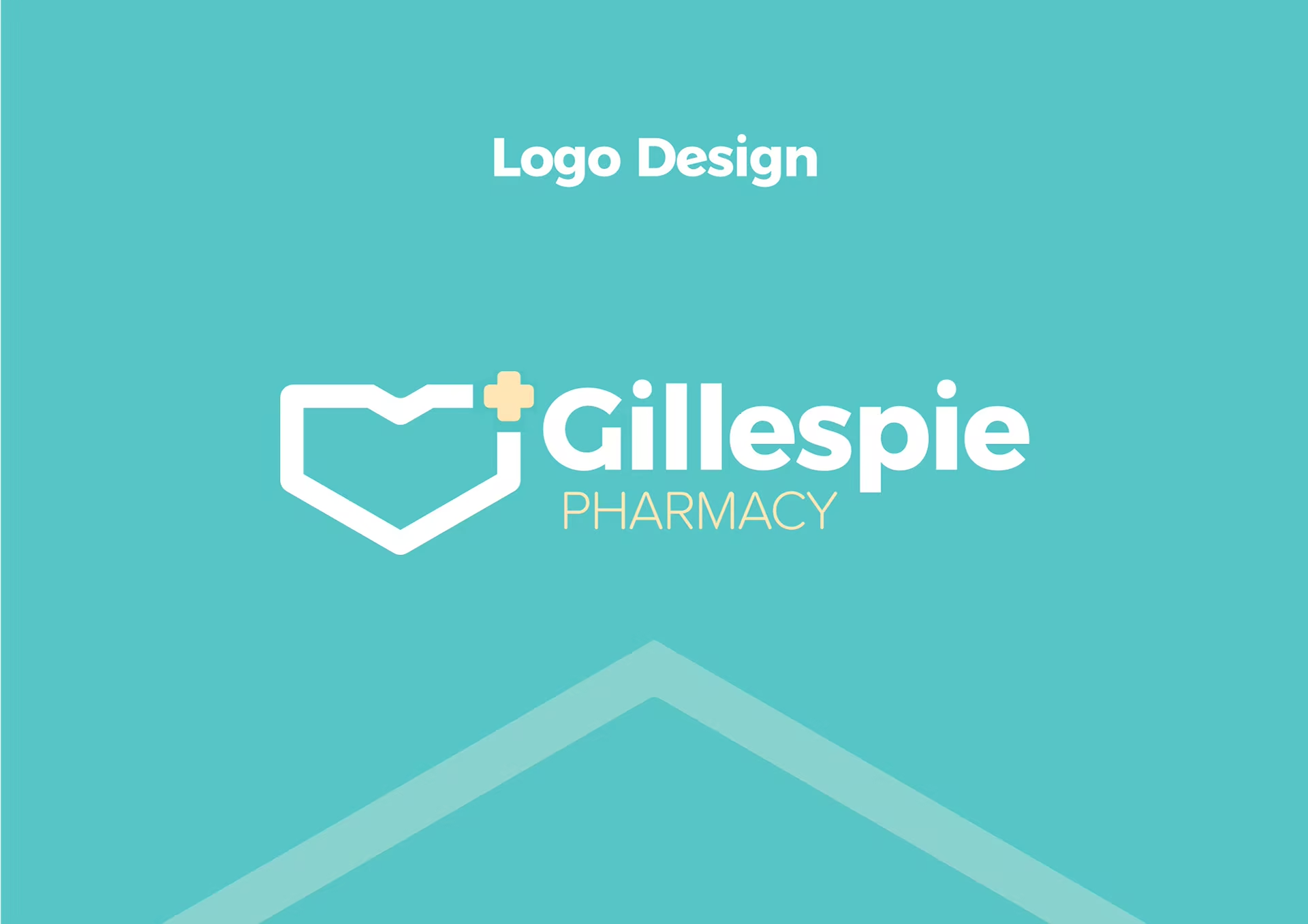
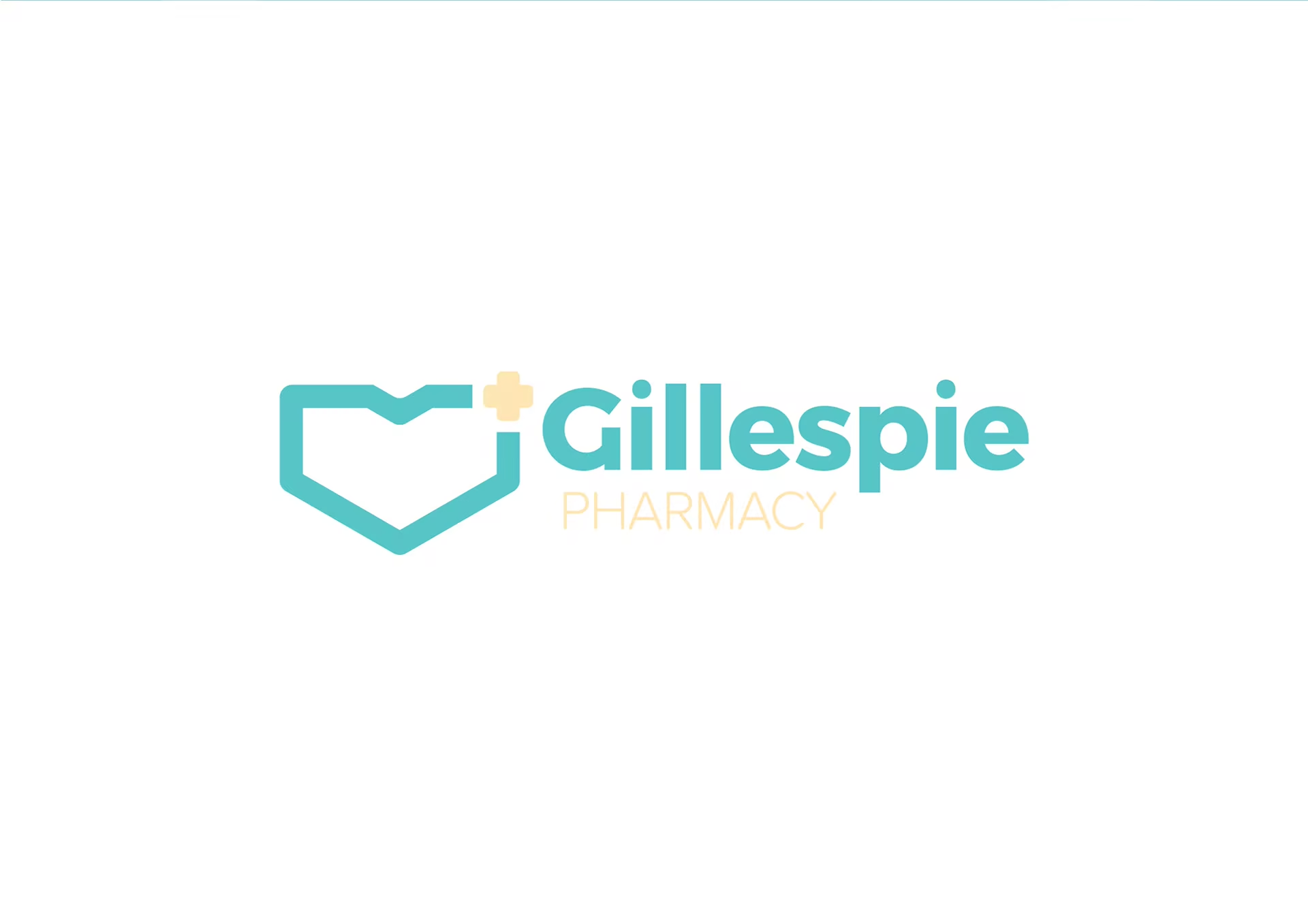
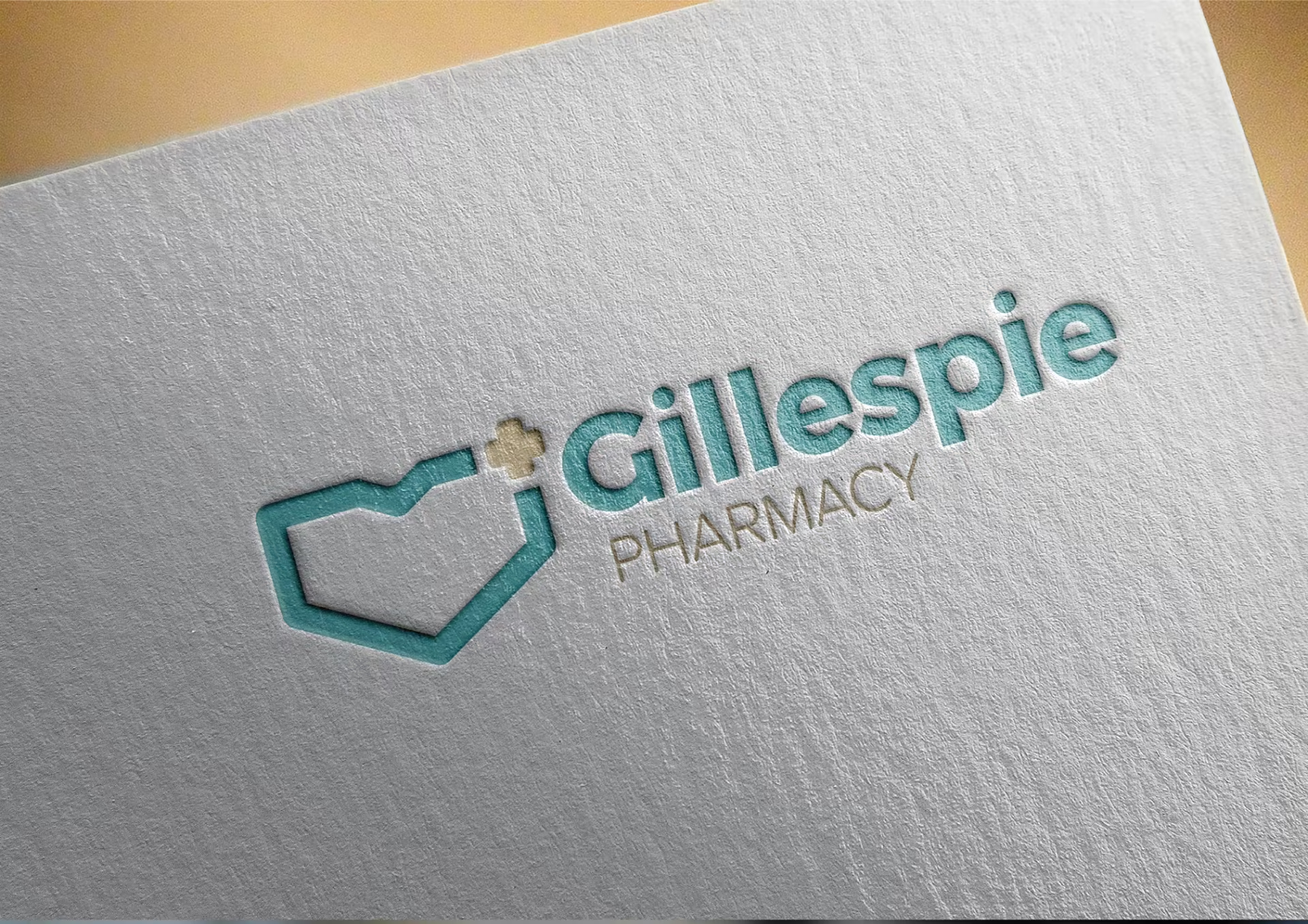
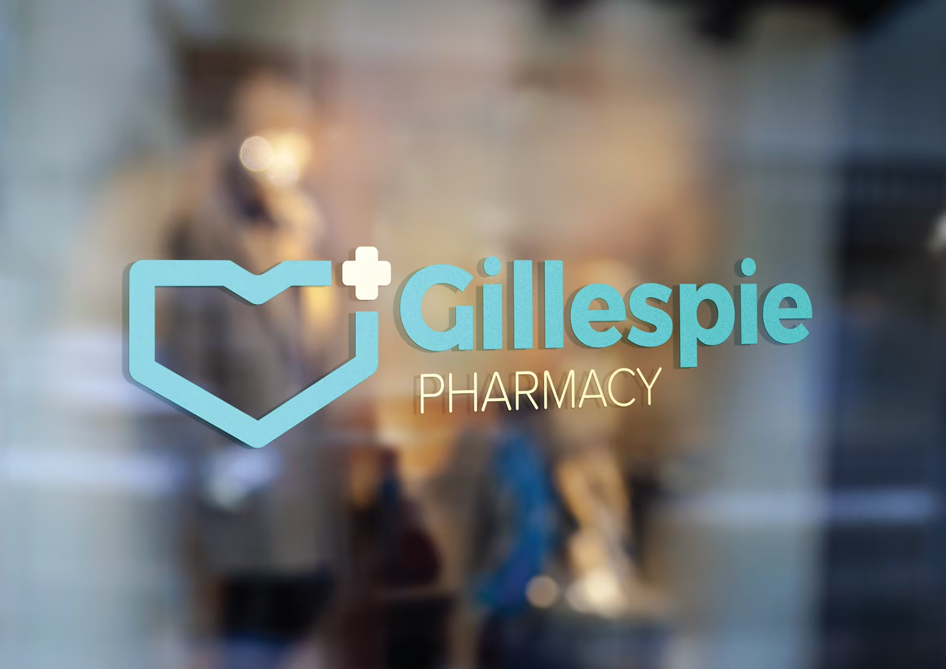
The starting concept joins two familiar signals: a heart for care and a pharmacy cross for professional support. Together they create a mark that can hold the service’s clinical and human sides without overcomplicating either.
A calm visual language
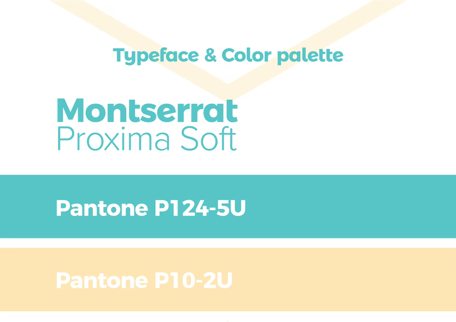
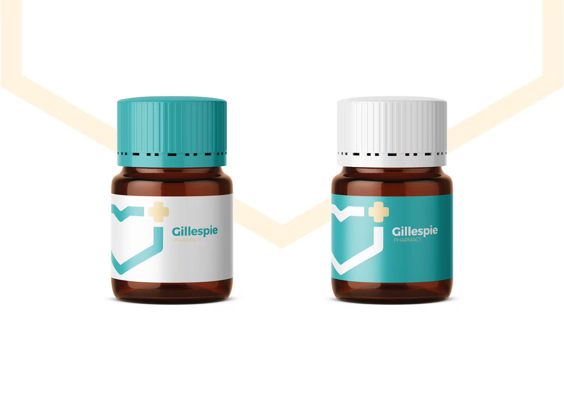
Turquoise carries the identity’s sense of clarity and freshness; pale yellow introduces warmth without becoming decorative. The rounded display language and simple geometric accents keep the system open across information, signage, and health and beauty applications.
A service people can enter
The identity was designed to support the moments around the prescription itself: finding the pharmacy, understanding what it offers, asking for advice, and leaving with confidence. The system stays legible when it moves from a formal brand statement into everyday service communication.
From identity to environment
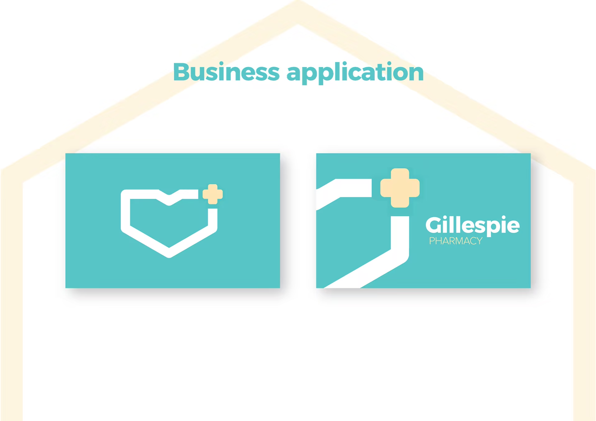
The final applications extend the mark into the places where trust becomes physical: the pharmacy, its surfaces, its materials, and the visual cues that help a customer understand where to go and what to expect.
The result is an identity that does not ask a pharmacy to choose between expertise and warmth. It gives both qualities a clear, everyday form.