Existo

Client
Existo Osteria Molisana
Year
2017
Role
Brand designer
Scope
Brand identity
View on Behance
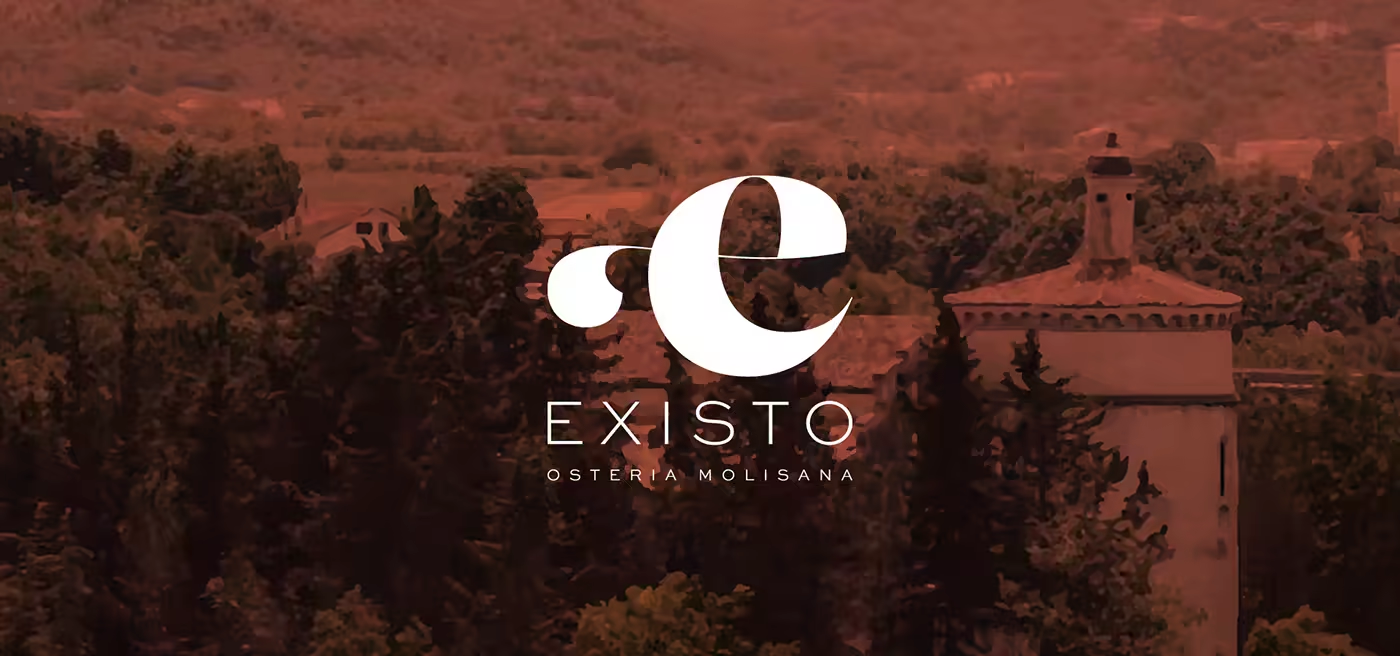
Existo Osteria Molisana wordmark set against the landscape of Isernia.

A sense of place turned into a generous identity for food, memory, and conviviality.

A warm identity for an Osteria shaped by place, memory, and food.

Existo is an Italian bistro founded in the historic centre of Isernia. Its menu draws on local traditions, generous flavours, and a fine selection of Italian and local wines, with gastronomy understood as pleasure, freshness, and conviviality.

A mark that unfolds

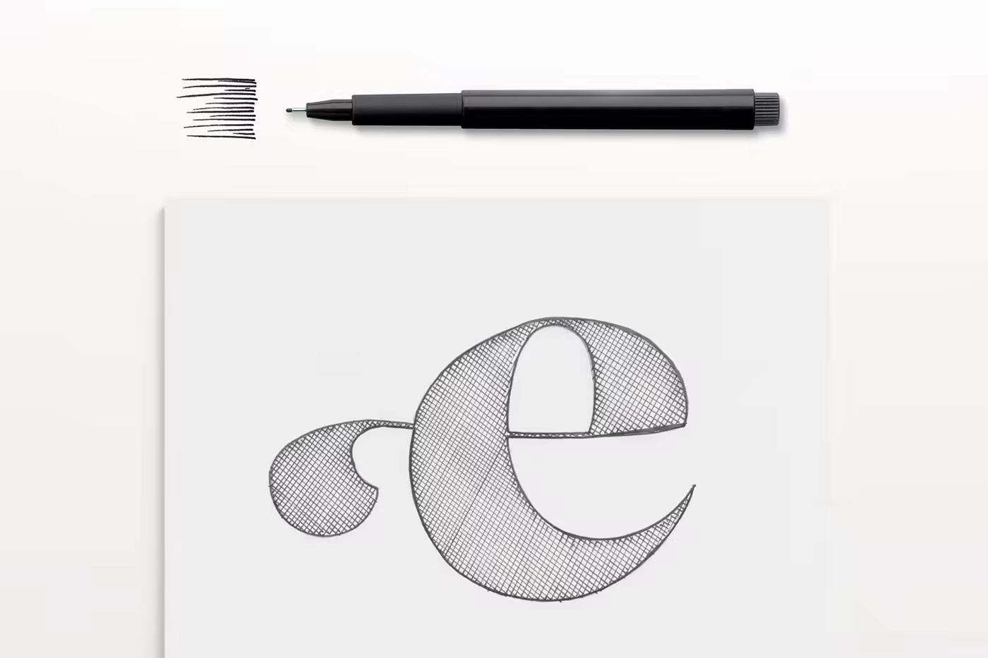
The starting concept explores the name through movement: a simple letterform is turned, opened, and given enough volume to become a symbol. The final mark holds the feeling of a place that reveals itself gradually, from a first glance to a longer evening at the table.
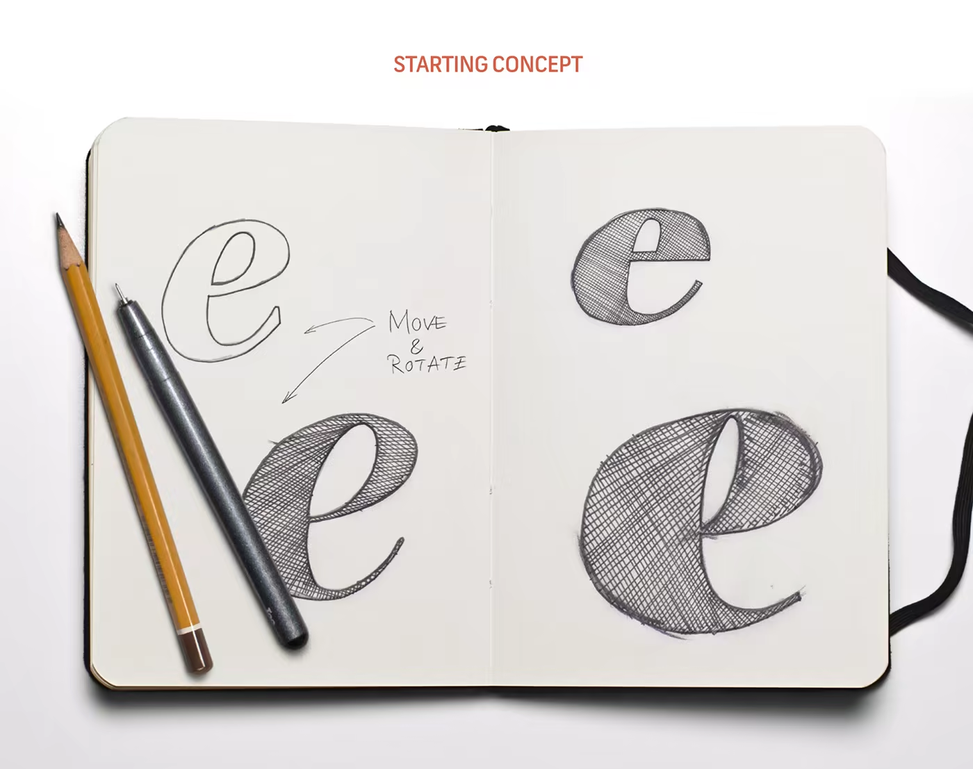
Existo starting concept showing a letterform being moved and rotated through hand-drawn studies.
The identity grows from a letterform in motion rather than from a literal food symbol.

A place with a point of view

The identity begins with the place itself. Existo needed to feel rooted in the traditions of Molise without becoming nostalgic, and contemporary without losing the generosity of the table.
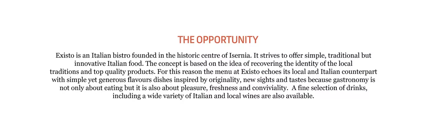
Existo opportunity statement describing an Italian bistro in the historic centre of Isernia and its local food traditions.
The brief was to recover local identity while leaving room for new tastes and experiences.
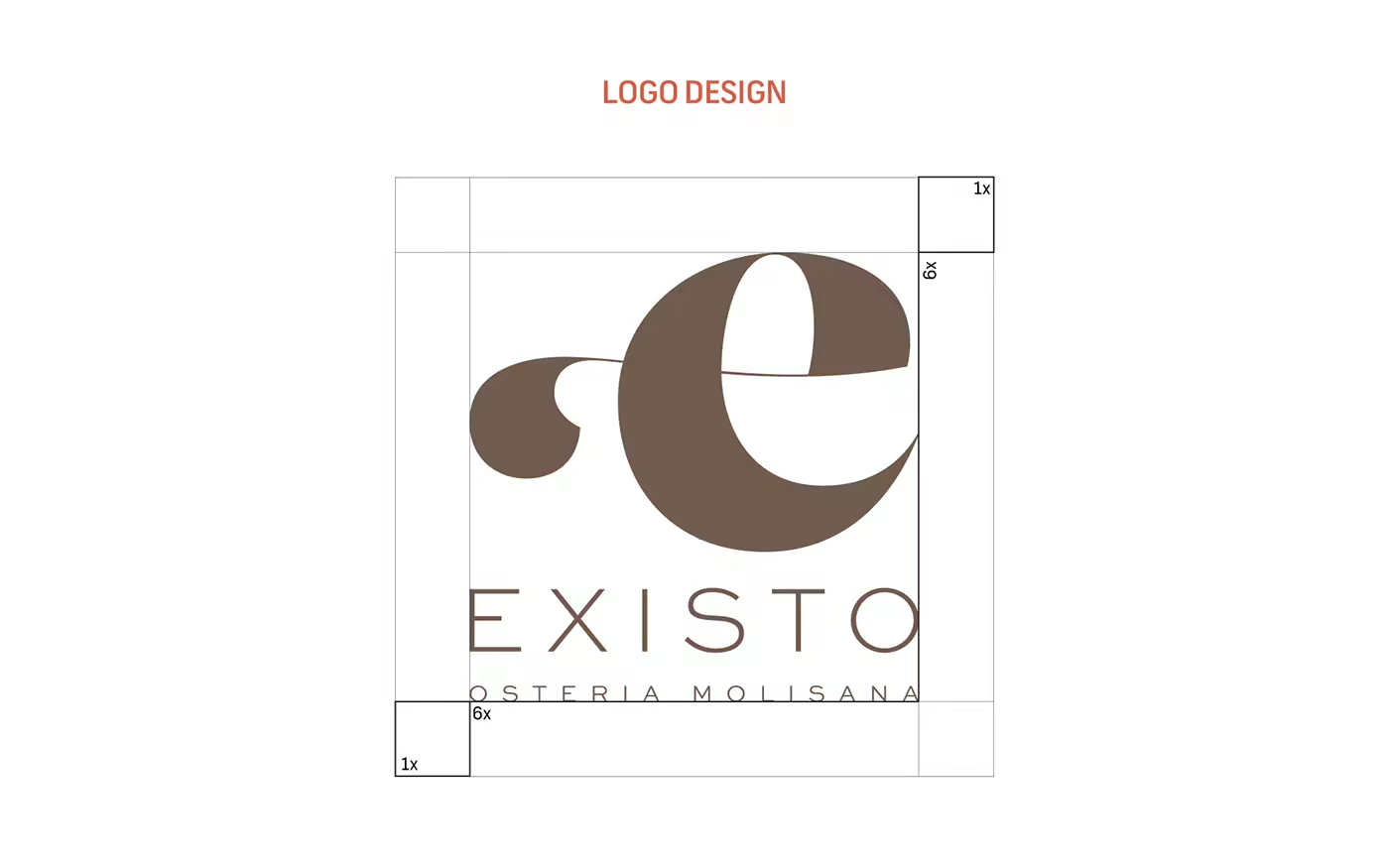
Existo logo construction showing the geometric development of the symbol and wordmark.
Construction turns the expressive gesture into a disciplined identity asset.
Existo logo design showing the final mark and wordmark on a warm white field.
The finished mark keeps the identity open, tactile, and easy to recognise.

The warmth of the system

Brown and terracotta give the identity a material, food-led warmth. The wordmark and supporting type balance expressive character with enough restraint for menus, signage, packaging, and the quieter details around a meal.
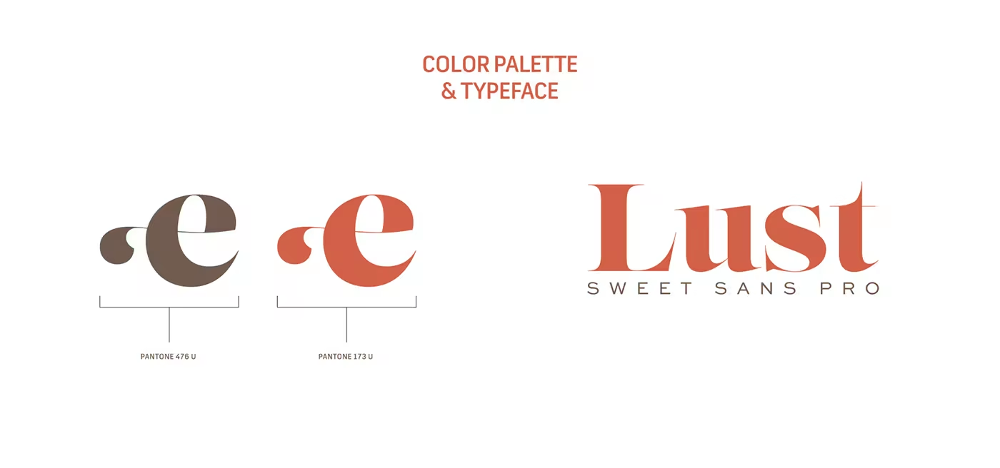

Existo colour palette and typeface showing the brown and terracotta identity colours with display typography.
A restrained palette lets the place and the food remain the loudest parts of the experience.
Existo menu application showing the identity used across restaurant information and typography.
The menu turns the identity into a generous act of orientation at the table.

From menu to occasion

The system extends through the objects and moments that shape an Osteria: printed materials, packaging, invitations, and the visual details that help a meal feel like an occasion rather than a transaction.
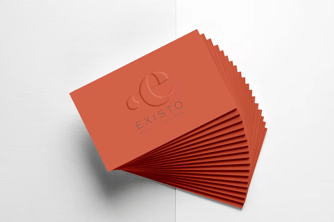
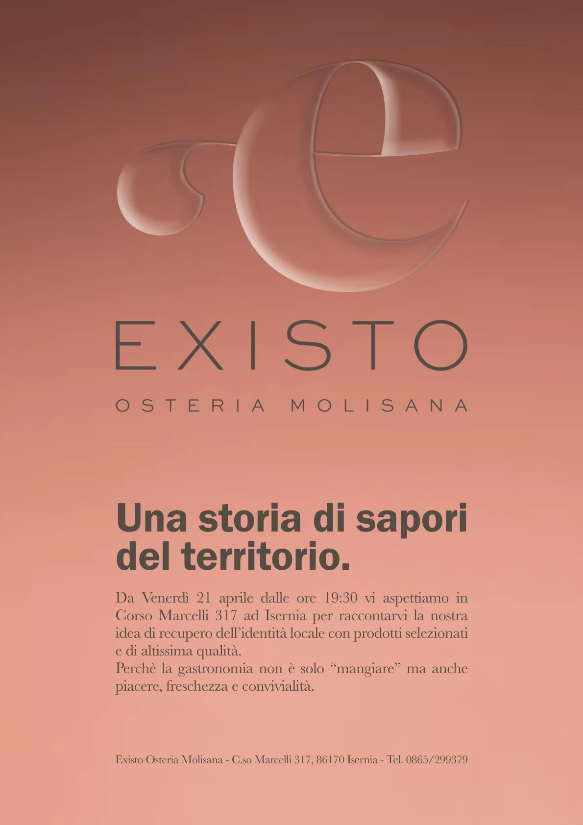
Existo identity applications showing branded restaurant materials and hospitality touchpoints.
Existo printed restaurant application shown as a tall editorial piece.
Print gives the identity a slower, more tactile reading experience.
Existo packaging application using the warm identity and wordmark.

A generous place to arrive

The final applications bring the identity back to the room: the landscape around Isernia, the restaurant’s physical presence, and the visual cues that make the experience feel local before the first dish arrives.
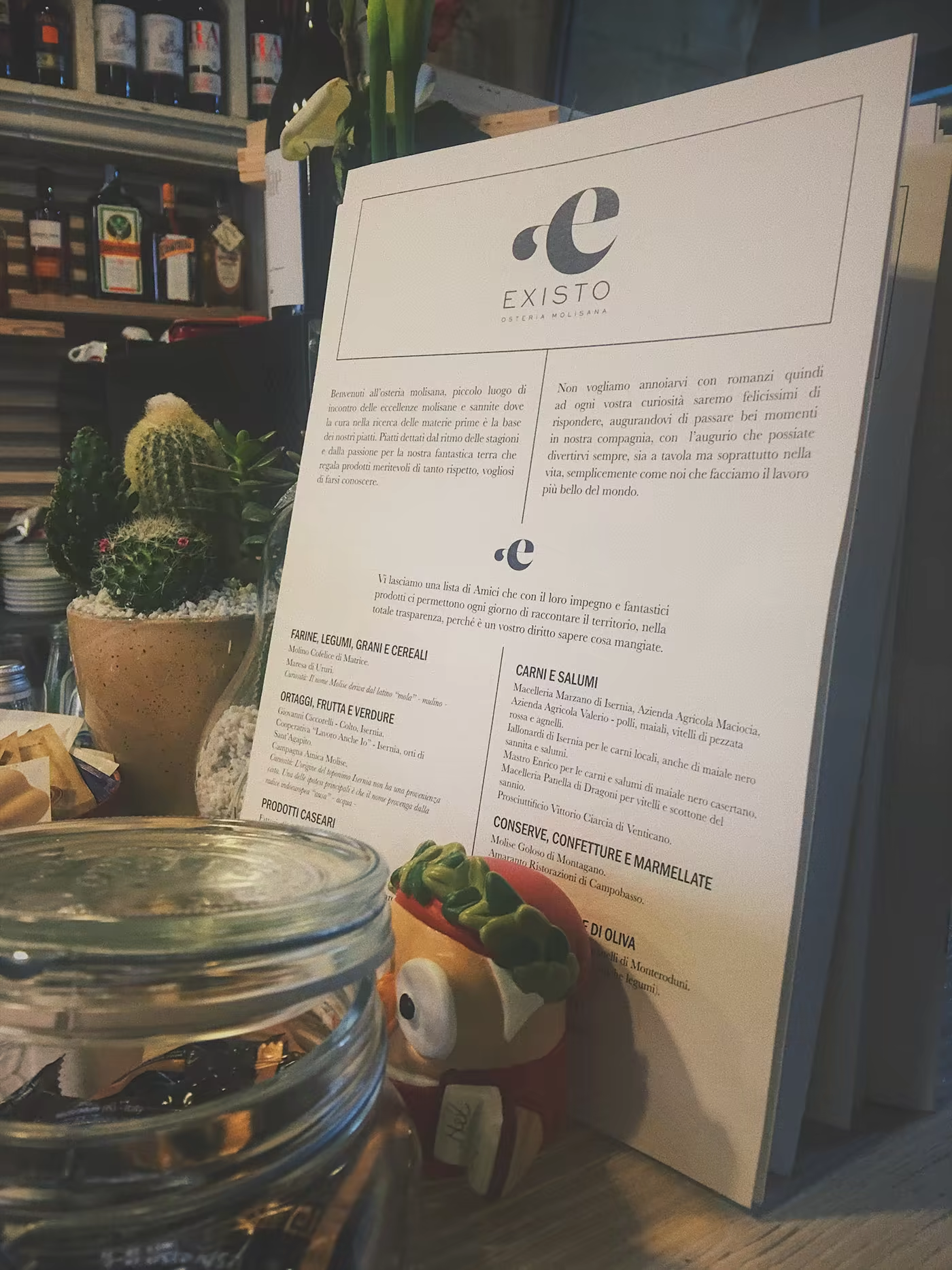
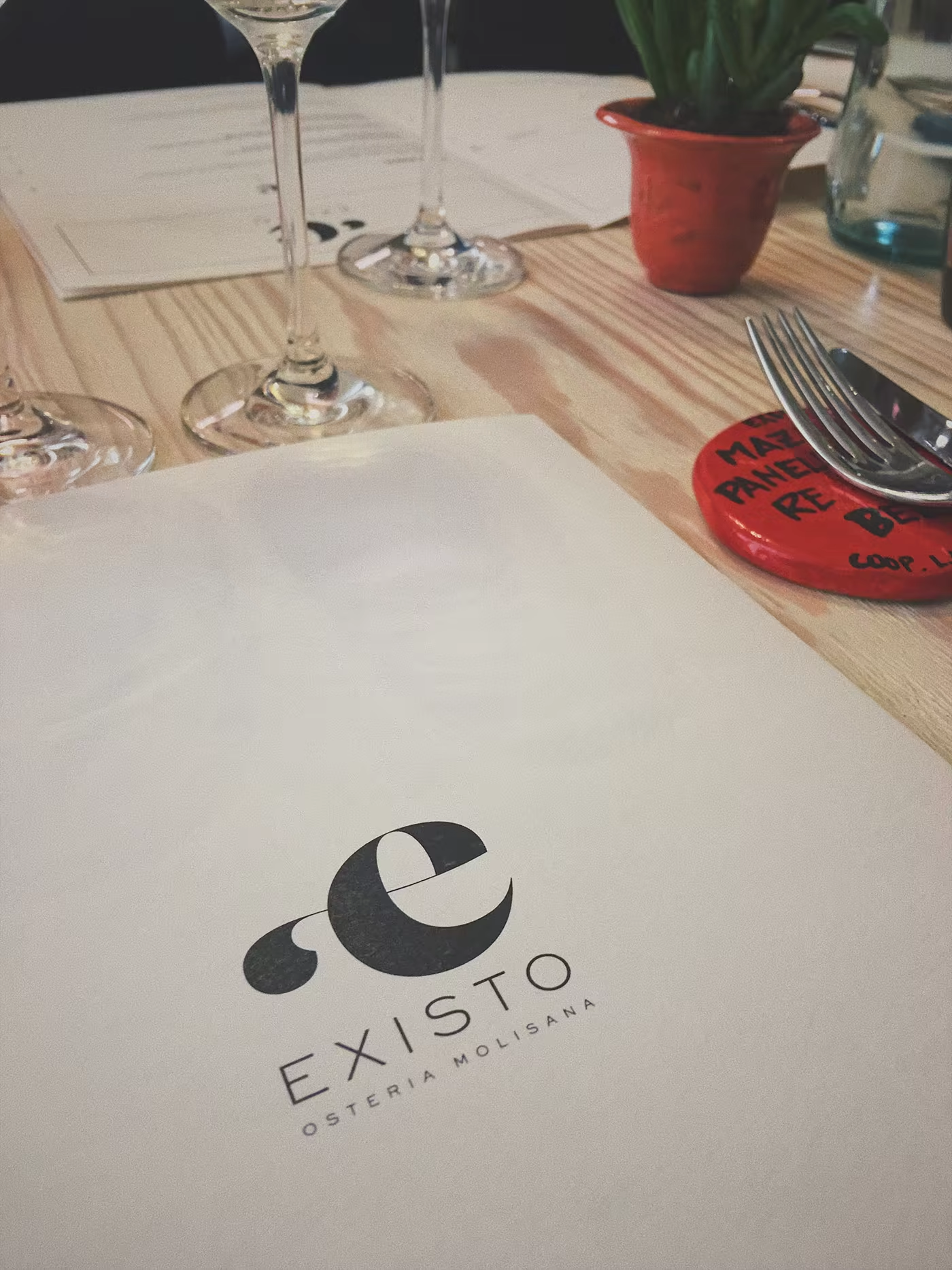
Existo restaurant environment application showing the identity in a tall hospitality composition.
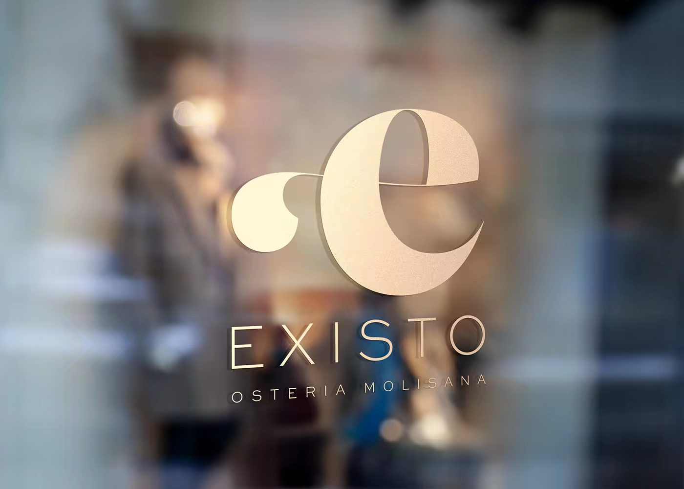
Existo restaurant application showing the identity across a hospitality touchpoint.
Existo closing identity application returning to the wordmark and place-led system.
A place-led identity becomes useful when it can hold both memory and the present moment.

The result is an identity with a strong sense of place and a generous point of view: local in its references, open in its welcome, and designed to be lived at the table.