Eigen Technologies

Client
Eigen Technologies
Year
2019
Role
Lead brand designer
Scope
Brand identity / Digital / Systems
View on Behance
Eigen Technologies brand statement and wordmark construction artwork.

A brand system designed to make Eigen’s intelligence visible, useful, and consistent.

A holistic rebrand for Eigen Technologies spanning identity, digital experience, guidelines, and the systems around the brand.

A more useful identity

Eigen’s rebrand needed to do more than refresh the mark. It needed to give a complex technology company a clear, ownable language that could move between product, marketing, editorial, and physical applications.
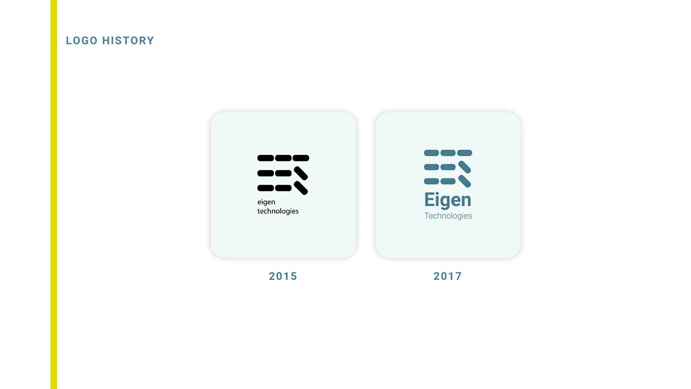
Eigen Technologies logo history showing the 2015 and 2017 marks.
The identity begins with a clear record of what came before: a mark evolving without losing its underlying idea.
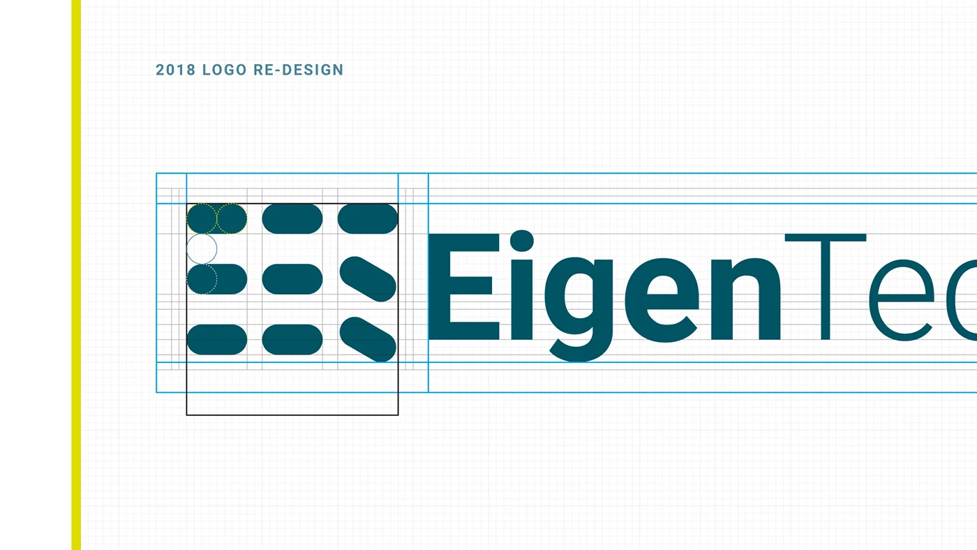
Eigen Technologies 2018 logo redesign shown on a construction grid.
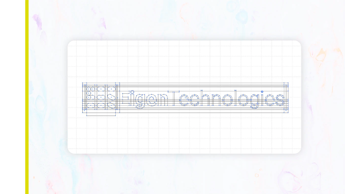
Eigen Technologies wordmark shown with construction lines and alignment points.
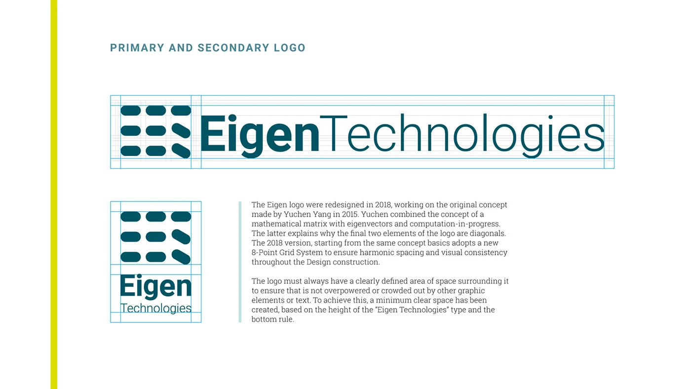
Eigen Technologies primary and secondary logo lockups shown with clear-space guidance.
The primary and secondary lockups make the identity usable across different contexts without losing recognition.

A visual language with range

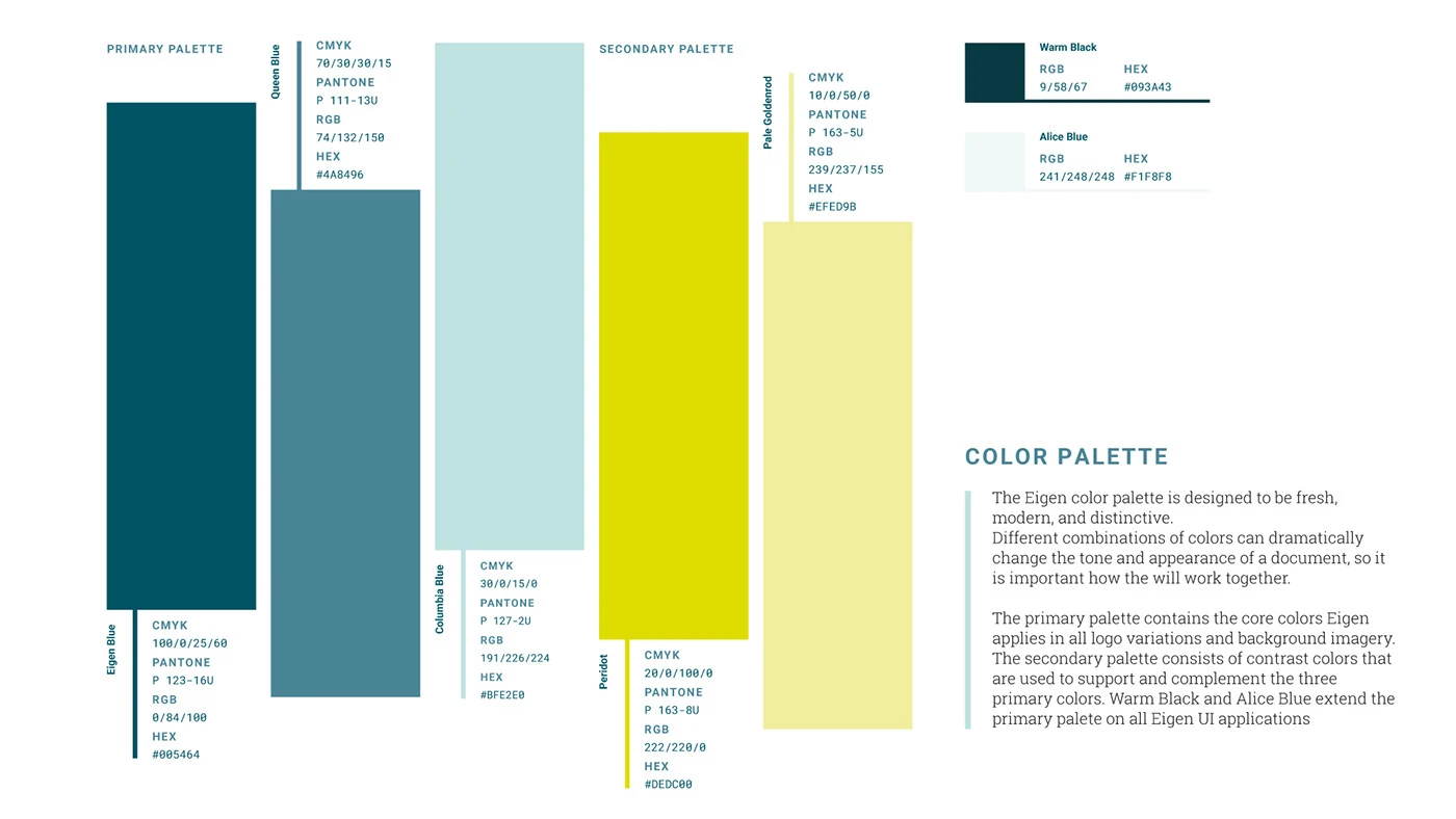
The system was built from a compact set of ingredients: a deep blue-green foundation, a bright signal yellow, lighter supporting tones, expressive graphic forms, and typography that could stay legible across dense information and more atmospheric brand moments.
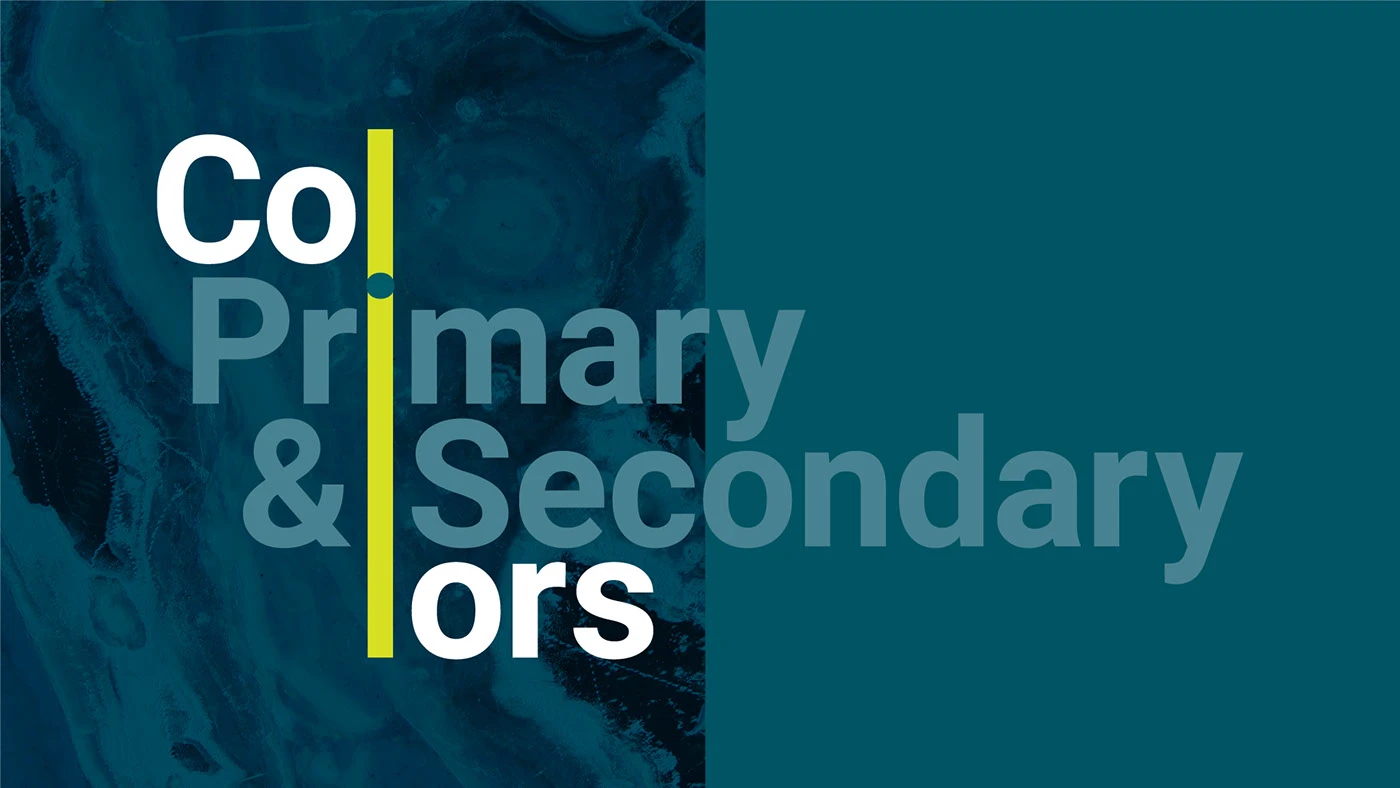
Eigen Technologies visual language showing primary and secondary color directions.
Eigen Technologies primary and secondary color palette with printed and digital color values.
Eigen Technologies typography specimen showing Roboto as the corporate typeface.
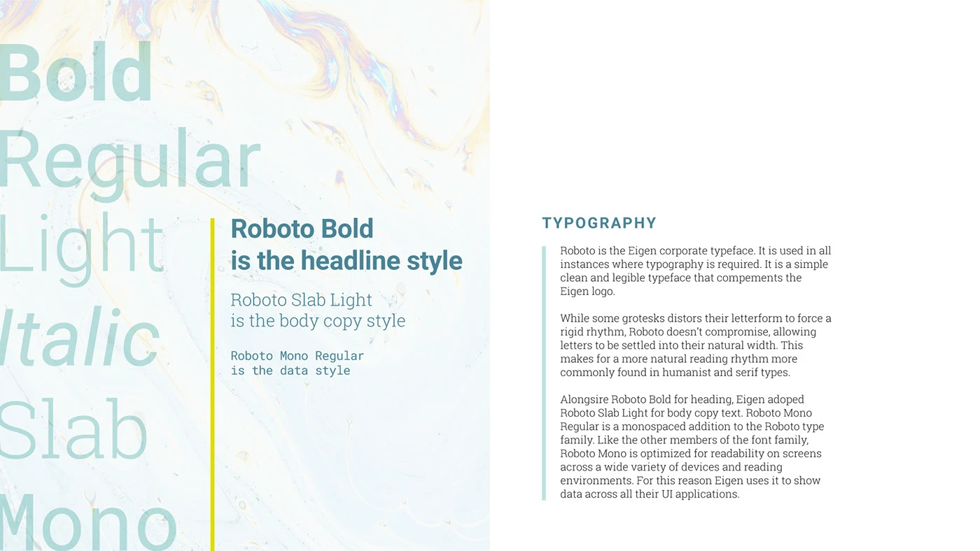
Eigen Technologies type system showing headline, body, slab, mono, and italic styles.
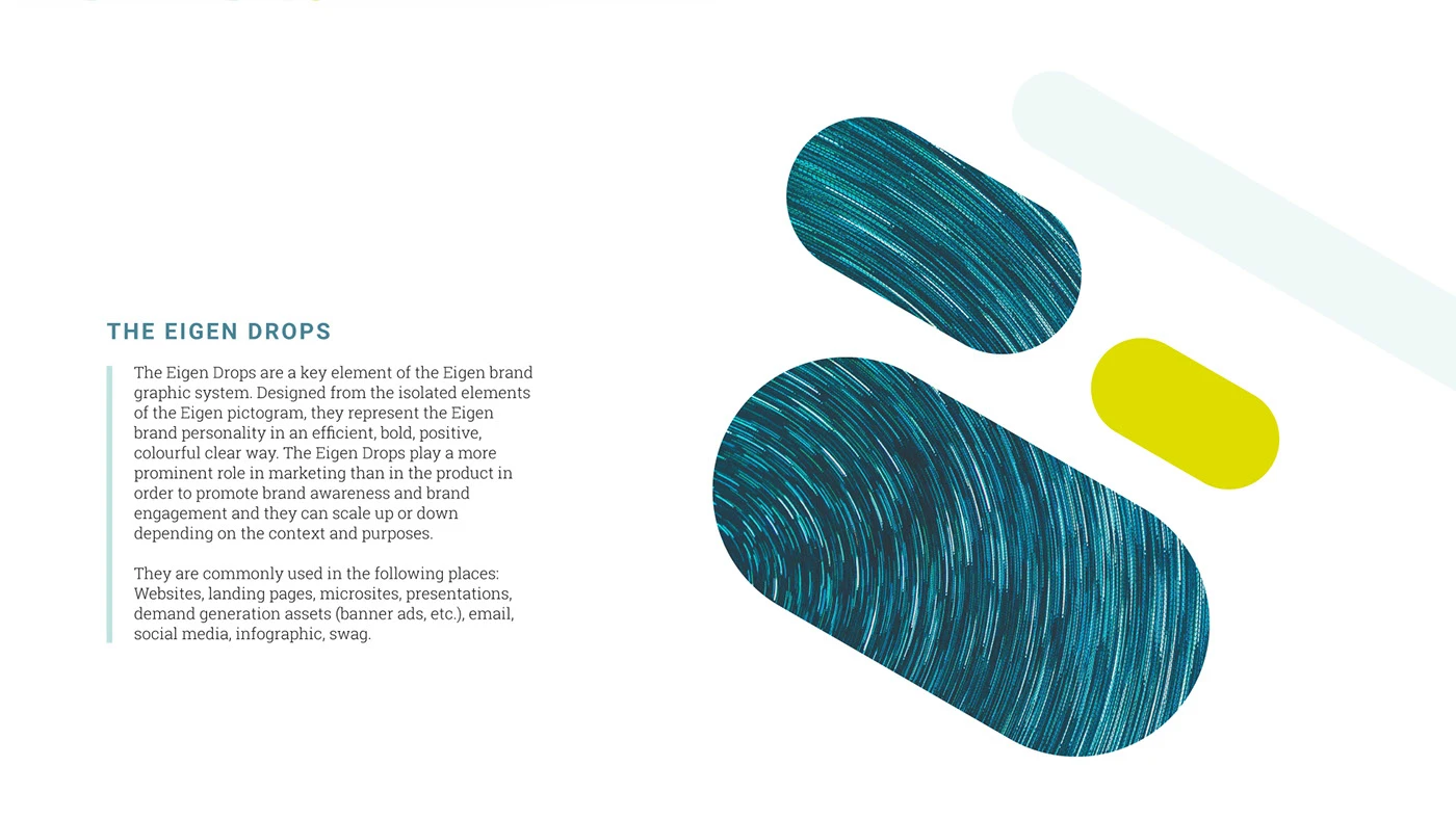
Eigen Drops graphic elements shown as textured blue, pale, and yellow forms.

The principles were deliberately practical:

  • Make complex information feel more approachable.
  • Create enough contrast to work across screens, documents, campaigns, and real environments.
  • Give teams a shared vocabulary for making future decisions.
  • Keep the system flexible enough for new products, people, and places.

From guidelines to working tools

The identity was documented as a working system rather than a static presentation. The guidelines explain how the mark, color, typography, image direction, and graphic language should behave, giving teams enough structure to make consistent decisions without flattening every application into the same format.
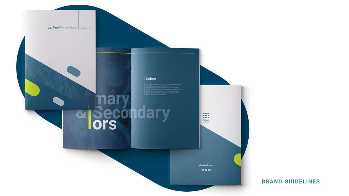
Eigen Technologies brand guidelines shown as a designed publication with logo, color, and application pages.

A system in the world

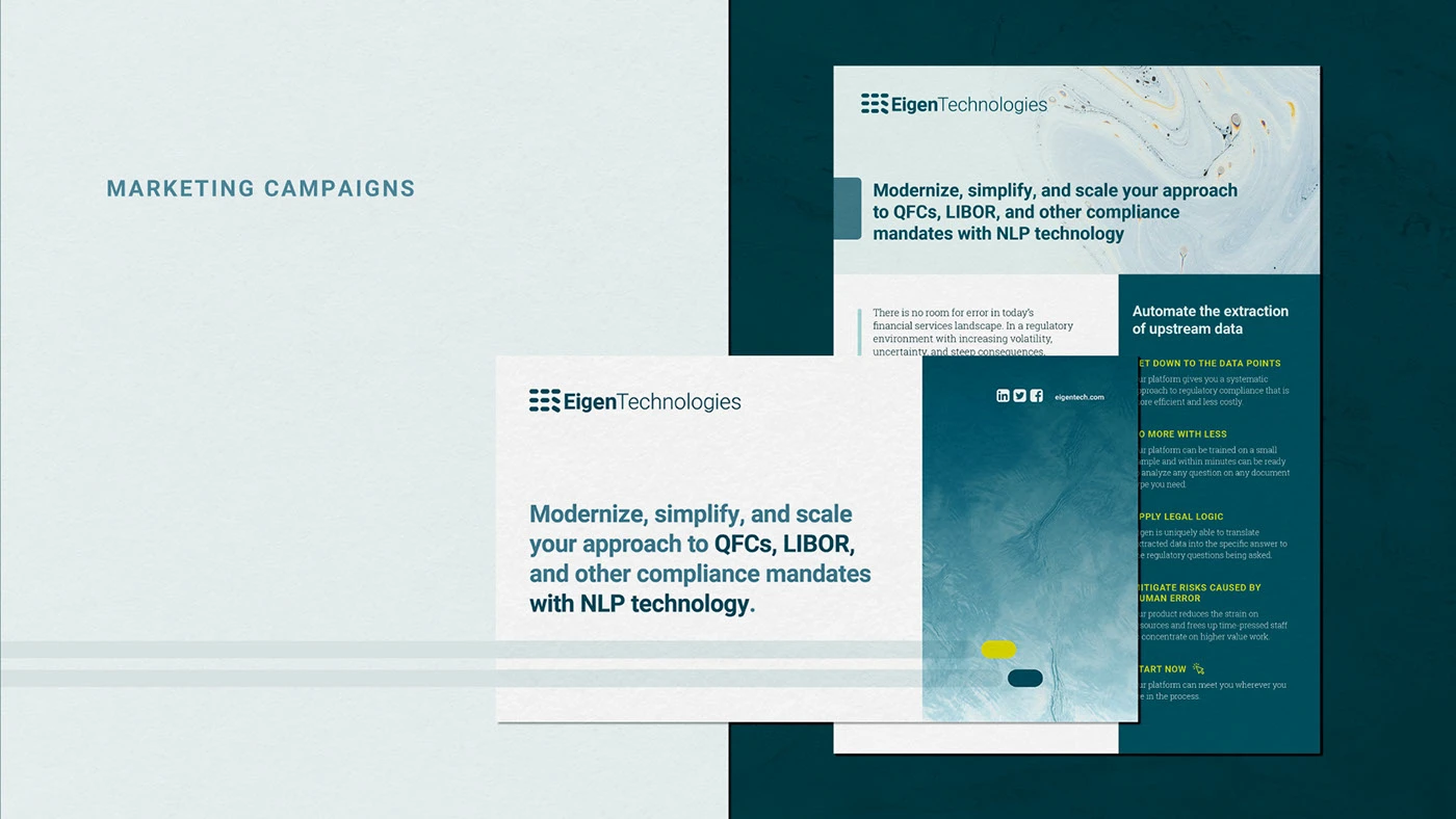
The strongest test of the identity was its ability to hold together across touchpoints. Stationery, campaigns, white papers, editorial objects, and posters all use the same underlying language while allowing the content and context to change.
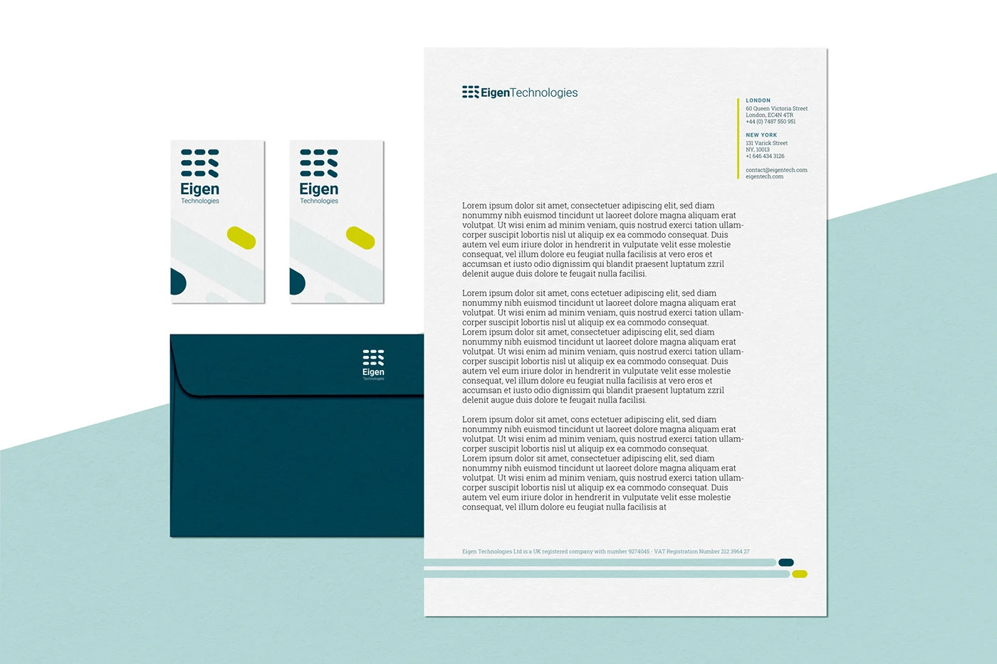
Eigen Technologies stationery system showing cards, envelopes, and letterhead.
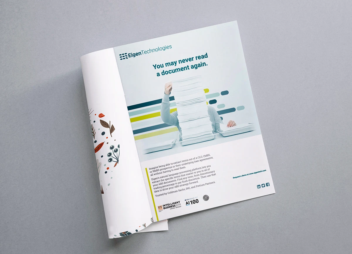
Eigen Technologies marketing campaign materials using the rebrand across digital and printed layouts.
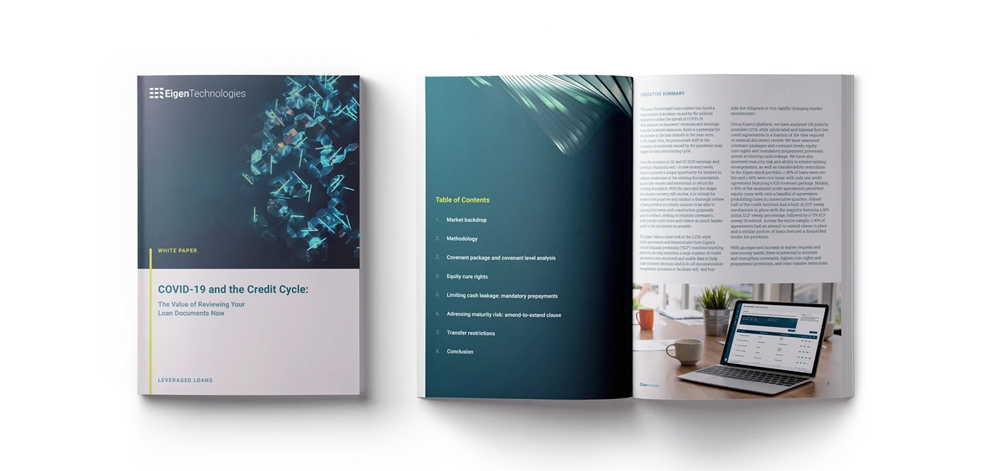
Eigen Technologies white paper shown as a designed editorial publication.
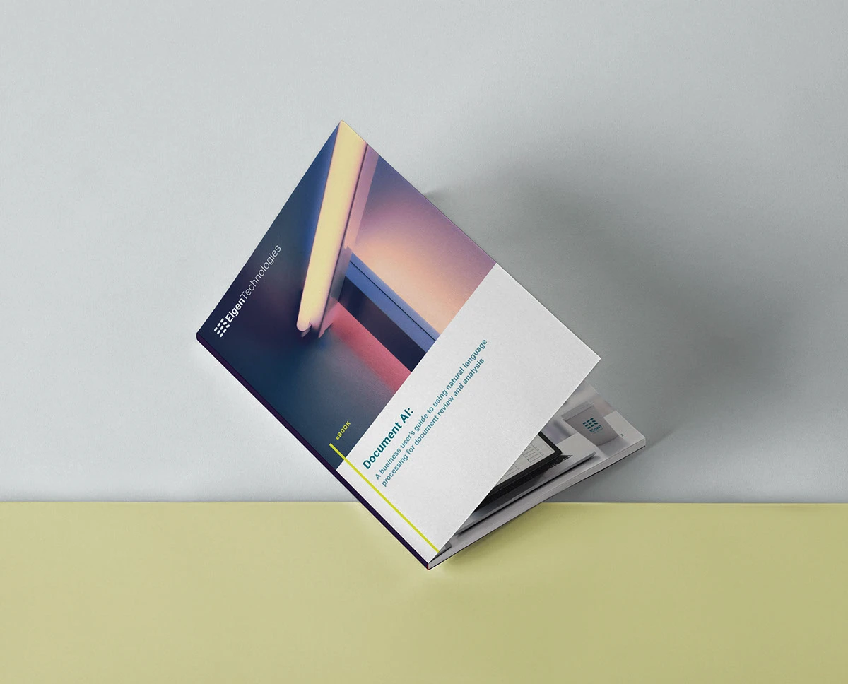
Eigen Technologies Document AI book shown as a physical editorial application.
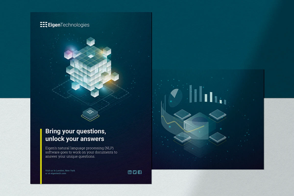
Eigen Technologies poster series showing the identity applied to dark blue printed communications.
Eigen Technologies editorial brochure shown as a physical document application.

Digital and physical expansion

The legacy presentation carries the system beyond the core guidelines: into a working website, campaigns, event materials, and the environments where the company met people in the real world.
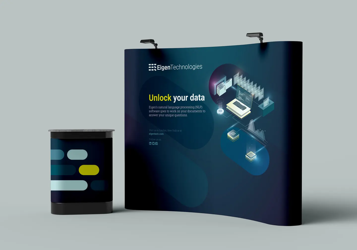
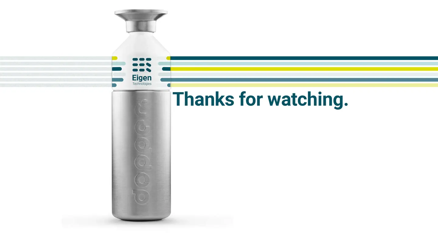
Eigen Technologies physical campaign display and branded product vessel shown as an environmental application.
The visual language scales from a screen to a physical setting without losing its signal colours or sense of movement.
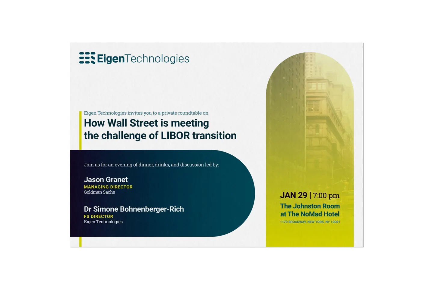
Eigen Technologies event invitation for a private Wall Street roundtable on the LIBOR transition.
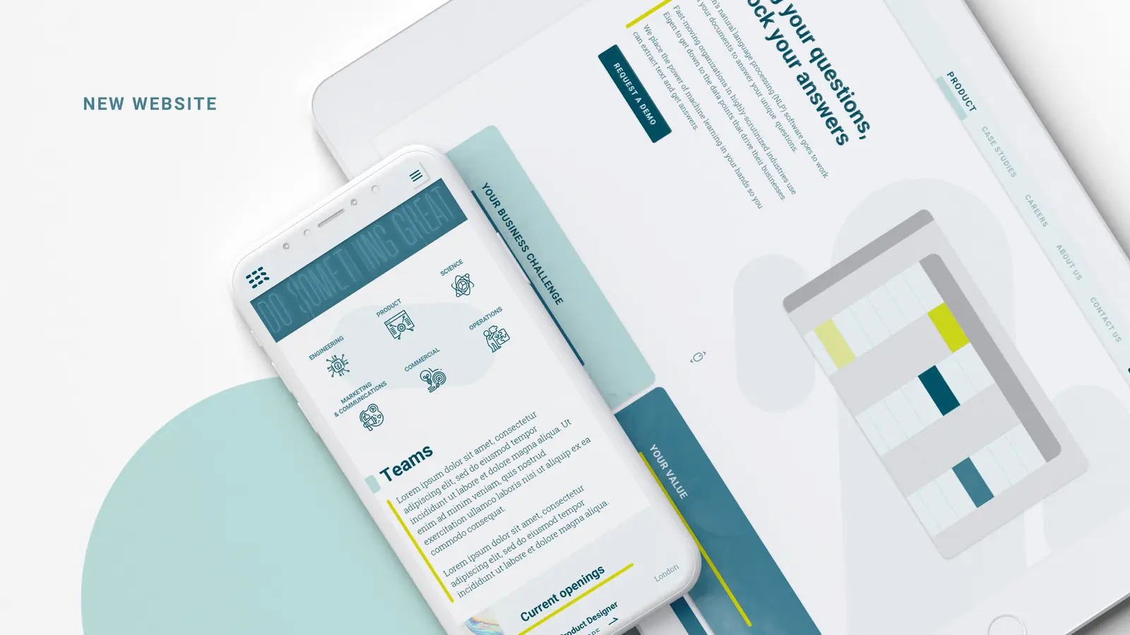
Eigen Technologies website experience showing responsive digital layouts and product storytelling.
Digital applications translate the identity into a clearer, more useful product story.

A workplace with the same point of view

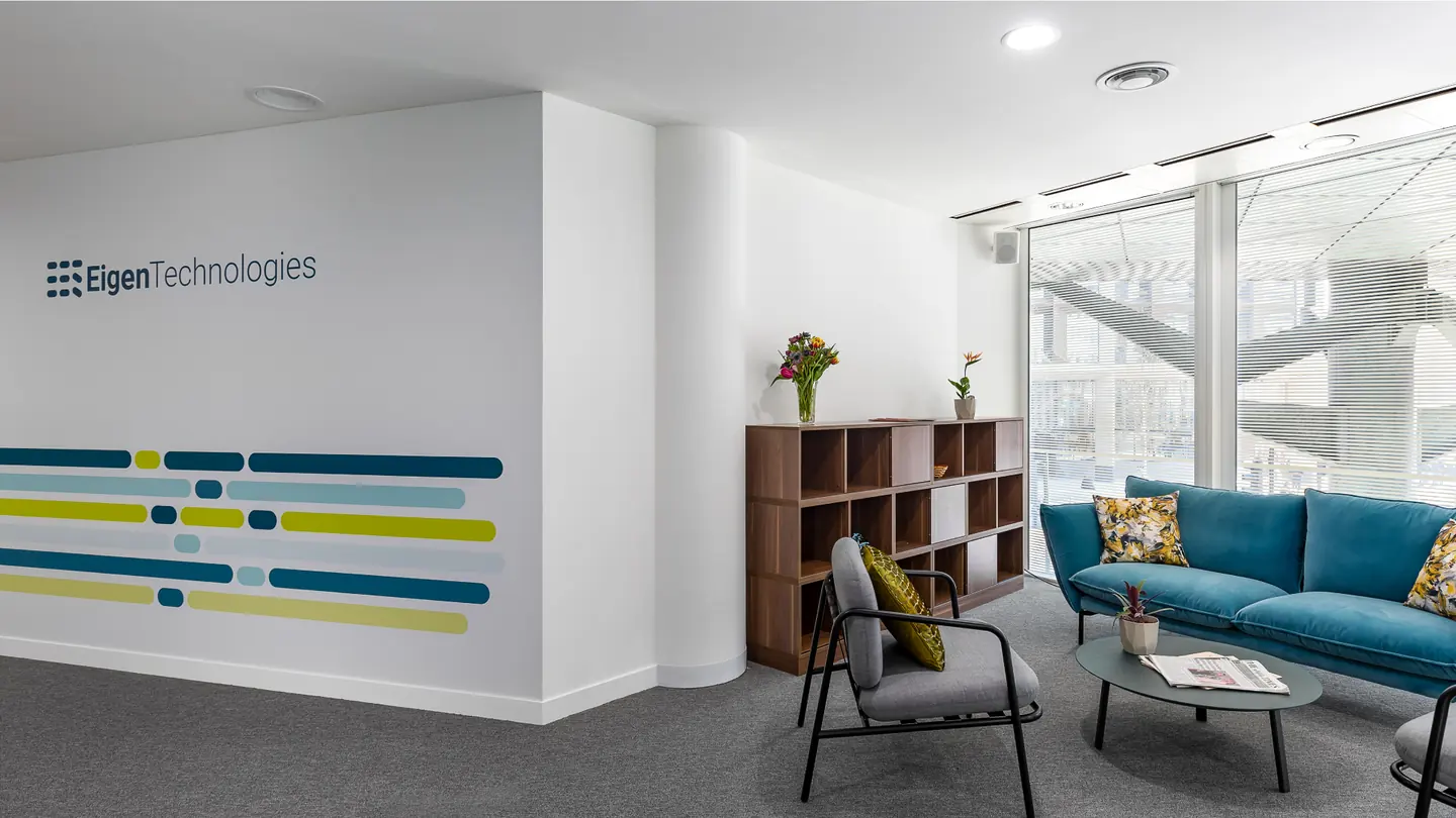
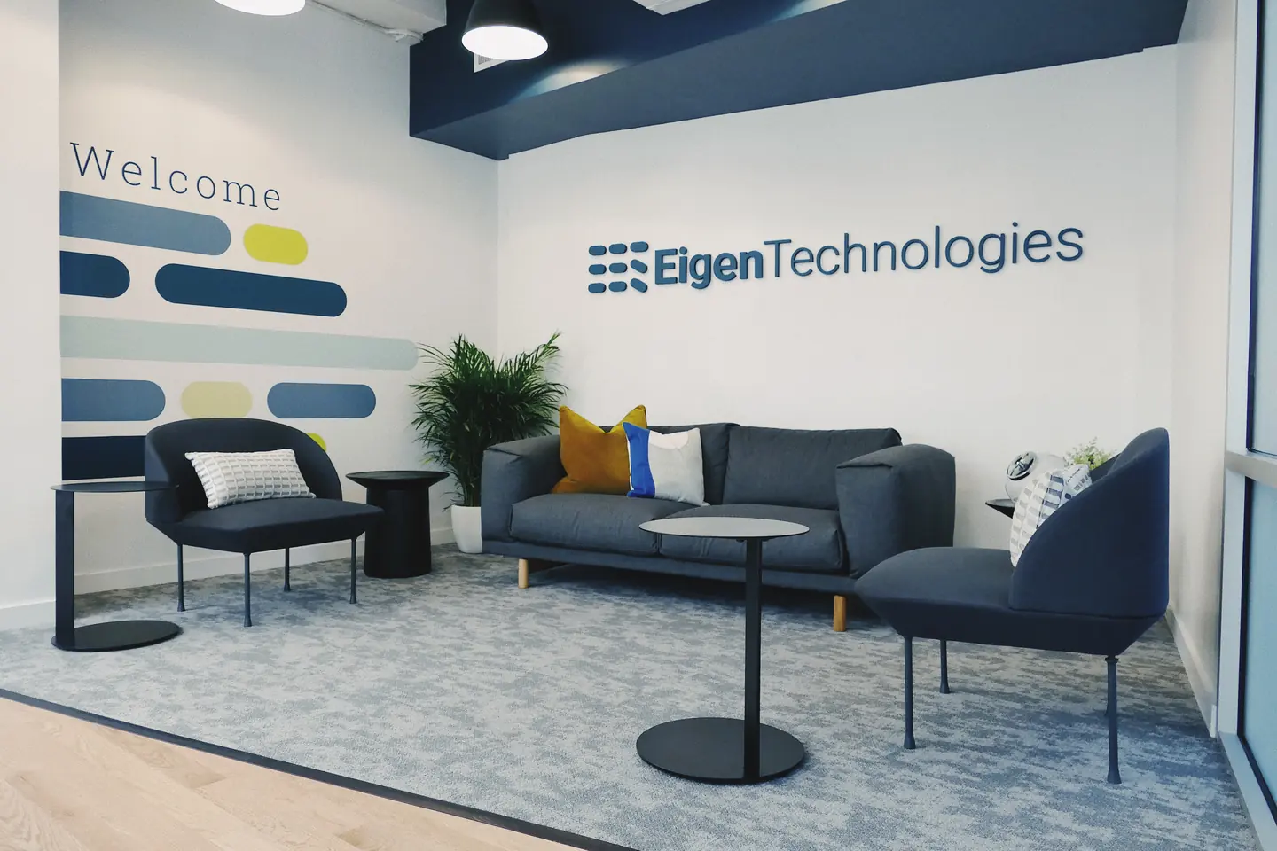
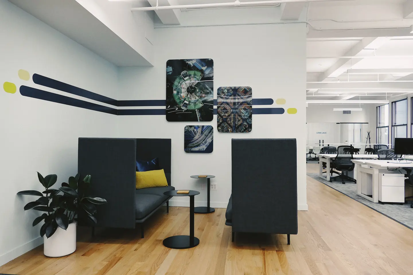
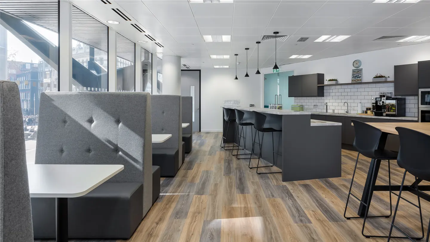
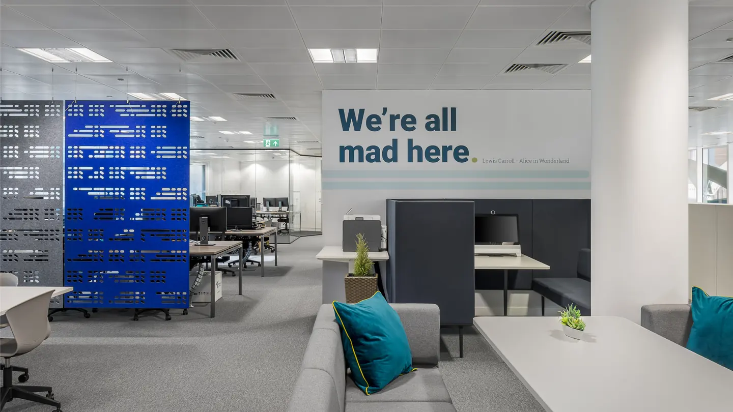
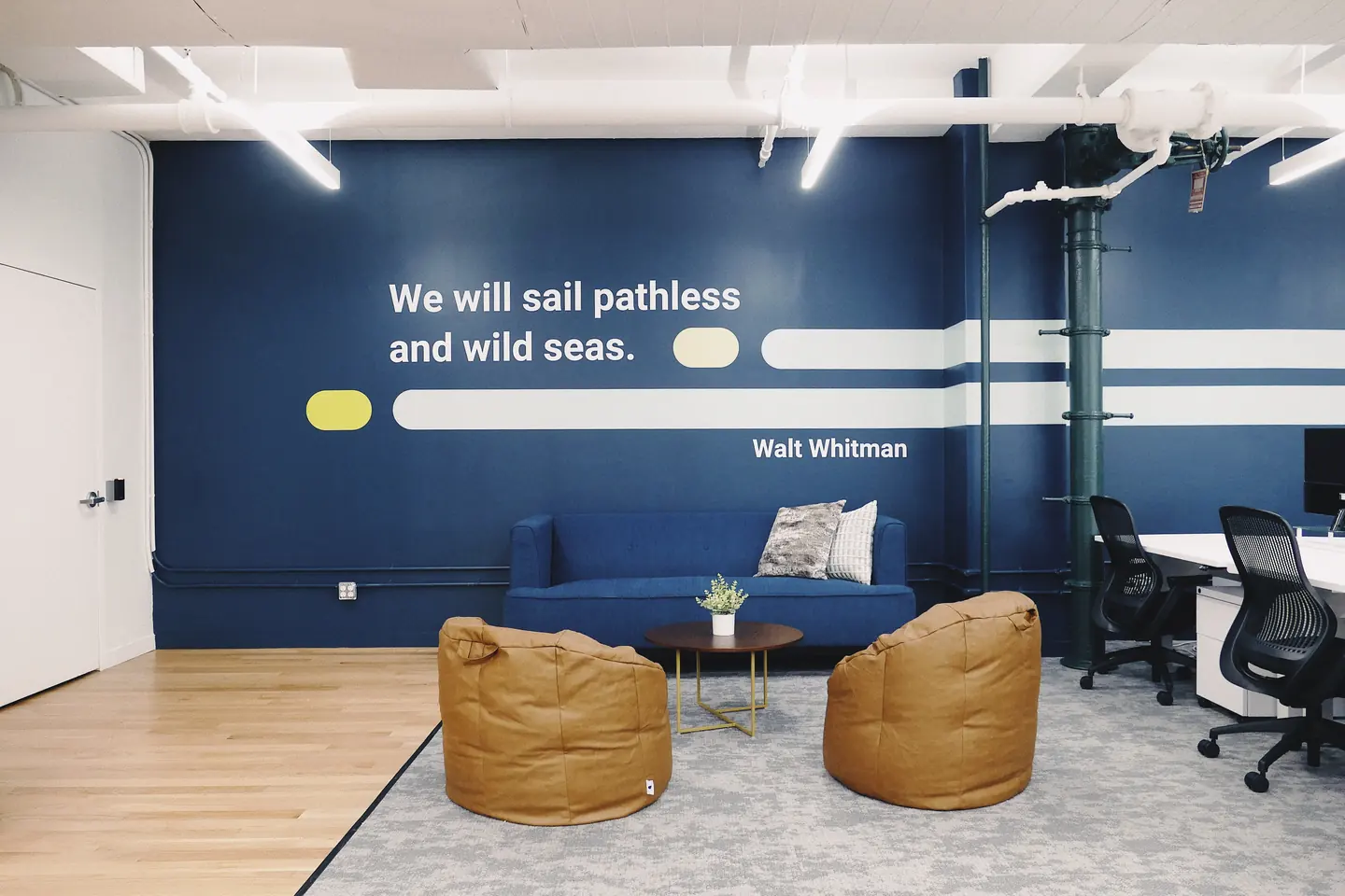
The office work makes the rebrand tangible. Wayfinding, walls, furniture, meeting spaces, and small branded objects carry the same rhythm into the everyday environment.
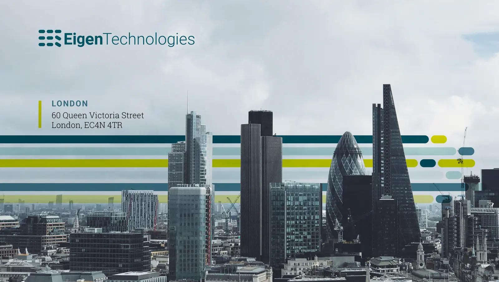
Eigen Technologies London office exterior with branded facade graphics and city skyline.
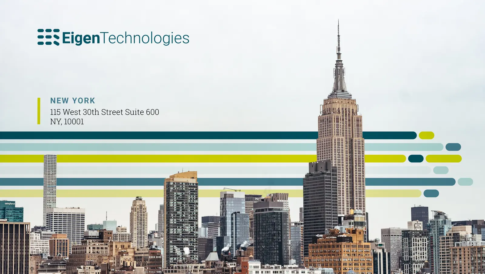
Eigen Technologies New York office exterior with branded cityscape graphics.
Eigen Technologies office lobby with branded welcome wall, seating, and wayfinding.
Eigen Technologies office lounge with branded welcome wall and soft seating.
Eigen Technologies meeting room with environmental graphics and branded wall elements.
Eigen Technologies open office floor with branded environmental graphics.
Eigen Technologies office interior with a blue branded wall and collaboration area.
Eigen Technologies office interior with a green living wall and branded environmental detail.
Eigen Technologies collaboration lounge with a dark blue branded wall and informal seating.
Eigen Technologies branded water bottle showing the identity applied to a small everyday object.

The result is less a finished identity than a living set of tools: a brand that can keep learning without losing its shape.