Talos Brand System
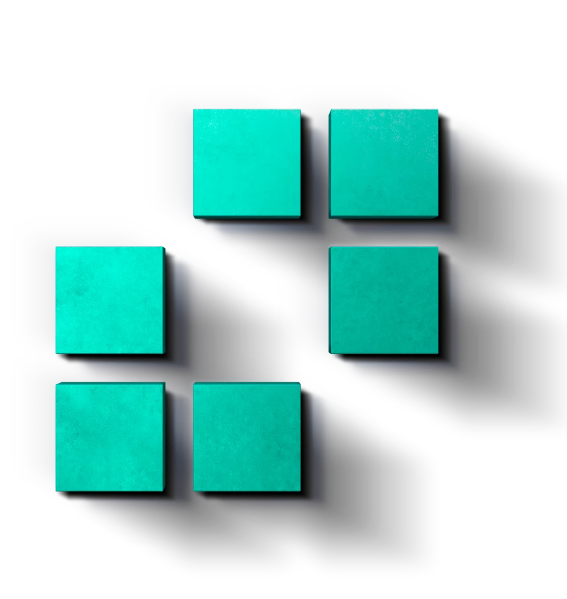
A visual system built to make institutional digital-asset infrastructure feel clear, composed, and ready to move.
A visual system for Talos, shaping how the brand appears across guidelines, product materials, imagery, and marketing applications.
The system begins with Talos’s established identity and extends it into a language for complex work: composed in the guideline, precise when applied to product materials, and expansive enough for what comes next.
Clarity across the trade lifecycle
Talos empowers institutions to trade and manage digital assets across the full lifecycle, from price discovery and execution to settlement. The system gives that breadth a clear, composed language—precise in infrastructure, useful in product materials, and confident in the next expression.
I shaped the framework around the identity: its protection, application rules, micro-design, colour, typography, geometry, product-material framing, imagery direction, marketing applications, and guidelines.
The logo architecture
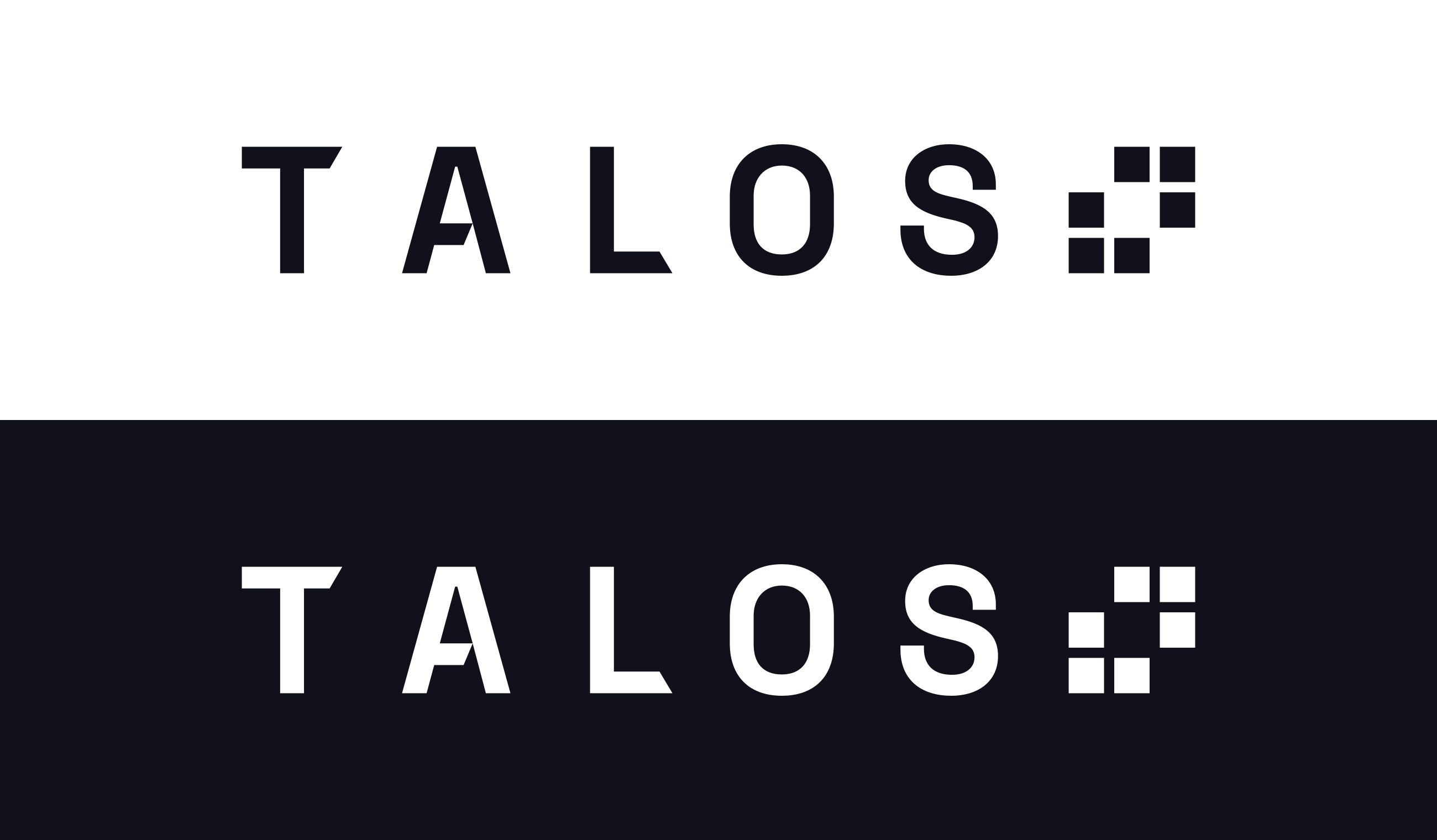
The system gives the identity four useful forms: the primary logo for most applications, the stacked logo for vertical spaces, the mark for compact moments, and monochrome when colour is unavailable.
One identity, four useful entrances.
Four applications, one visual language: each form gives the identity the right presence for its context.


Protection creates recognition
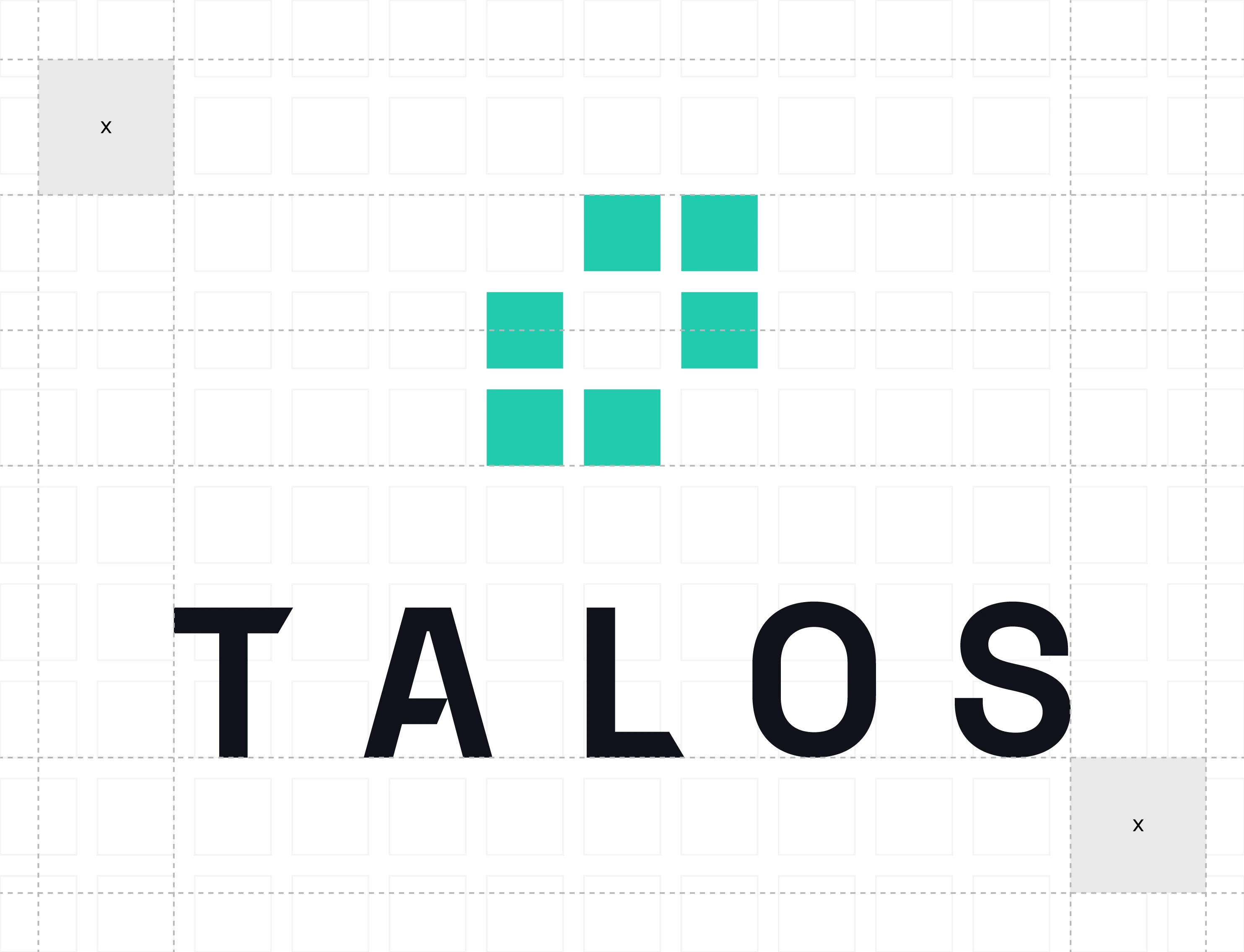
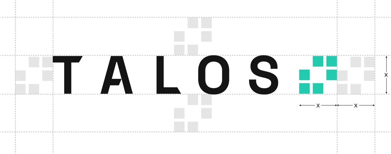
Recognition begins with room. The mark’s own square sets the clear-space unit, giving the identity enough air to remain legible from a product header to a small digital surface.
Let the mark breathe before it speaks.
Clear space protects recognition as the identity moves across products, reports, presentations, and small digital surfaces. Monochrome forms are reserved for applications where colour cannot do the work.
Colour as behaviour
A palette calibrated for signal.
Talos Green establishes recognition. Purple, Blue, Orange, and Red introduce controlled moments of distinction, while Talos Black, White, and Light Grey hold the field together.
Recognition at the point of entry.
#22CAADUrbanist gives the system a voice
Urbanist is the working voice of the system: four weights that move from interface detail to confident declaration while keeping the hierarchy clear.
Urbanist keeps the system useful.
Its four working weights move from quiet interface detail to confident declaration without changing the underlying voice.
We empower institutions to trade and manage digital assets


Geometry carries information
The square motif turns the mark’s logic into a flexible visual language. Its 1:4 spacing, 4 mm construction multiples, and restrained opacity let it frame, align, and texture a composition without becoming decoration.
A square can carry a lot.
The square is the system’s smallest useful unit. This lab shows how the mark’s logic becomes a measured field, a construction rule, and a restrained tonal vocabulary.
- 1:4
- Spacing-to-size relationship
- 4 mm
- Construction increments
- 20–80%
- Motif opacity sample range
The mark is the source unit. The surrounding field makes its proportions legible.
Exact Talos mark / 640 × 640 source viewBox
A bracket for emphasis.
A line for emphasis, calibrated to the type it brackets: riser to baseline across multiple lines, with a 10% extension above and below for a single line.
We empower institutions to trade and manage digital assets.
Advanced algorithm suite
Product materials in context
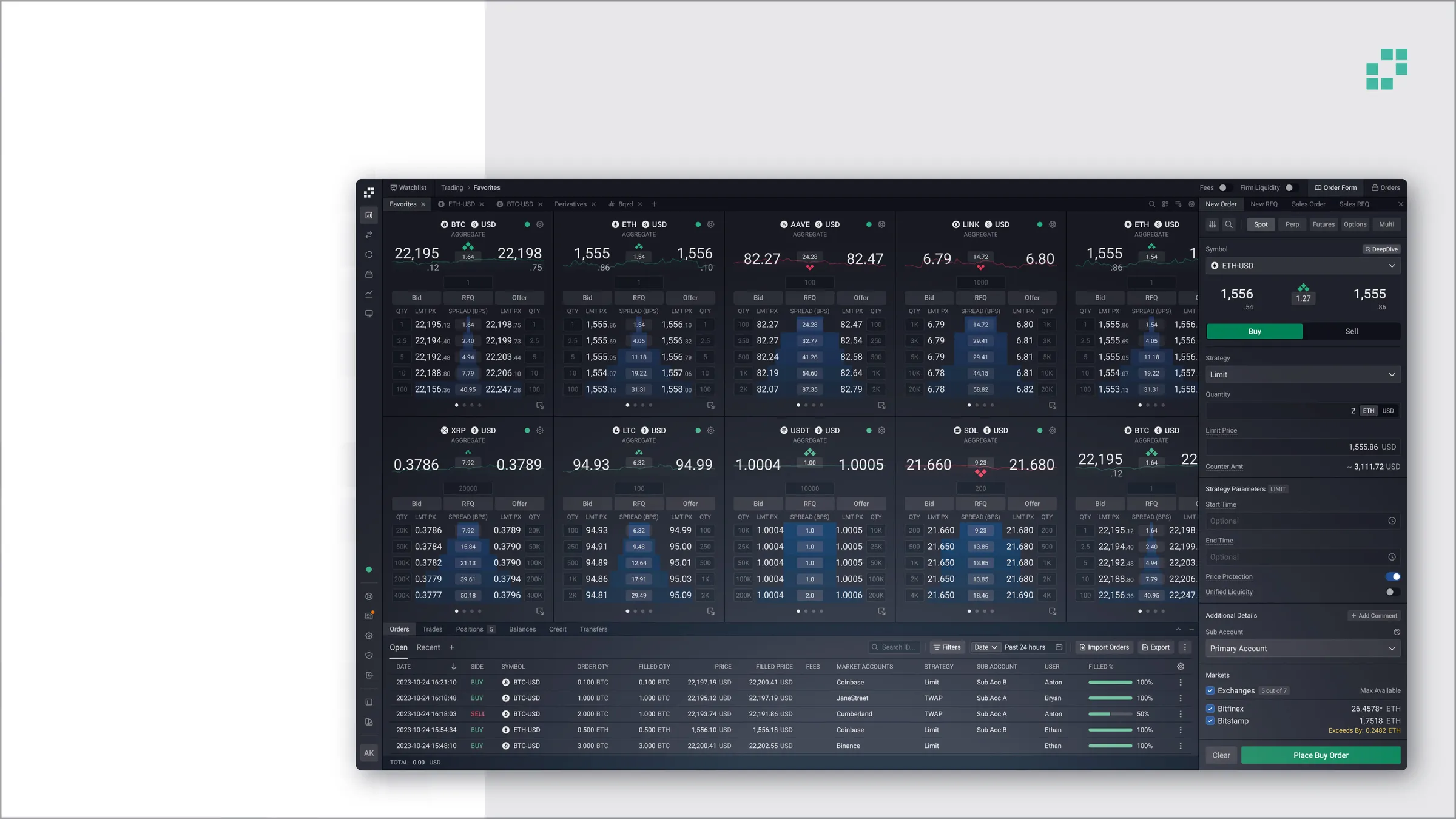
The system proves itself when it meets product work. Product materials give the visual language a real environment: a way to frame complexity, support hierarchy, and carry the brand into marketing applications.
Make complex work feel composed.
Product reference imagery is evidence: close enough to show the work, edited enough to keep the hierarchy clear.


Brand imagery
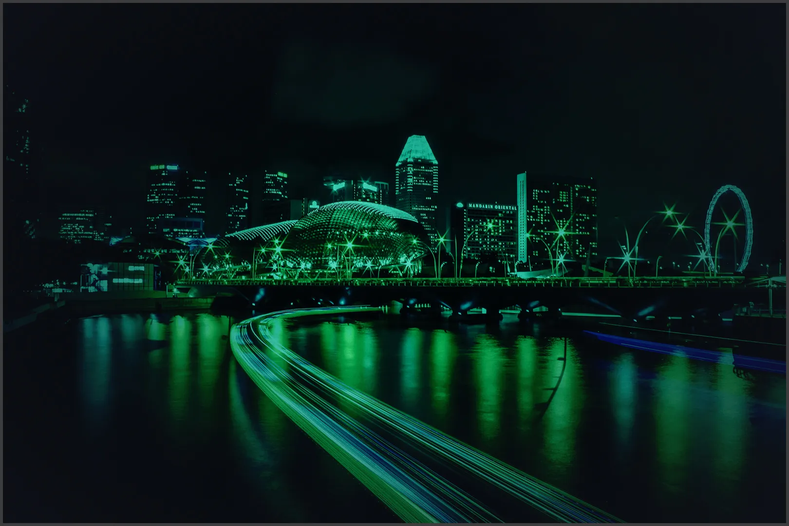
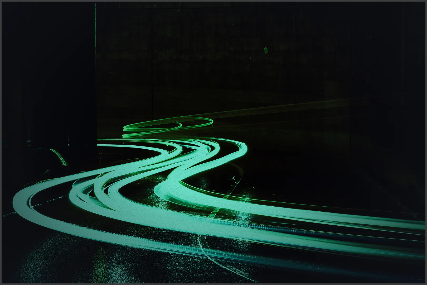
Brand imagery moves away from the interface and into atmosphere. Aerial cityscapes create scale, bridges make connection visible, and precise details bring the system back to material reality.

Blocks create dimension
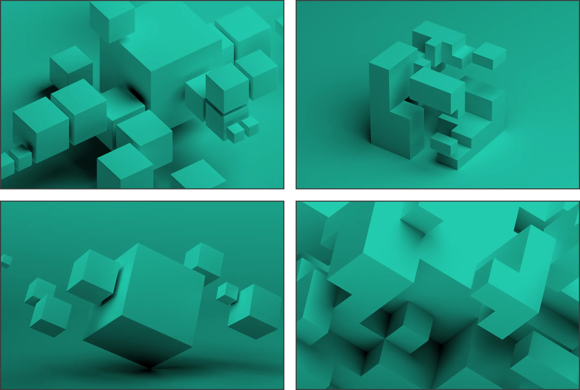
Three-dimensional blocks give the square a physical register: depth, modularity, and forward motion held inside Talos Black and green.
Depth without noise.
The square becomes spatial, modular, and ready for the next Talos expression. It is a visual device with enough restraint to keep the work in focus.
A system that can grow
This is the first Talos project in the portfolio—and the starting point for a wider family of work. It establishes a visual grammar future Talos expressions can extend: coherent, recognizable, and open to new products, stories, and applications.
The system gives Talos room to move without losing its precision or character.

