p(X)

A single counterparty, made visible as a system.
A new identity and digital experience for p(X), making institutional digital-asset liquidity feel singular, discreet, and ready to use.
The work began with a blank page. p(X) was a new company and a wholly owned affiliate of Talos Global, created to unify fragmented digital-asset liquidity across disparate venues. I shaped the project end to end: strategy, identity, visual direction, website, and the system of applications around it.
From Project X to p(X)
The working name was Project X. The final name became p(X): a formal, compact reading with a natural resonance in probability, pricing, and financial markets. In mathematics, p(x) commonly describes the probability or distribution of an outcome. The identity uses that openness deliberately: precise enough for institutional work, but not trapped inside a literal product description.
The parentheses matter. They hold an outcome, a relationship, and a changing field in one small lockup. p(X) is not a wordmark made from letters; it is a notation that can become a counterparty, a signal, or a point of resolution.
A mathematical reference, redrawn as a signature.
Munson Italic was the typographic starting point. Its italic forms were designed to recall equation lettering from late-nineteenth-century mathematics textbooks—a precise cultural reference for a name that already behaved like notation.
The final p(X) was not left as typeset text. The characters were isolated, redrawn, and optically adjusted so the p, x, and parentheses read as one compact signature. Spacing, inclination, and shared tangencies were tuned as relationships inside one mark.
The finished drawing resolves around a three-unit module: twelve units high, a one-unit p stem, a 2u optical separation, and a 1:4 incline that holds the construction together.
- Incline
- 1:4
- Drawing height
- 12u
- p stem
- 1u
- Optical separation
- 2u
A notation with room to operate.
The lockup stays mathematical at every scale. Colour variants keep the mark legible across surfaces, while concise entity signatures distinguish KY from US.
One mark, two operating entities.
Two geometries, one operating idea
p(X) needed to make a single bilateral counterparty feel tangible: discreet, highly capable, and at home in the environments where trust is built, without borrowing the clichés of sci-fi finance.
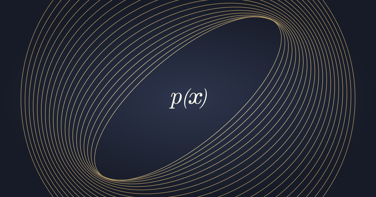
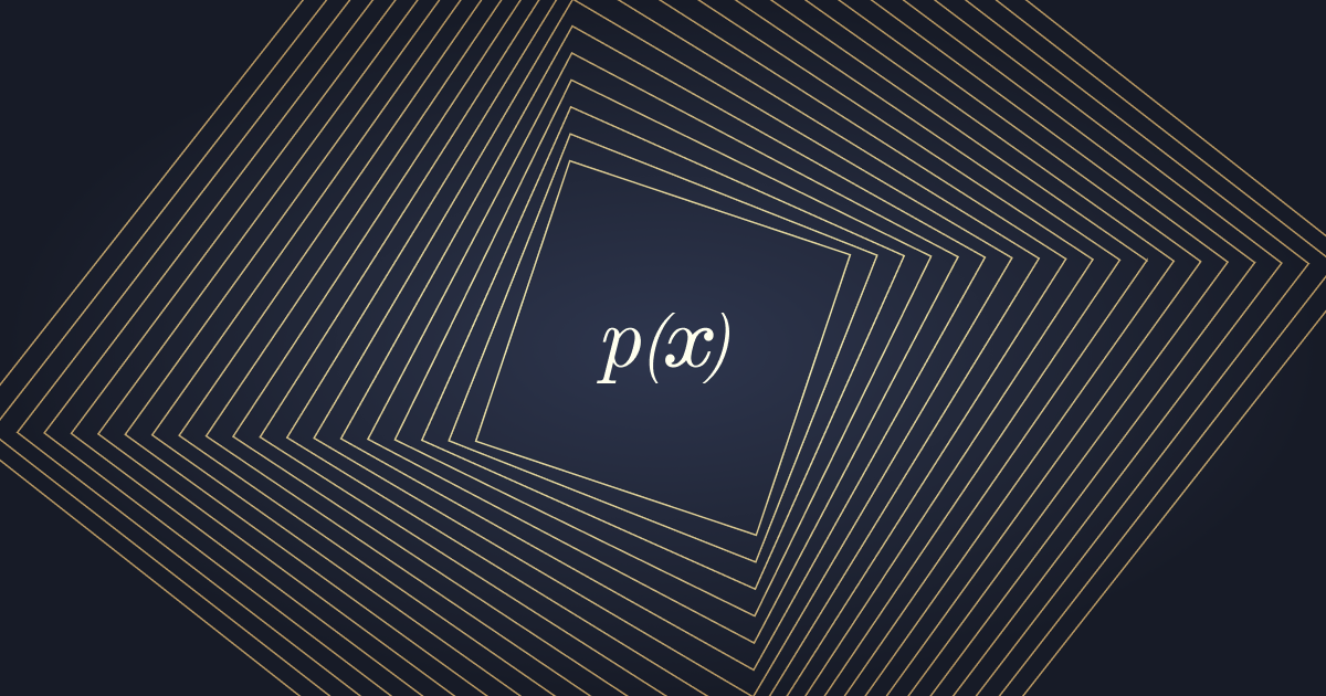
The rings and squares are the first expression of that logic. They are two visual grammars for flow and structure: rings carry the circular language of the Cayman entity, while squares carry the orthogonal language of the US entity.
Together, they make multiple venues and jurisdictions legible through one point of access. In motion, the field gathers, separates, and resolves again. The animation makes the counterparty idea felt before it is explained.
A deliberate tension
The visual direction holds two instincts together: Larken gives the identity its editorial authority; Manrope keeps the interface direct and readable in motion.
That tension lets p(X) feel established without pretending to be old, and modern without borrowing category clichés.
Modern enough to move.
Larken sets the point of view. Manrope carries the operating layer.
One system, three levels of voice.
The type system is a measured hand-off between point of view and operation.
Two surfaces and one rule
The public palette is built around contrast. Raisin Black gives the system its deep field; Ivory opens it into explanation. Lion carries structure through rules, rings, labels, and focus, while Cool Gray marks action. Cordovan remains reserved for the identity.
The identity had to work before it looked finished.
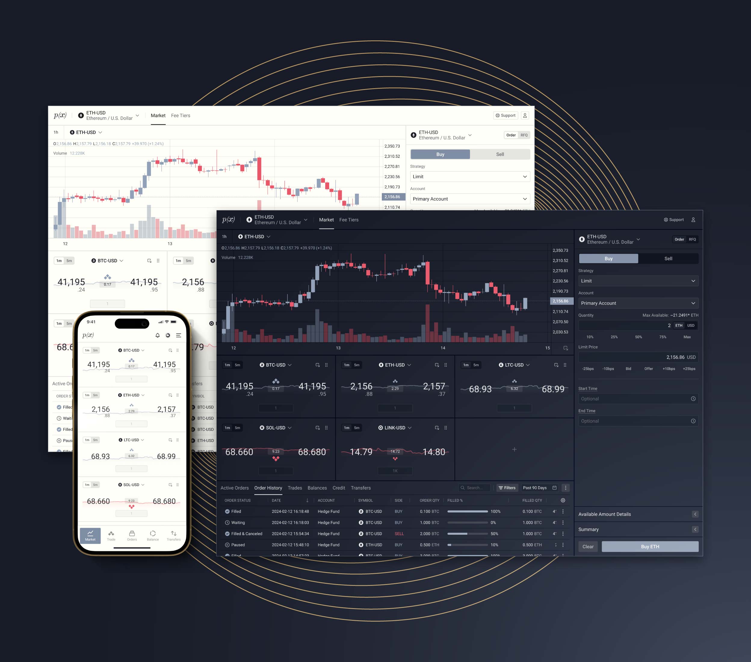
p(X) moved into onboarding, sales, product, presentations, and daily operations.
The website as proof
The website is the identity behaving in public: a dark field for the market, a light surface for explanation, a structured return to the dark, and a cool-gray invitation to act.
The motion turns that sequence into a rhythm: field, promise, operating model, action.
Built for institutional execution
Institutional-grade liquidity, seamless execution, and a unified trading experience.
Execute without friction
Access global liquidity and execute large trades with minimal market impact.
- Aggregated liquidity across top exchanges, OTC dealers, and internal flows.
- Trade across 150+ supported coins, from major to long-tail assets.
- Execute sizable orders in a single fill.
- Reduce partial-fill risk in fast-moving markets.
One counterparty, endless reach
One counterparty opens access to leading exchanges, OTC desks, and proprietary flows.
- Trade with a single bilateral counterparty across multiple liquidity sources.
- Replace the complexity of managing relationships with multiple liquidity venues.
- Trade across spot, derivatives, and structured products.
- Unify settlement and reconciliation across the trading relationship.
Tailored to your needs
Algorithmic execution strategies shaped around your trading objectives.
- Work with our trading desk to design strategies around your goals.
- Minimize market impact and information leakage for sensitive trades.
- Receive detailed transaction-cost analysis and execution reporting.
Streamlined processes
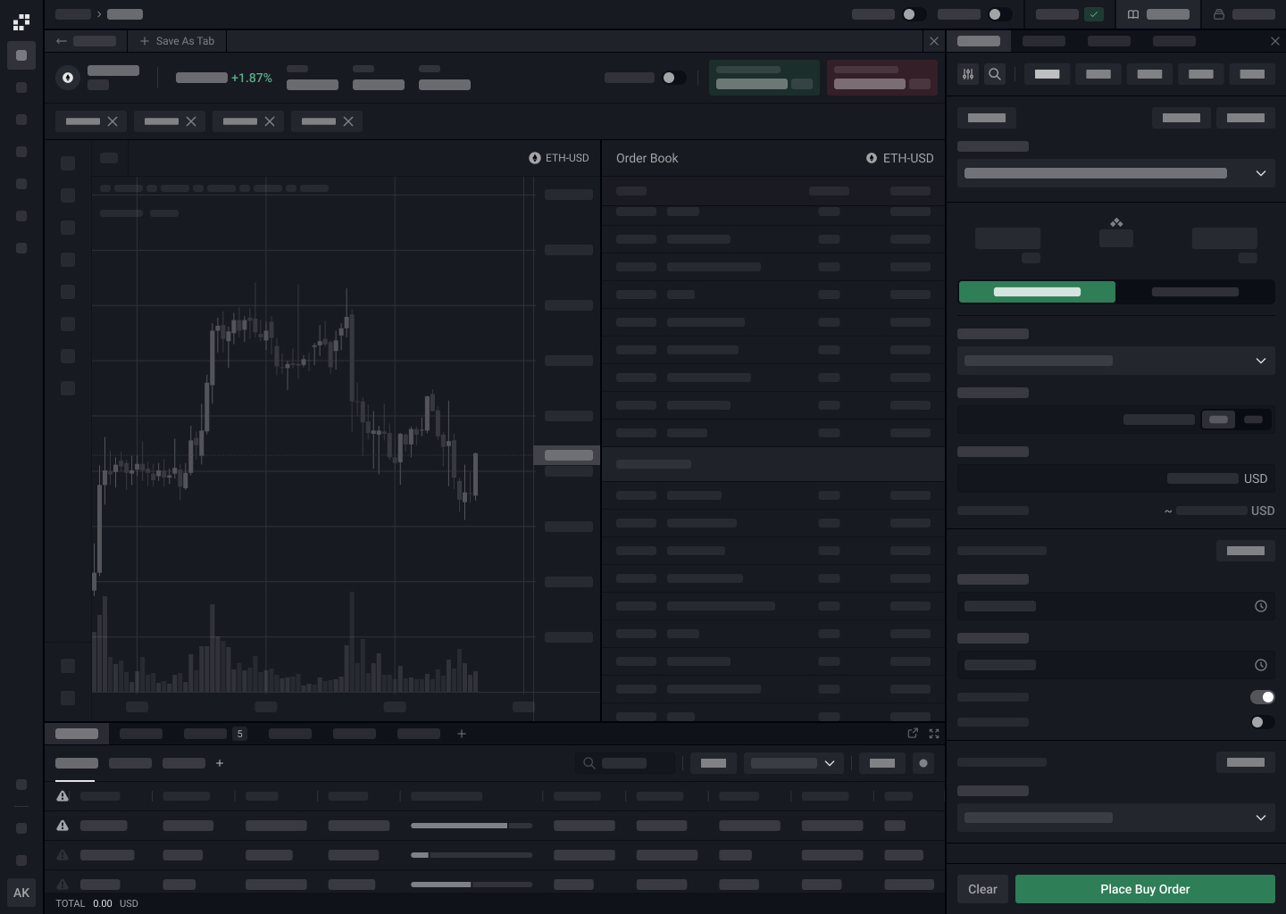
Reduce operational overhead through simplified onboarding, execution, and settlement.
- Institutional onboarding designed for speed and clarity.
- One point of contact for trading activity and support.
- Efficient daily settlement across trading activity.
- Comprehensive reporting and audit trails for compliance and reconciliation.
Private bilateral execution
p(X) keeps trading bilateral and private, protecting your trading intent and strategy.
- Trades are bilateral and private.
- Algorithmic execution helps keep trade size and strategy out of public order books.
- Built for sensitive repositioning, treasury needs, and large institutional flows.
Execute without friction
Access global liquidity and execute large trades with minimal market impact.
- Aggregated liquidity across top exchanges, OTC dealers, and internal flows.
- Trade across 150+ supported coins, from major to long-tail assets.
- Execute sizable orders in a single fill.
- Reduce partial-fill risk in fast-moving markets.
Execute without friction
Access global liquidity and execute large trades with minimal market impact.
- Aggregated liquidity across top exchanges, OTC dealers, and internal flows.
- Trade across 150+ supported coins, from major to long-tail assets.
- Execute sizable orders in a single fill.
- Reduce partial-fill risk in fast-moving markets.
A list becomes a landscape.
const panes = accordion.panes;

panes[0].classList.add('is-active');
The component begins as a complete field, not a stack of cards.
panes.forEach((pane, paneIndex) => {
  pane.classList.toggle('is-active', paneIndex === next);
});

activePane → grows
quietPanes → hold context
Focus expands, context recedes, and the explanation arrives with it.
panels.forEach((panel, panelIndex) => {
  panel.hidden = panelIndex !== next;
});
reveal(panels[next]);

current → releases
next → enters
frame → stays
Changing direction feels like moving through one surface, not opening another component.
Five benefits share one frame. The active idea expands into view while the others remain legible as context.
From visual language to living interface.
The p(X) website started in Figma, then Figma Make helped create a first pass on the build. From there, it was refactored in Cursor with React and Vite into a live experience with real routes, components, motion, and responsive states.
Global liquidity.
One counterparty.
A system in operation
p(X) now has the visual and verbal structure to move from strategic proposition into daily use—discreet where it needs to be, expressive where it helps, and coherent across the surfaces it touches.
The outcome is not a logo or a finished website, but a working system for making one counterparty feel present across many conditions.